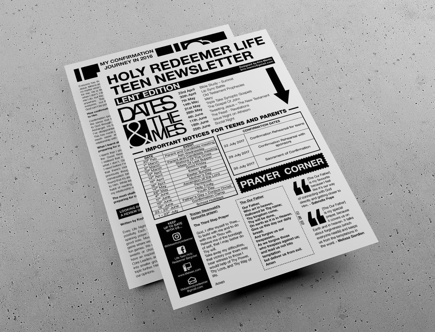
Holy Redeemer Life Teen Newsletter: Lent Edition
Brief: Design the quarterly A4-sized newsletter for the Life Teen youth group of Holy Redeemer Catholic Church. Full creative license given to the designer. Newsletter must be 1 x double-sided page. Design must be black and white to cut down on printing costs.
Challenge: The newsletter must be in black and white only, but it must be interesting and appealing to teenagers. No resources provided. Only copy provided and copy must be placed and designed so as to lead the reader from the most important content to the least important.
Outcome: My immediate thought was that I wanted this project to be modern and have an edginess to it - definitely nothing
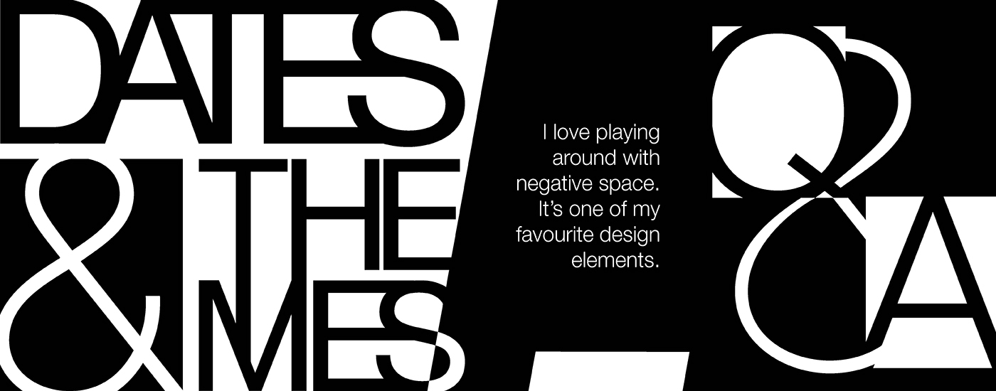
childish. I know a lot of designers frown upon the Helvetica typeface because they say it's outdated, but I completely disagree. I love Helvetica and, in a sense, this newsletter was a celebration of it and showcases its diversity. The decision to only use one typeface was mine because I felt that using more than one would make the already-busy design look more chaotic and incohesive. I was warned that there would be a lot of copy that I would have to try to squeeze over one double-sided page so my first thought was "puzzle pieces". I wanted each section and bit of copy to lock into each other like Tetris blocks so as to utilize as much space on the page as possible while maintaining a sense of order and linear design. I also knew that I wanted to use oversized, abstracted graphics, letters and punctuation as weighty graphic elements to balance out the white space on the page and hold the reader's interest. Overall, I'm happy with how the newsletter turned out - and any time I get to place with negative space in a project is a fun time!
childish. I know a lot of designers frown upon the Helvetica typeface because they say it's outdated, but I completely disagree. I love Helvetica and, in a sense, this newsletter was a celebration of it and showcases its diversity. The decision to only use one typeface was mine because I felt that using more than one would make the already-busy design look more chaotic and incohesive. I was warned that there would be a lot of copy that I would have to try to squeeze over one double-sided page so my first thought was "puzzle pieces". I wanted each section and bit of copy to lock into each other like Tetris blocks so as to utilize as much space on the page as possible while maintaining a sense of order and linear design. I also knew that I wanted to use oversized, abstracted graphics, letters and punctuation as weighty graphic elements to balance out the white space on the page and hold the reader's interest. Overall, I'm happy with how the newsletter turned out - and any time I get to place with negative space in a project is a fun time!