Bishops Projects
2020 - 2021

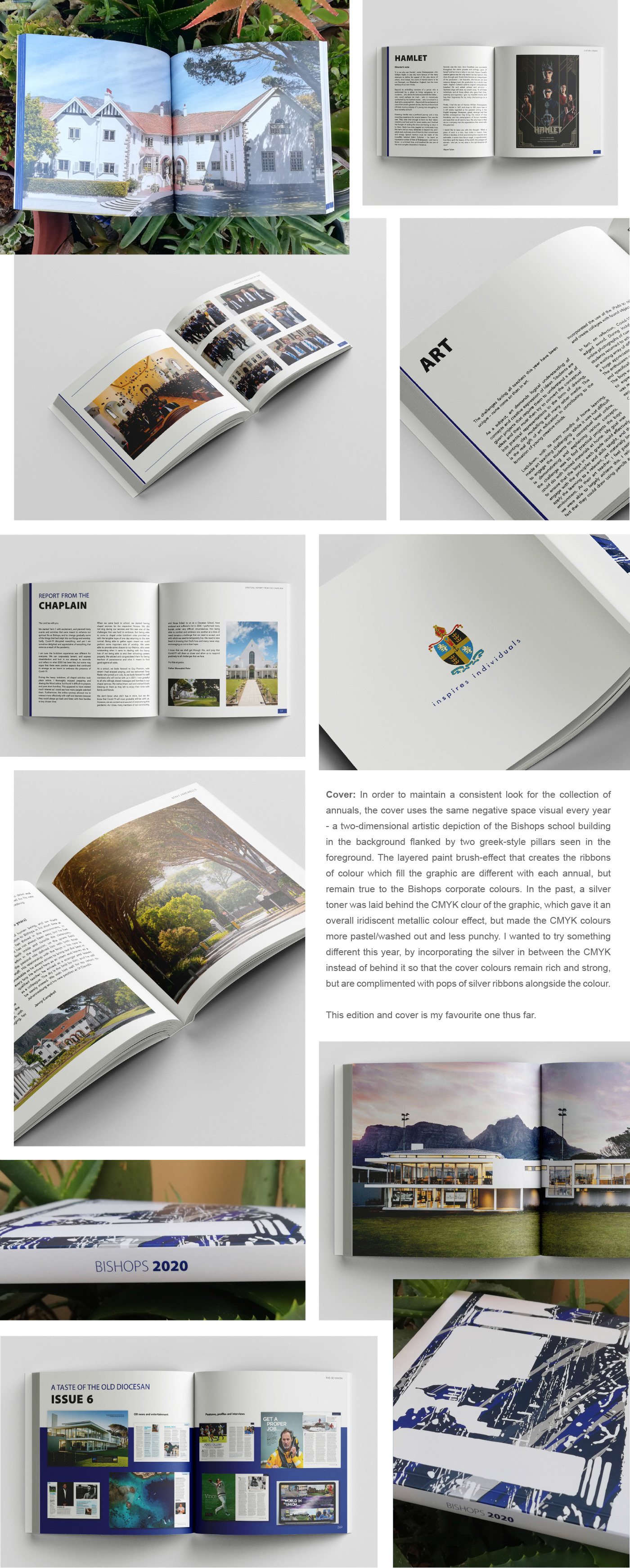
Bishops Annual 2020
Brief: Each year, Bishops has an annual book created that includes the highlights and notable mentions of that year.
Challenge and Outcome: For the 2020 edition, the impact of Covid-19 was far-reaching, causing the educational system to be disrupted nationally - an impact that was felt throughout the book creation process. However, I was fortunate to, once again, be working with a fantastic team from Bishops on this project (Nella and Wayne), who are committed, patient, understanding and always take the process in their stride. The three of us, along with our proofreader, Wendy, worked together like a well-oiled machine and rolled with the curve balls of Covid-19 to produce a beautiful edition filled with stunning photographs provided by Freddy Child-Villiers and Craig Watson amongst others.
Every year we try to keep the general template and overall look the same, while introducing a new stylistic element to make that year unique. For this edition, I introduced a blue stripe that ran down the outer edge of the left page, creating a blue tint along the pages when the book is laid flat. We also removed the section opener wording on the double-page spreads so that the book would have a more run-on kind of feel and the images could take centre stage.
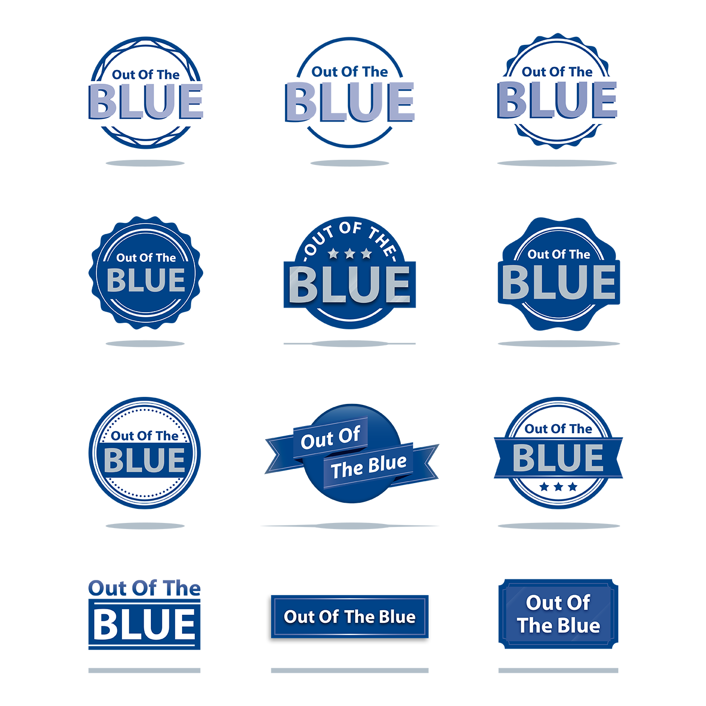
Emblem Concept
Brief: Create an emblem for the Bishops newsletter using its title, ‘Out of the Blue’.
Challenge and Outcome: The brief changed a lot from start to finish as the client was inspired by different concepts each time they would see a new iteration of the emblem, but below are a few of my favourite options that I created during this exercise

Bishops Matric Yearbook 2020
Brief: Create the Bishops Matric Yearbook for the class of 2020.
Challenge: The parent in charge of the admin process of the book for this year charged me with creating a completely updated look from the previous year; one that matched the feel of the annual, but is a bit less formal and more endearing and fun. From a timing point of view, this was one of the most challenging projects that I’ve completed thus far in my career. The parameters of this project shifted often and there were many late nights in a row that were spent trying to get this book to the client on time, but I must say that I was really happy with the end result.
Outcome: We used the same fonts and font weights as the annual and incorporated the spacious, grid-like feel of the annual, but juxtaposed this look and feel with collage pages and polaroid framed photos in between to incorporate a more relaxed, nostalgic, endearing feel.


Bishops Business Card 2020
Brief: Develop a new look for Bishops’ business cards and roll out 8 personalisations.
Challenge and Outcome: We developed numerous looks but the client settled on the one above. I suggested using the clear-on-white technique on the Bishops wordmark on the front with the smaller blue ‘Bishops’ placed inside the ‘O’. I think the result was clean and sophisticated - a look in line with the elegant, but modern and minimalistic Bishops branding.
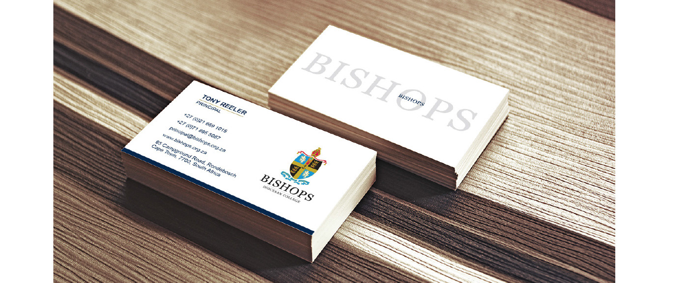
Below are a few of the other options that I also liked...