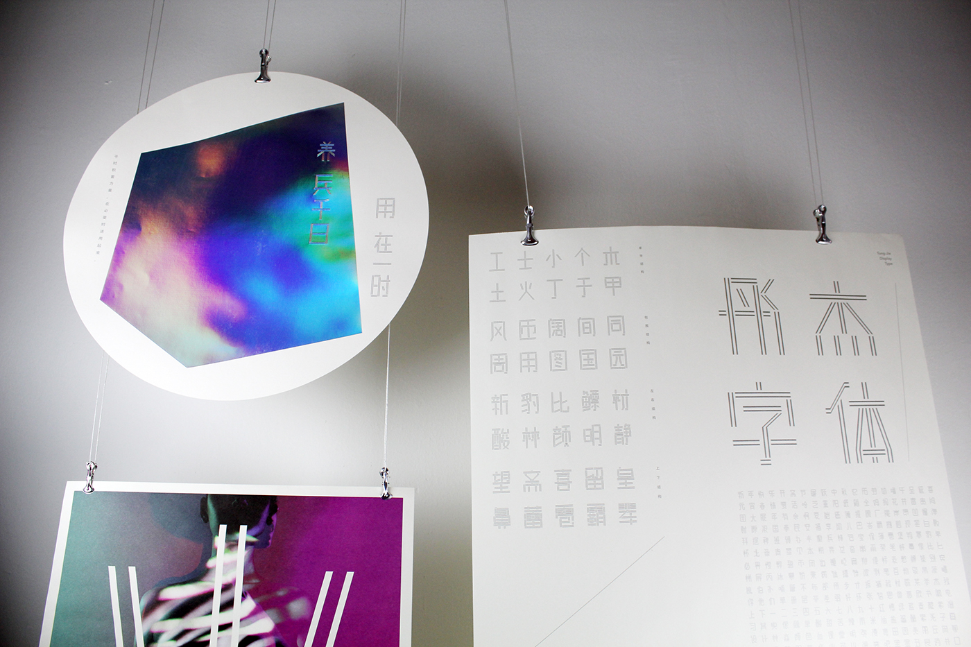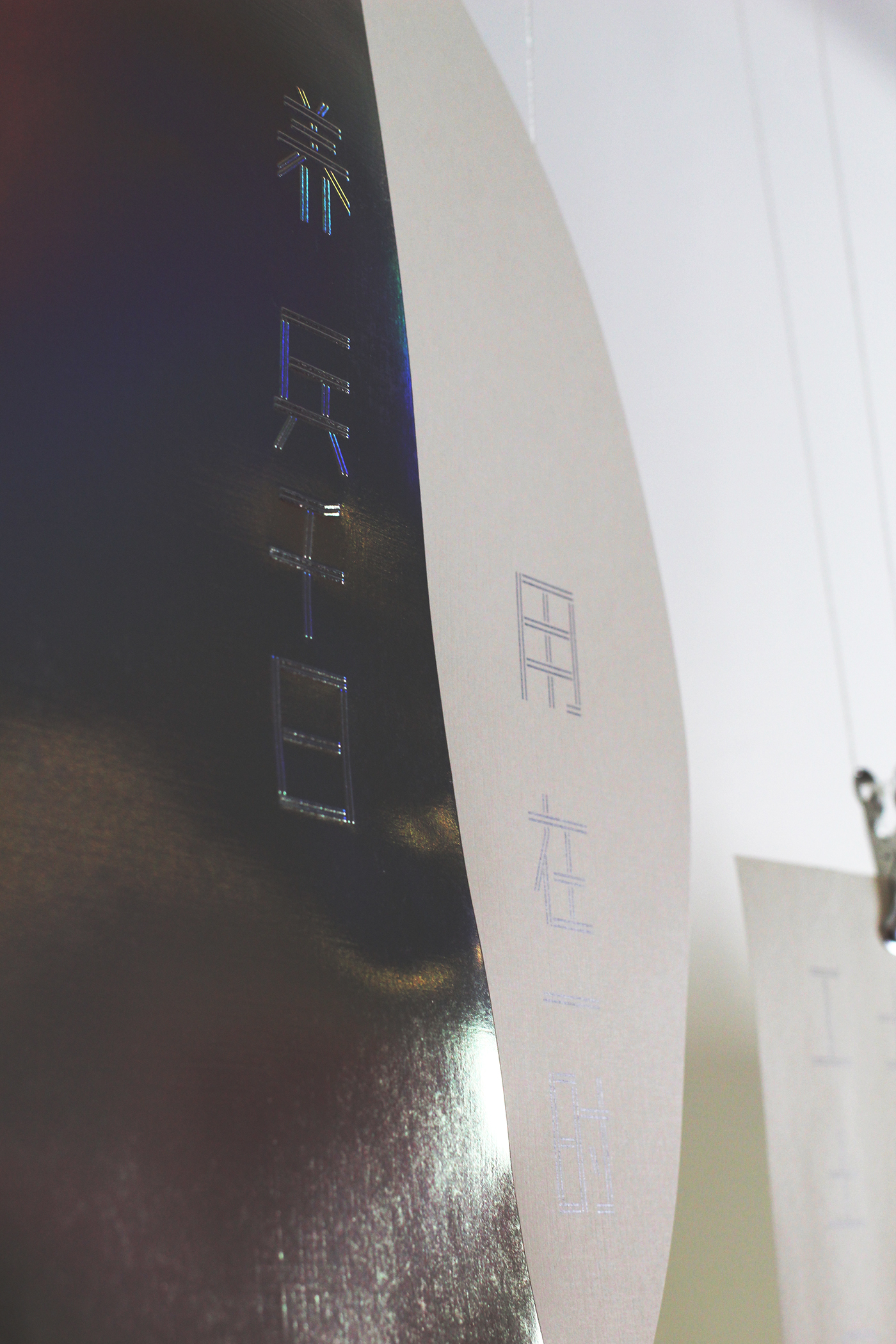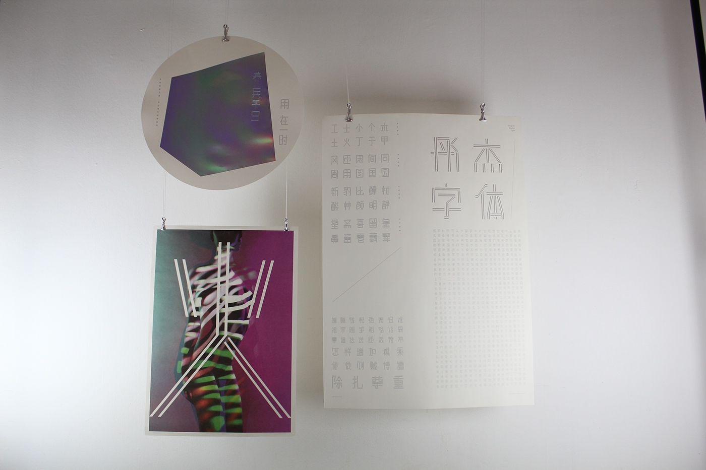
TONG - JIE TYPEFACE
双线汉字,古现交融
Double Line Word, Ancient Culture Blend With Modern Design.
双线汉字,古现交融
Double Line Word, Ancient Culture Blend With Modern Design.
-
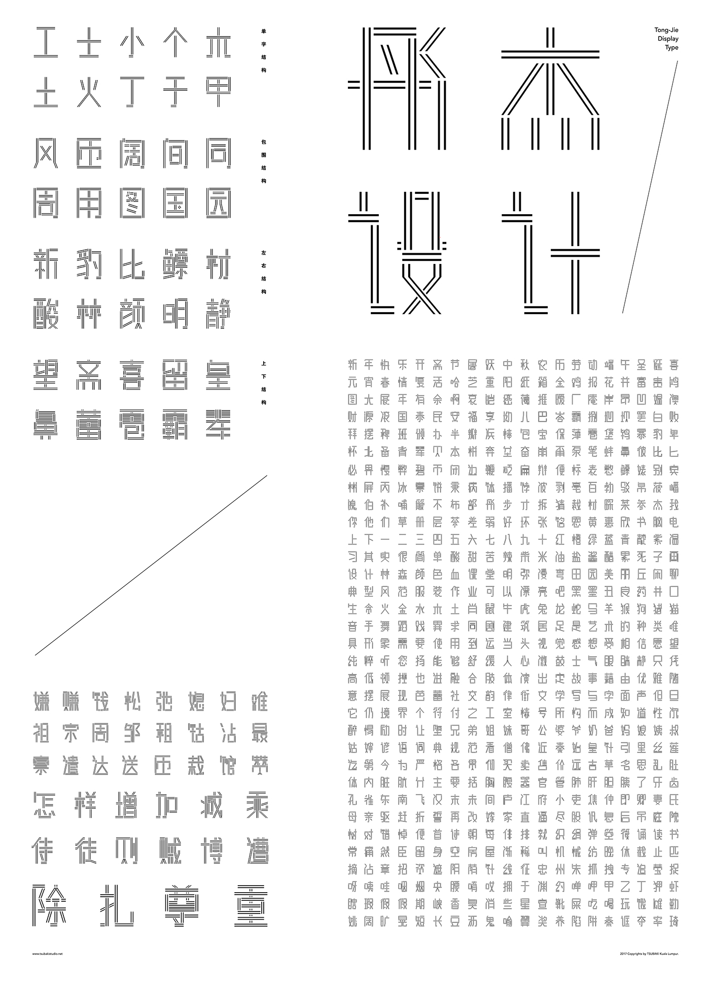
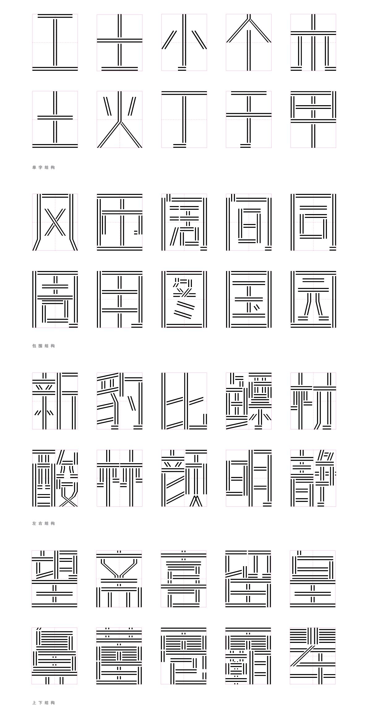
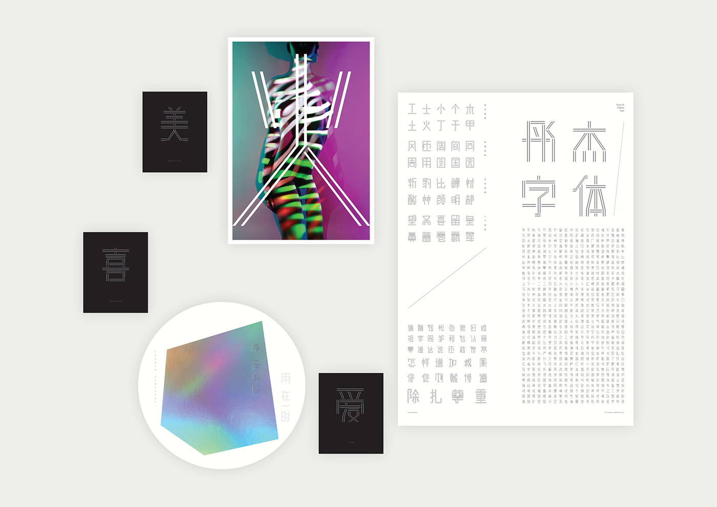
此设计,灵感来自于“五福拱寿”的纹样来创造现代的 “彤杰设计”。
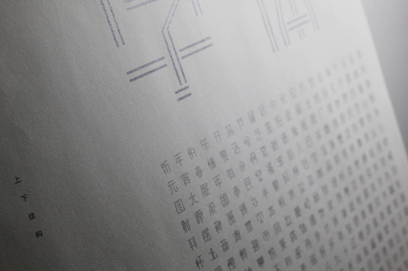
汉字的构形并非天马行空,而是有理可依、有理可析。
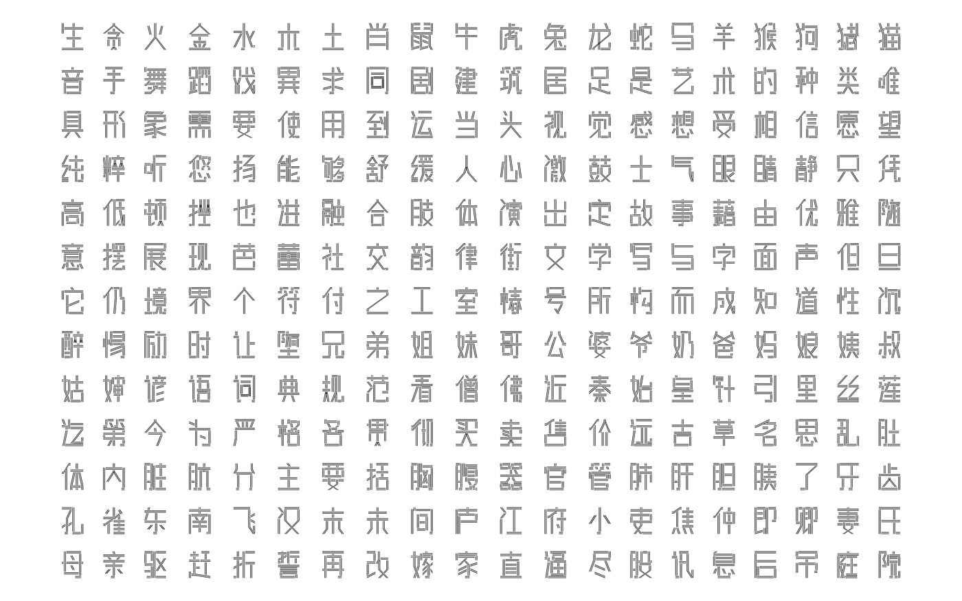
汉字原是方体字,为了让它更显平稳与大器,本设计采用双线来组构汉字的笔画。加之,文字落在方格之中,并以十字作为中心,搭建出许多灵动并精美的“文字建筑”。 透过整体的汉字设计,我们亦能感受到古代的文化,现代化的设计理念。
-
The modern typeface “Tong-Jie Typeface” was inspired by the “Longevity held up by the Five Blessings” pattern.
The configuration of the Chinese characters is based on reasonable and rational analysis. Chinese characters are square words. In order to make each character smooth and structured, the design adopts double lines as the Chinese character’s stroke.
In addition, the Chinese characters are put in columns and grids, to create various beautiful and vivid “type architecture” in a consistent manner.
We can feel the fusion of the ancient culture and modern design concept through this whole design of “Tong-Jie Design” typeface.
Design /
TSUBAKI KL
-
Silver Winner at Design For Asia Awards (DFA) 2017