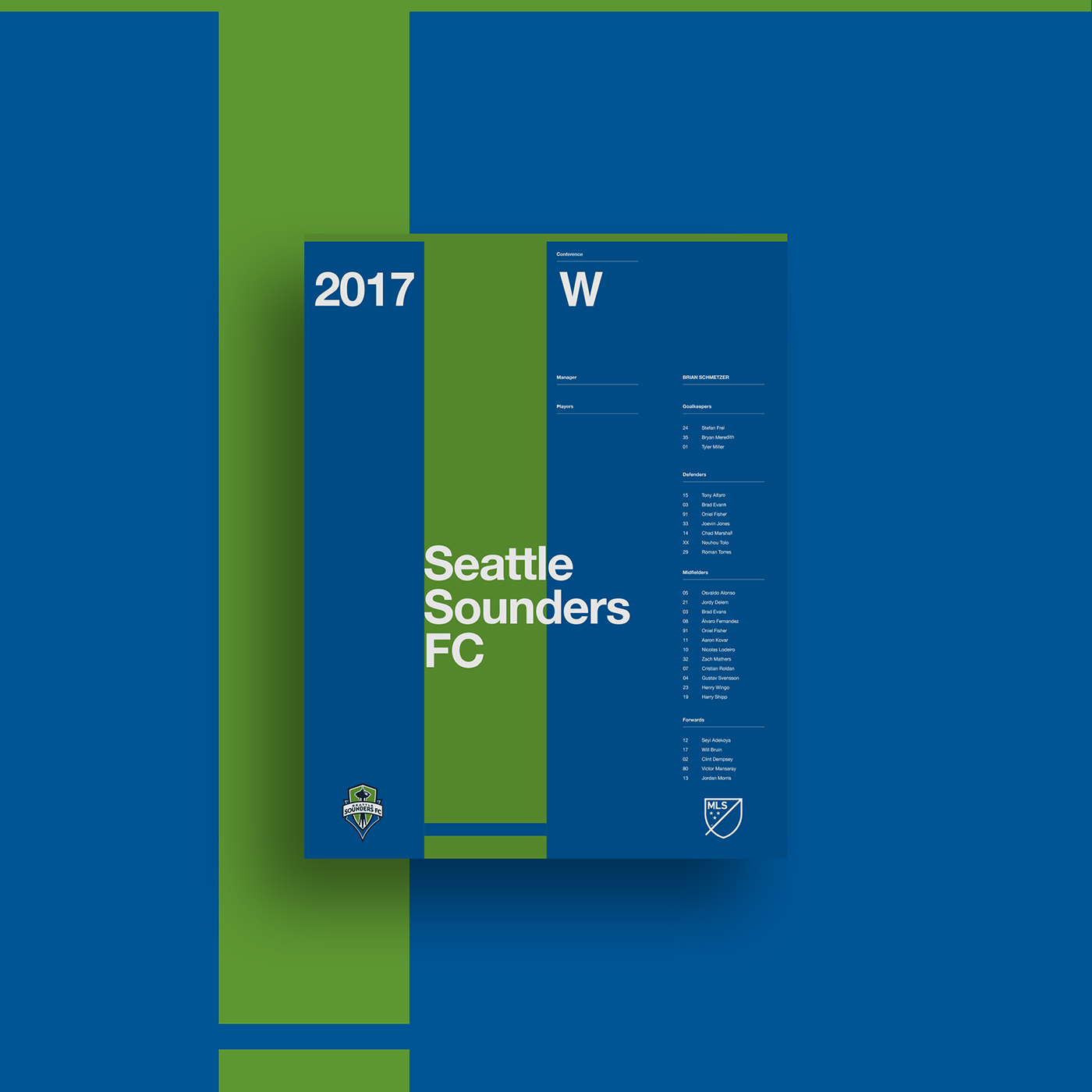
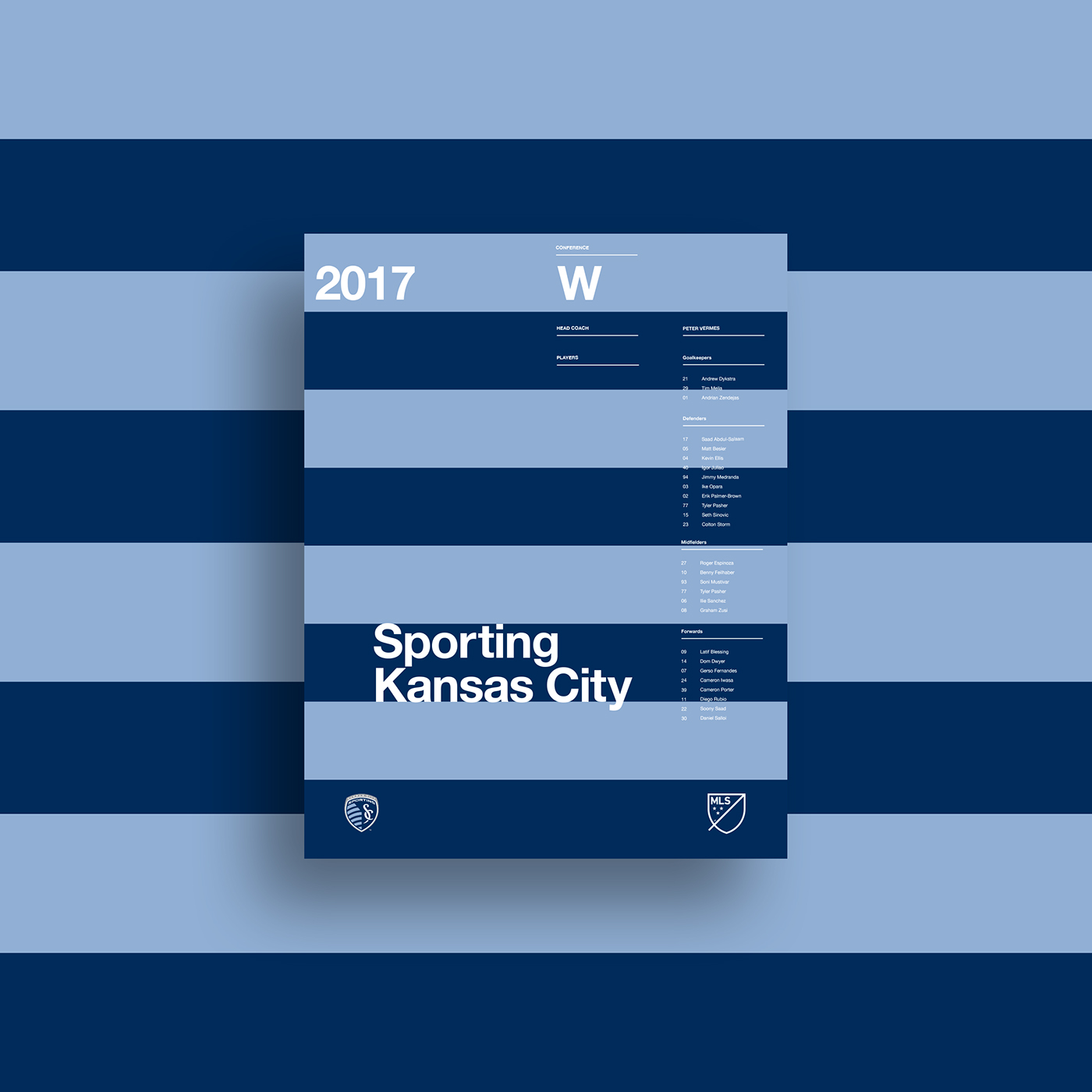
MLS Roster Posters
I grew up playing soccer for various club teams and through high school, all the while attending Seattle Sounders games while they were still part of the USL (United Soccer League). When they joined the MLS in 2007 my dad and I continued our season tickets with the new Seattle Sounders FC, and have maintained our support and partnership ever since. The Seattle Sounders have been a big part of my life since I was kid and continue to be a great bonding experience between my dad and I and a great community experience for Seattle residents.
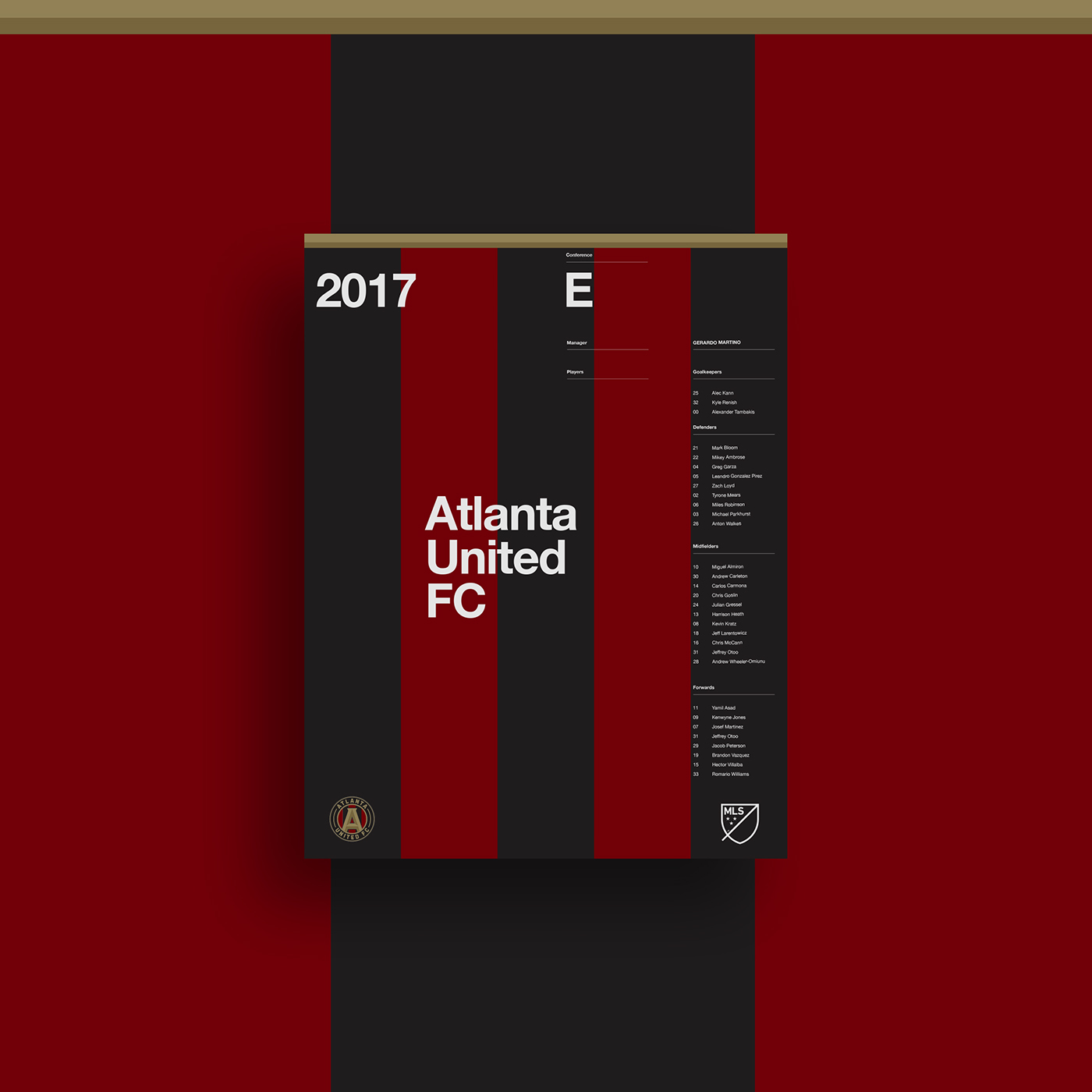
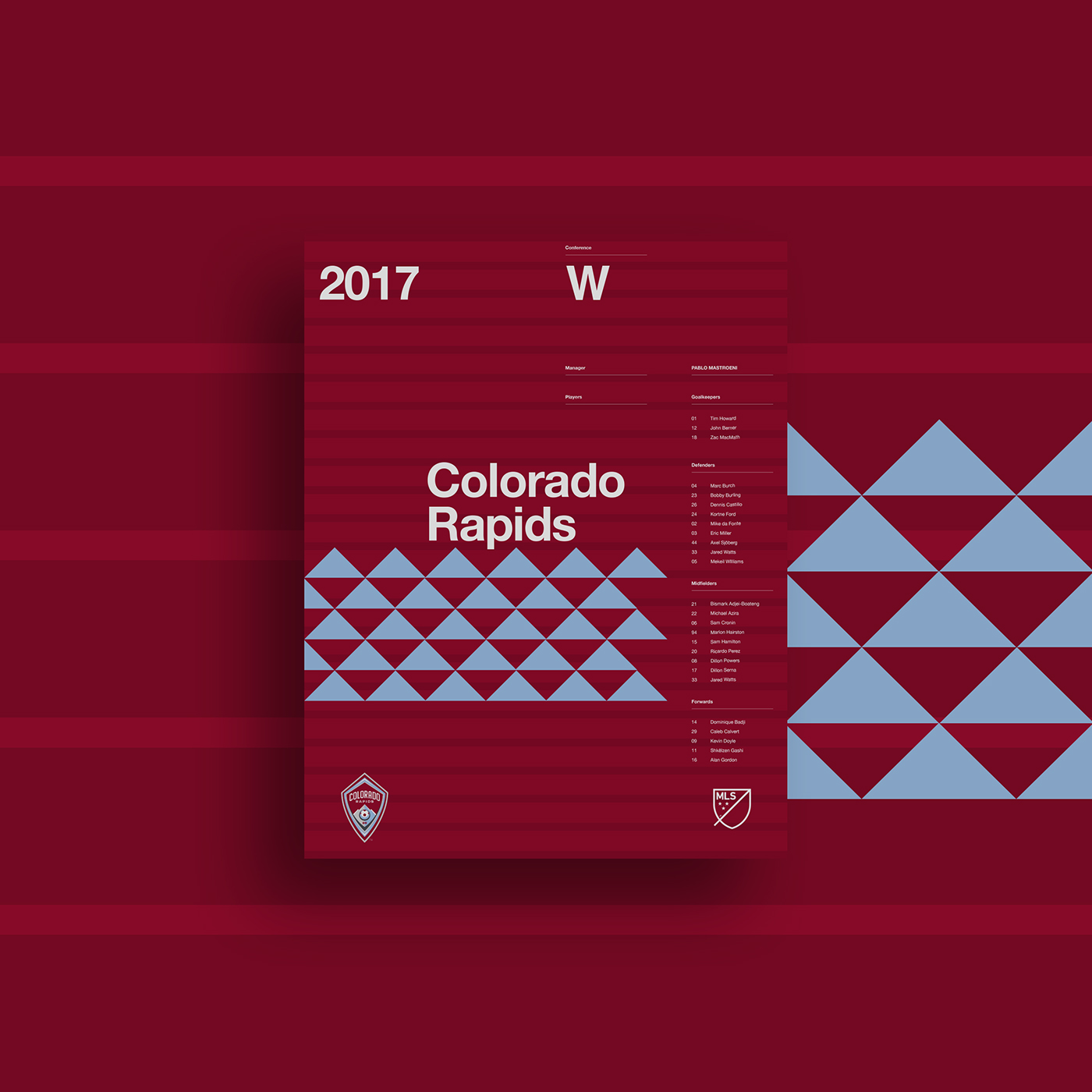
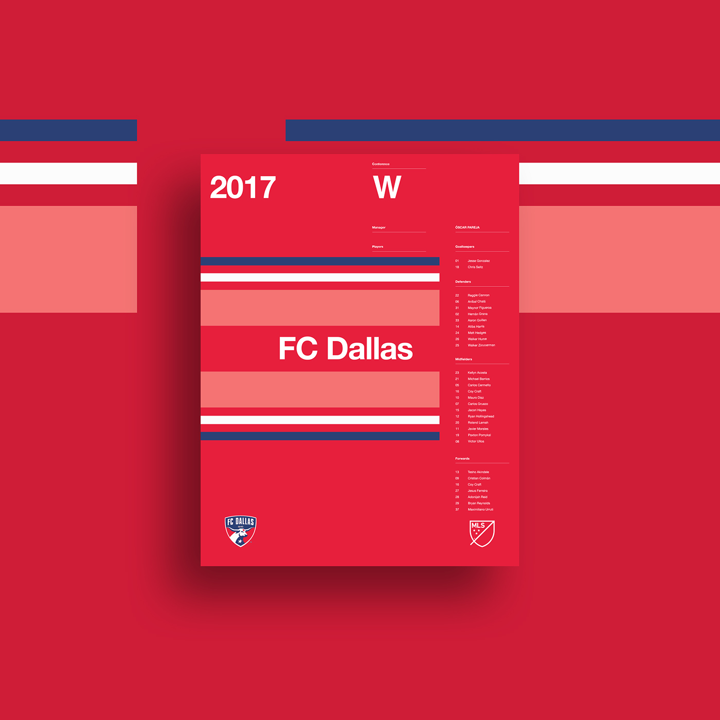
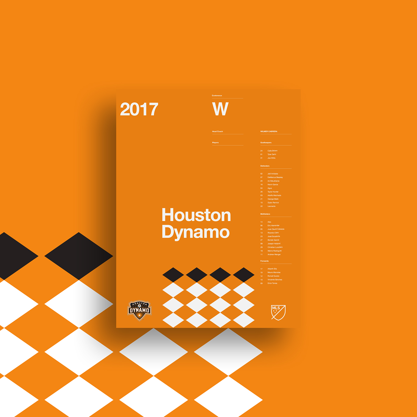
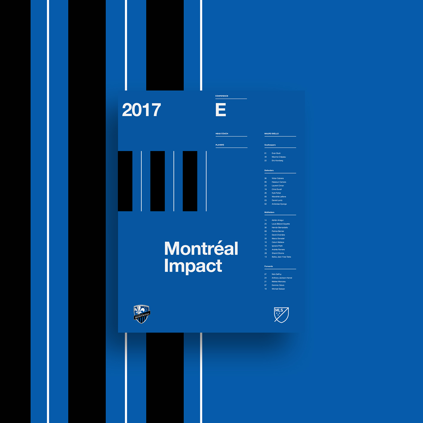
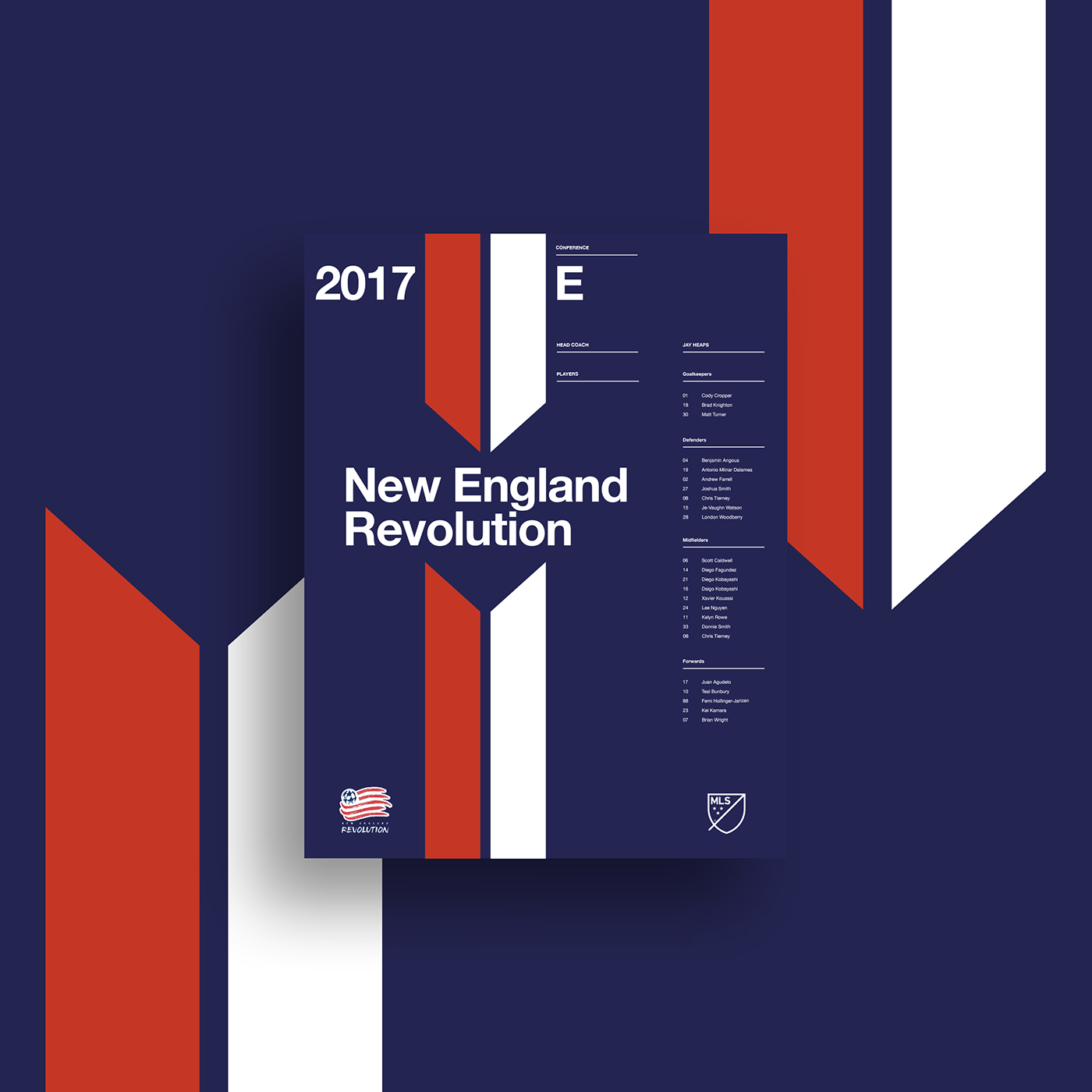
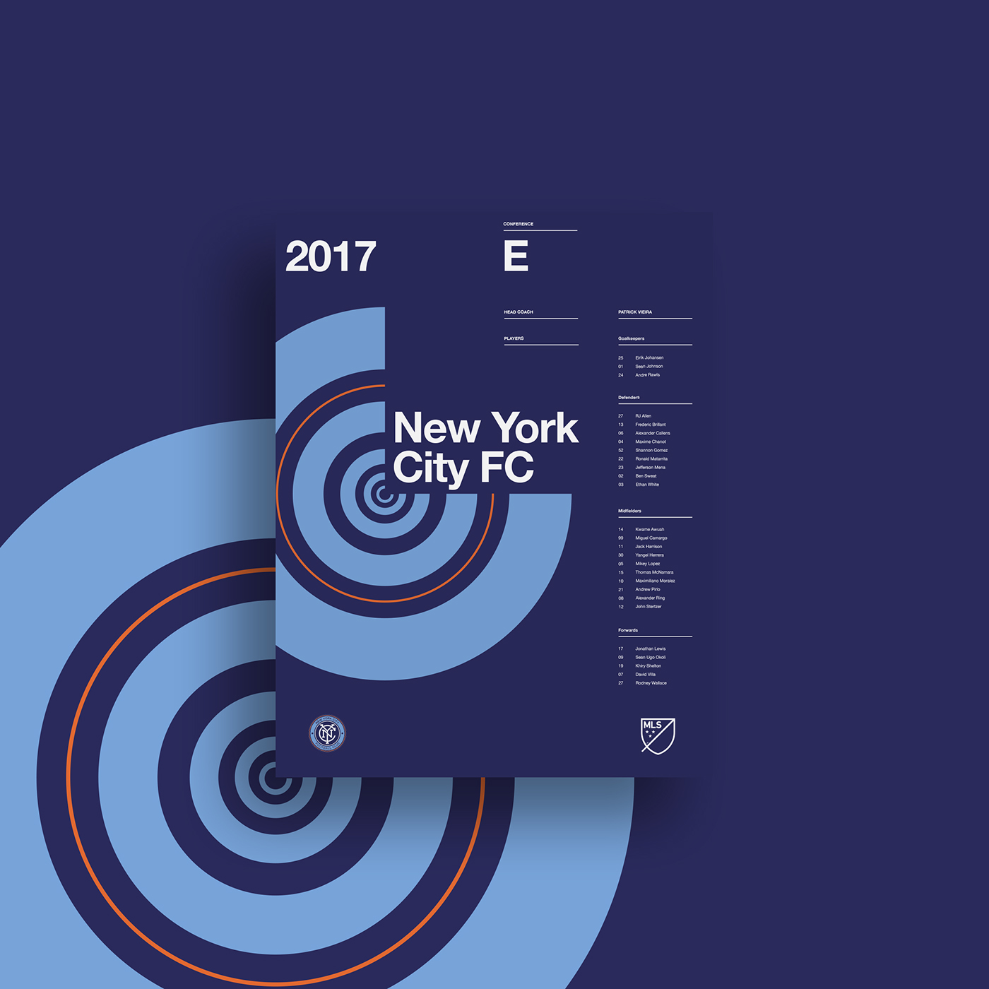
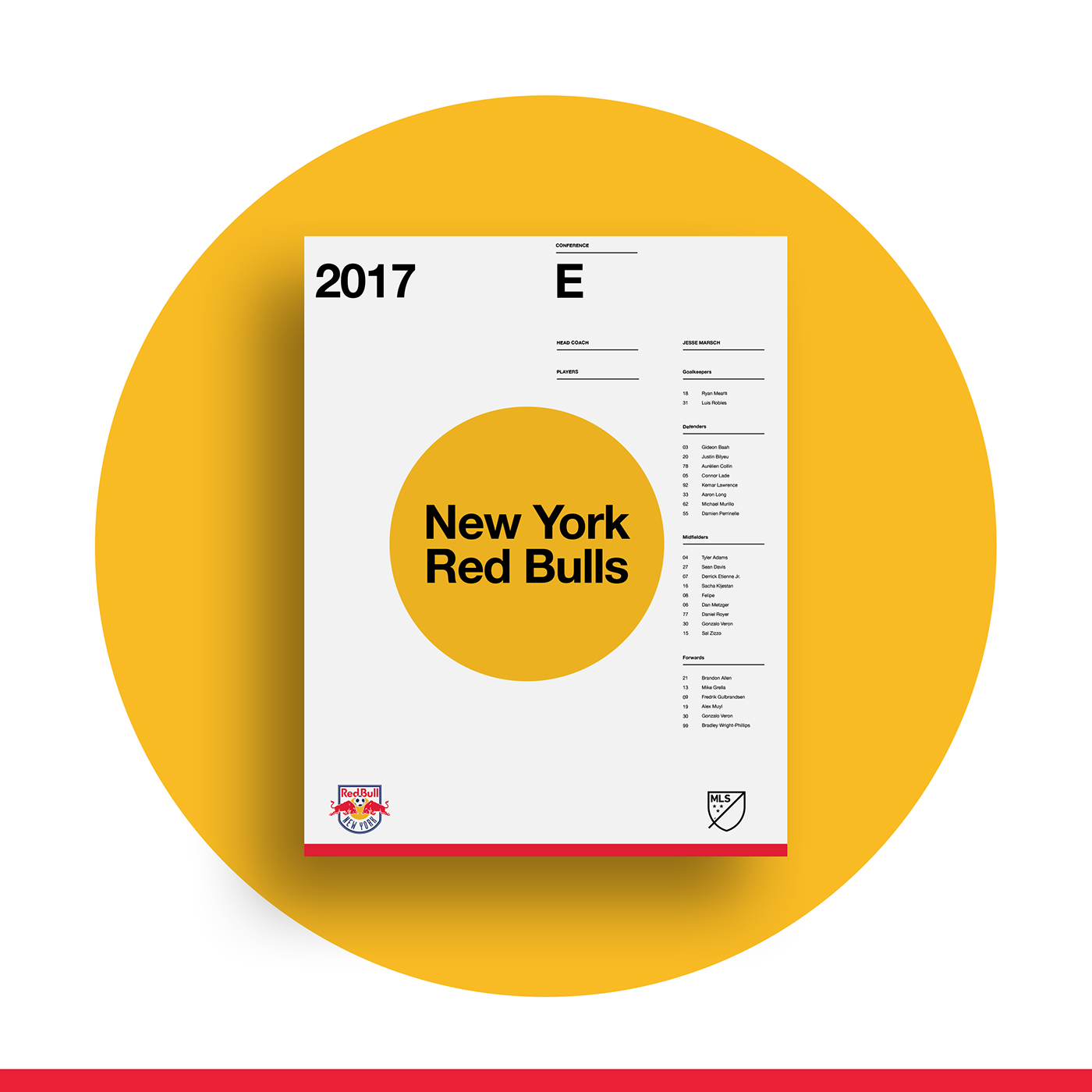
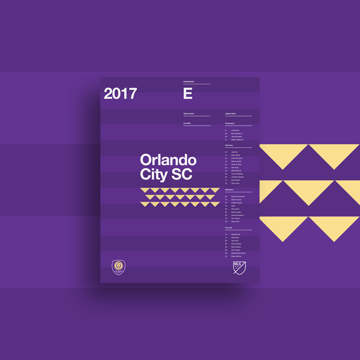
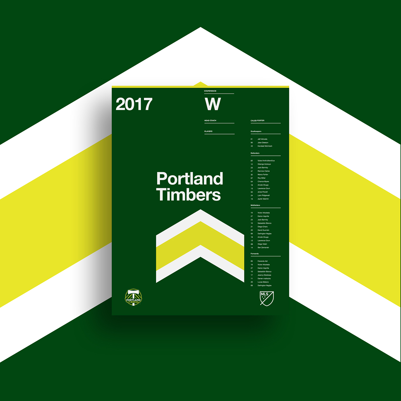
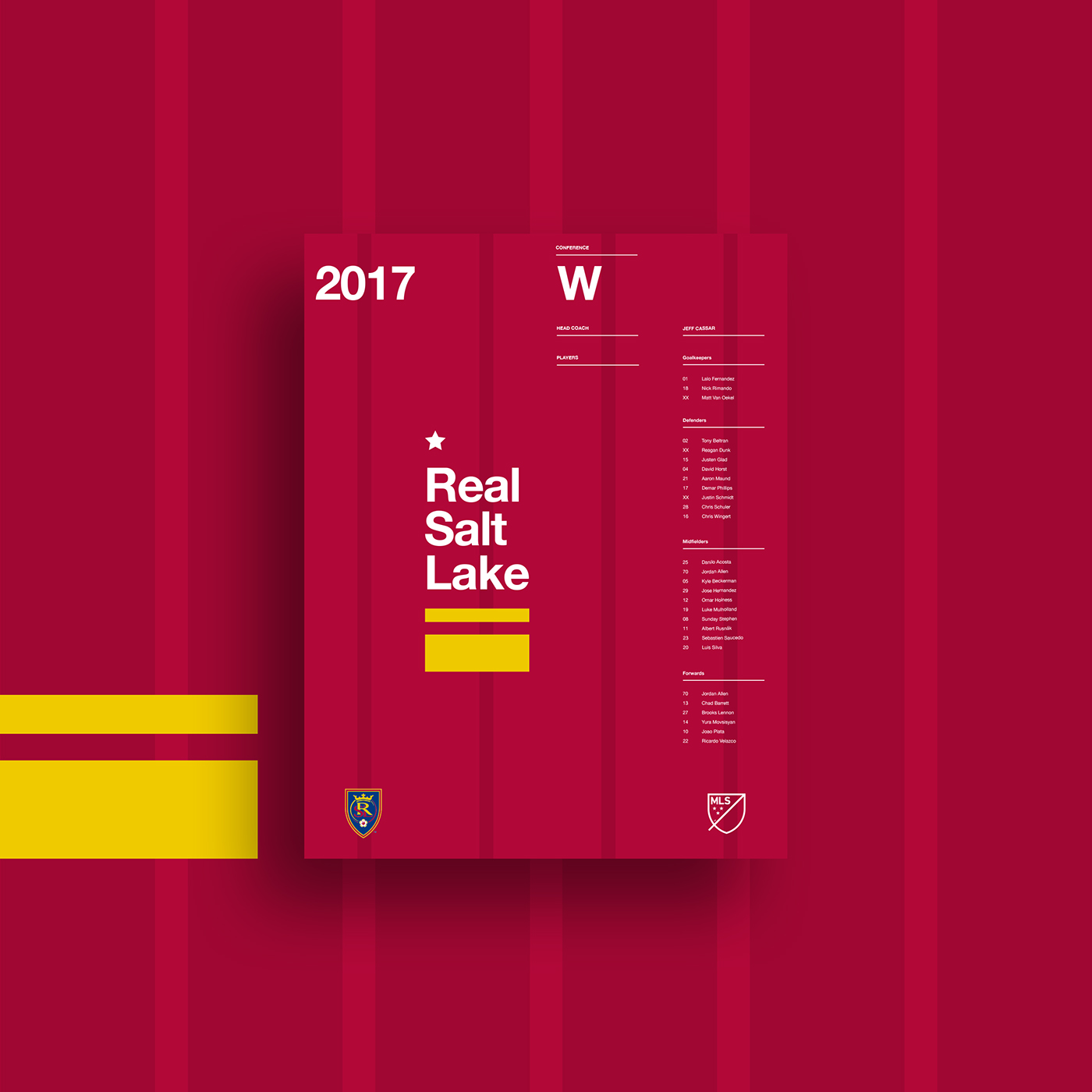
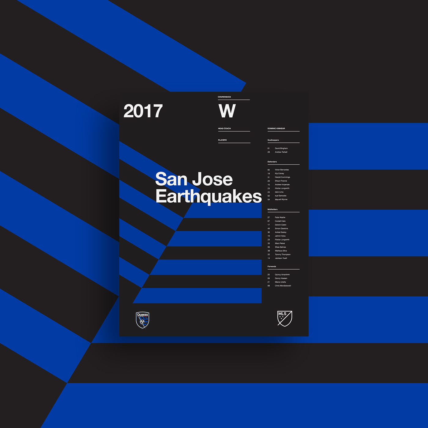
This passion for the MLS and how soccer in North America fits in with the international soccer community inspired me to design a series of posters for the 2017 season inspired by elements of Swiss graphic design and the International Typographic Style in collaboration with geometric elements present in respective team jerseys and branding.
The goal of these posters was to explore relating something primarily used for displaying content (like a sports team roster) to a tangible object (like a jersey). After attending many MLS and international soccer matches one thing that remains the same is the aesthetic personality of the sport. Most MLS teams tend to use a more rustic and distressed approach to their print materials in the area of text and graphical representation of their products, which more or less coincides with the often abrupt and “down-and-dirty” gameplay that makes up the MLS. However, what I’ve noticed from high-ranking international teams is that those that employ a cleaner and more refined approach to branding stand with a more professional hierarchy than those that chose the former.
This was an overall attempt to standardize a simple layout and typographical representation of the player rosters for each team in the MLS with an approach that emphasizes clean layout and elimination of the flashy elements that proliferate design in numerous MLS programs.
From a personal perspective I wanted an opportunity to experiment with a style that I was not very familiar with, and to also obtain a deeper understanding of grid theory. As part of this project I researched extensively grid systems and the work of Josef Müller-Brockmann including his publication “Grid Systems in Graphic Design”, as well as the work of Paul Rand, Adrian Frutiger, Massimo Vignelli, and Emil Ruder.
**This project was inspired (heavily!) by Studio JQ's work here.