Space & Identity | Durstone stand design for Cevisama 2017
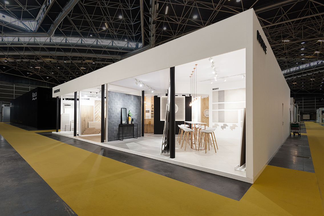
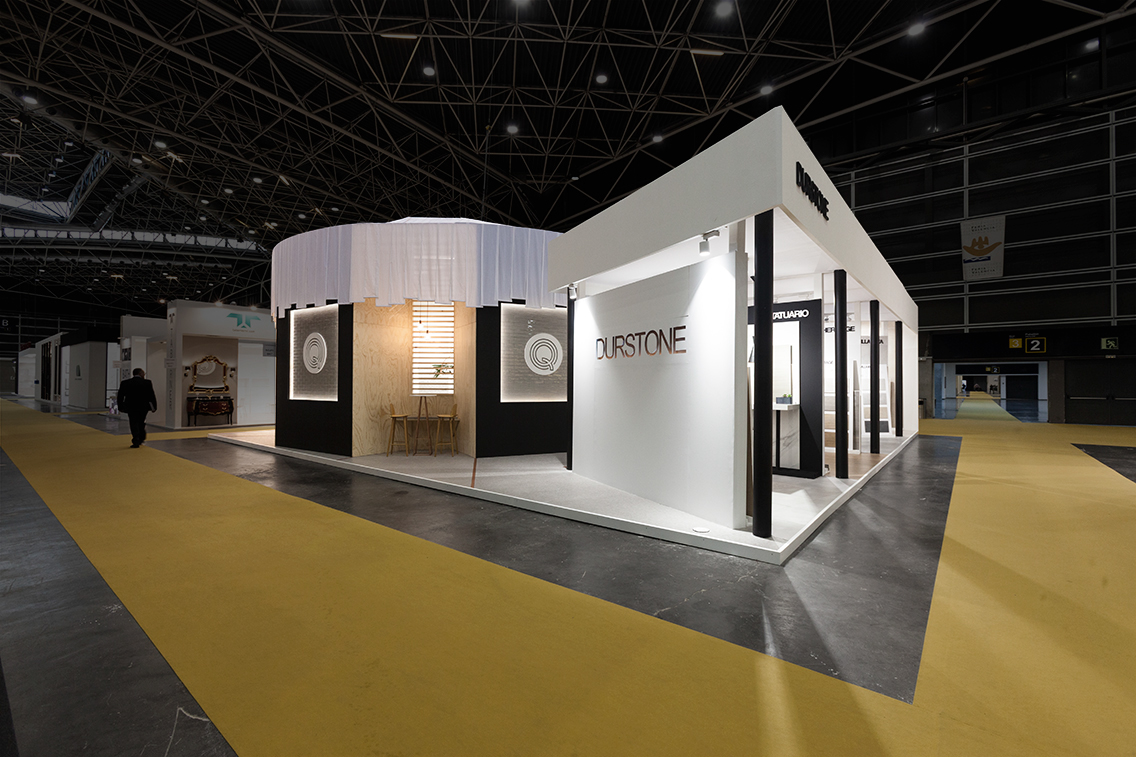
This year, Durstone's stand at Cevisama 2017 was a big challenge for our team. The aim was to create a stand that played with private and open spaces and, at the same time, unified the two unique identities of Durstone and Q.
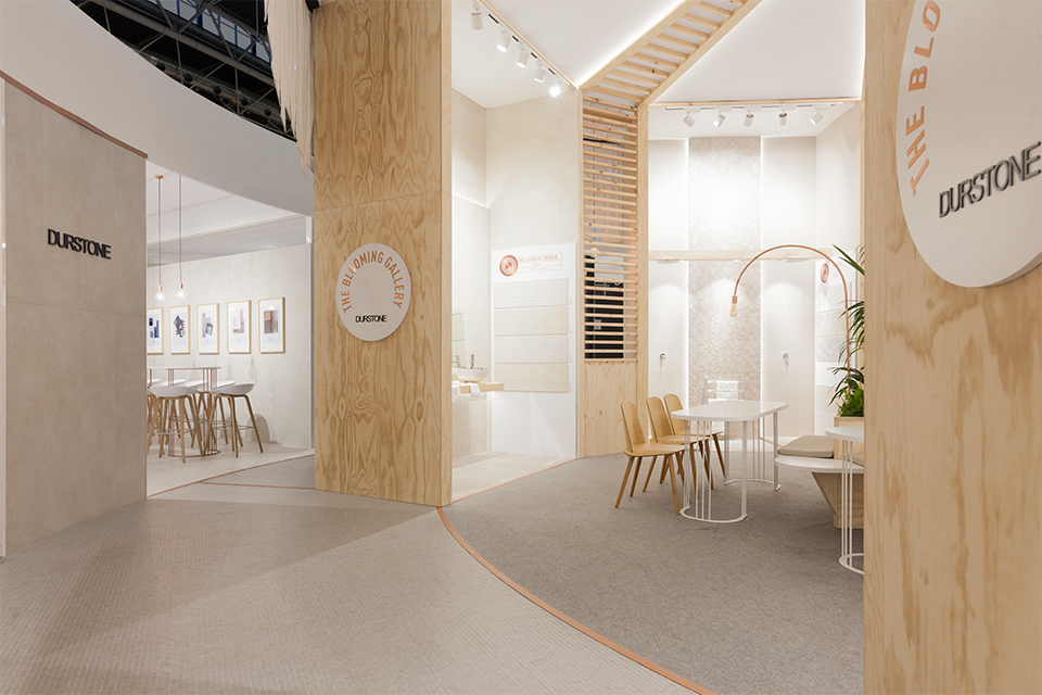
The concept of "the Blooming Gallery" reappears and it's reinvented on this fair. A rounded house closes the space dedicated to wall tiles and represents the young and eclectic vibes of Q. Three bare materials decorate the space, define the colour palette and the new elegance of the brand: pine, fabric and copper. Inside, a radial design it's reflected from the ceiling to the floors. A meeting space surrounding a planter on the center and on the walls, scenes decorating the latest product additions for Q.
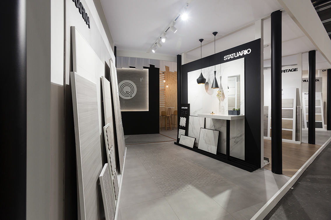
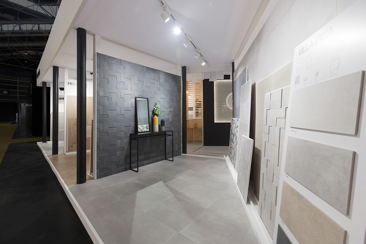
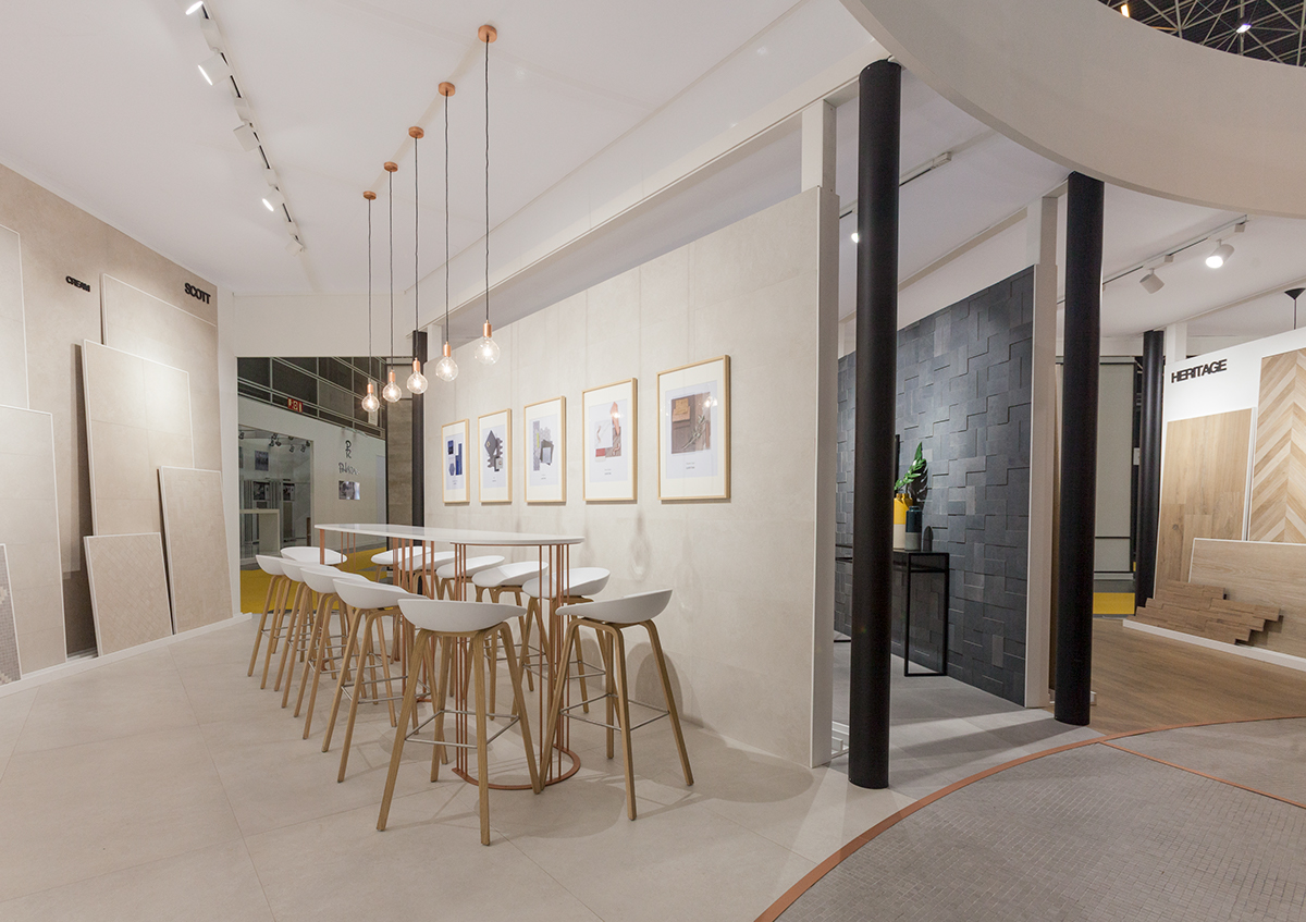
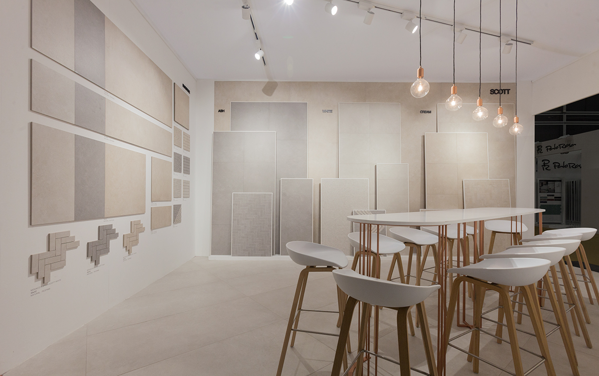
The Durstone floor tiles area however is an open space easily accessible from outside. You can get a flimpse of their latest collections from the corridors and enter the space. Mostly white and clean, slight touches of black elements such as columns create the contrast that is so minimalistic and characteristic of the brand.