


Under – Brand identity


WHAT? Under also means wonder/miracle in Swedish and we wanted to get through a bit of a divine feeling in the branding/logo. You know that moment after weeks of hard work and you start to doubt yourself, and then – suddenly, you have an epiphany and you see the perfect solution appear in a bright light before your eyes.
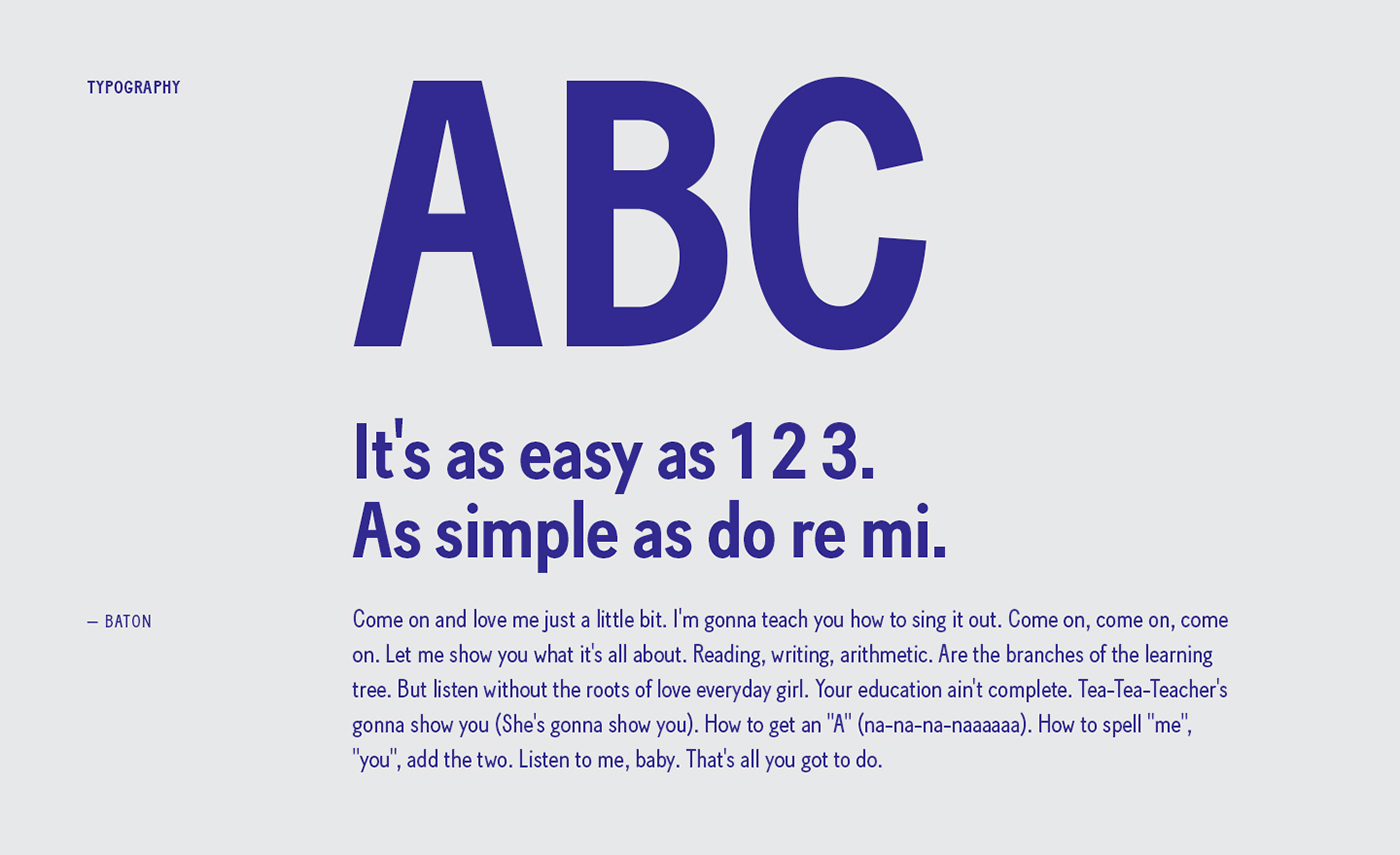
HOW? Simple but bold. Playful but professional. That was the starting point for our identity. We believe in simple solutions with a lot of POW! So that was just the way we did our own brand.
For the simplicity part we started with a light grey colour that binds together the identity with the logo or symbol embossed depending on application. We did a flexible folder solution that can be used in a variety of different ways.
For the POW! part we used a vibrant blue colour that carries a lot of punch but still has a warmth to it. The business cards are made of duplexed 270 g Arjowiggins Curious Matter Adiron Blue paper, with the front in white foil and the logo on the back in transparent glossy foil, all for that extraordinary tactile feel.
And while we where at it, we made some wall art for the office as well.


