

Evias — Evias has developed an eco-system to charge Electric Vehicles, wherever they are, without stopping for charging.
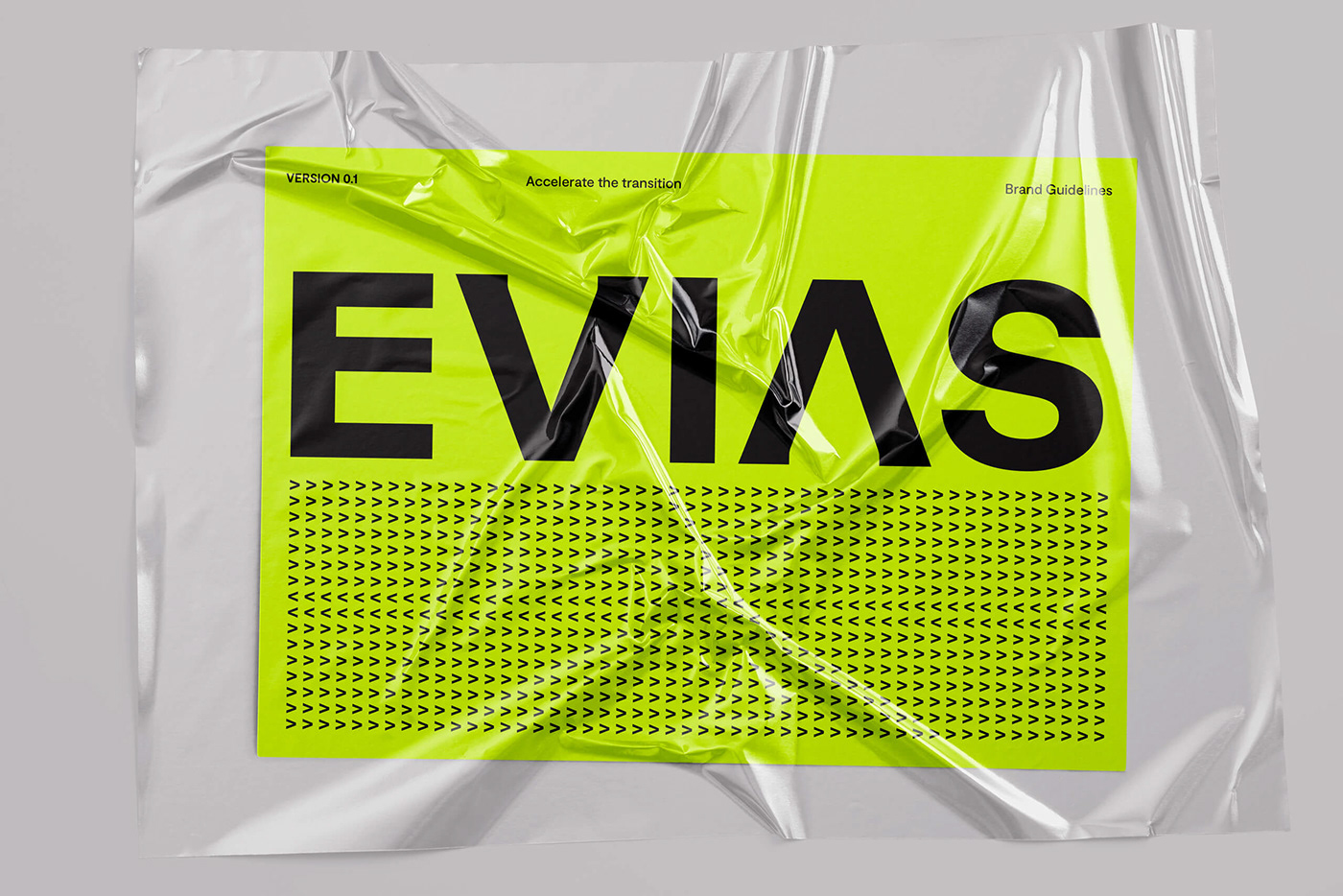
Evias is at the forefront of the electrical roads industry and we wanted to transfer that energy into the brand. To begin with, we created a solid and stable logo. The V and A were reduced to two mirrored and characteristic arrows that can represent the directions of both the road and the electricity, as well as the energy that flows through the rails and that drives the vehicles forward. We wanted the energy to literally flow through the brand. An electric yellow-green color permeates the graphic identity.


In addition, we developed an illustration/animation style for technical explanations, which is a modern interpretation of architectural drawings, as well as a icon concept where we kept some of the feeling from the illustration but in a simpler and bolder style.


When you place the two arrows from the logo mirrored vertically, an abstract E is created which is also Evias symbol.


