Sahlins Brygghus – Brand identity & beer packaging


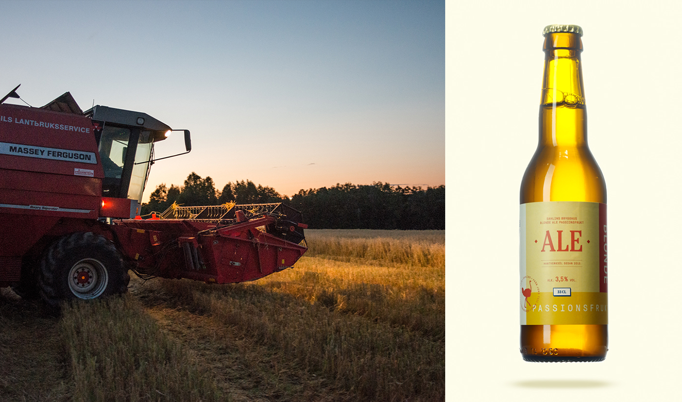
WHAT? Sahlins is a family owned farm in Sweden. The family breeds ostriches and tend to their fields. The farm has been in operation since 1979, and in 2015 they added a craft brewery – Sahlins Brygghus. The Swedish craft brewery scene has exploded during the past years and is fiercely competitive. A common denominator among craft breweries is their target audience: The male beer geek. Generally they employ a masculine visual language. Sahlins Brygghus wanted to create high quality beer with pure flavors aimed at a gender neutral audience.
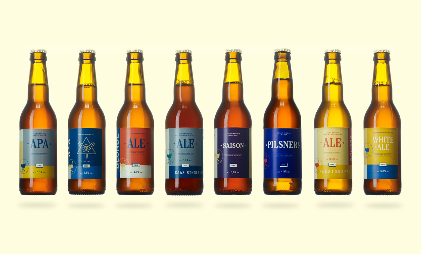
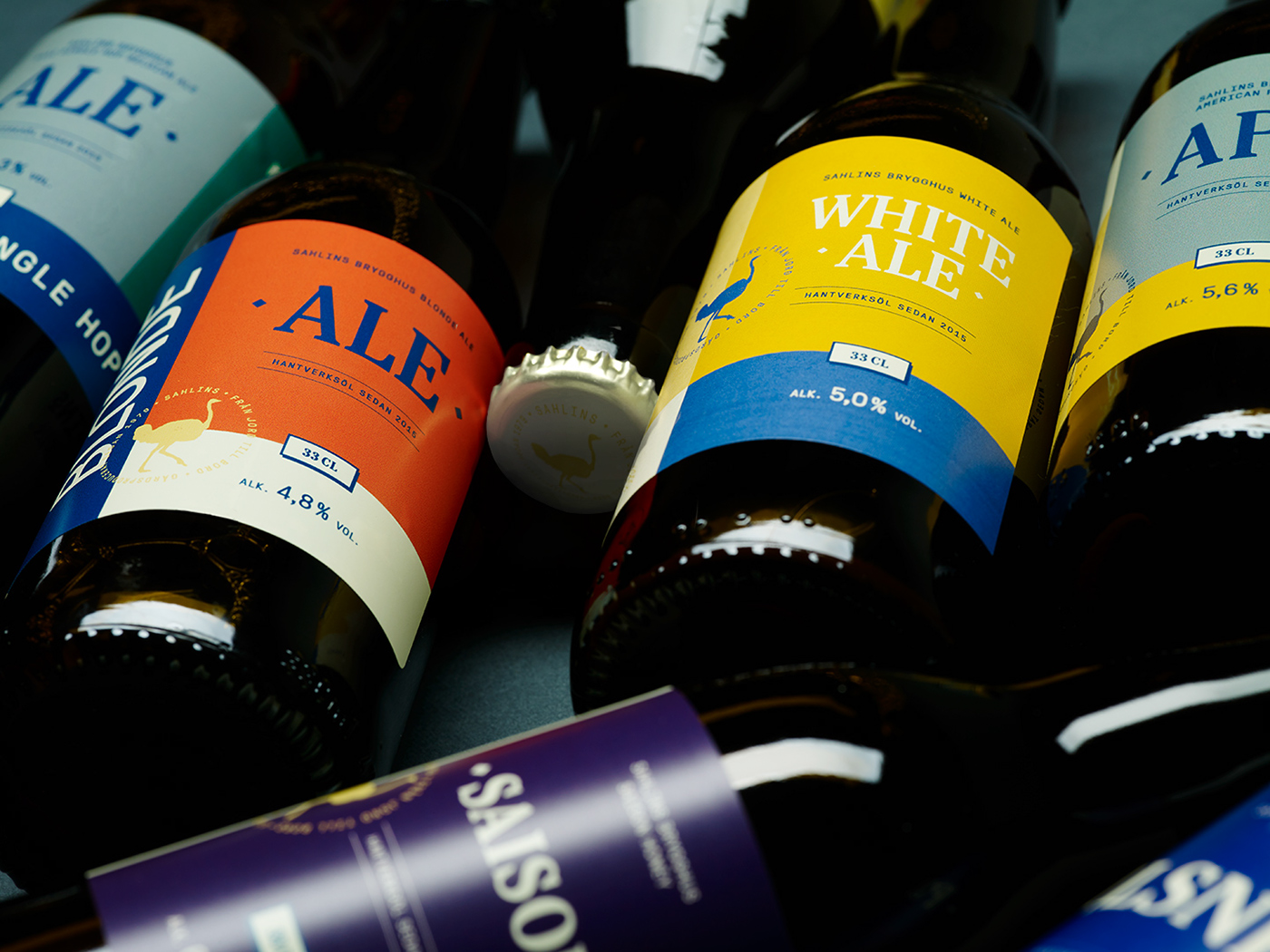
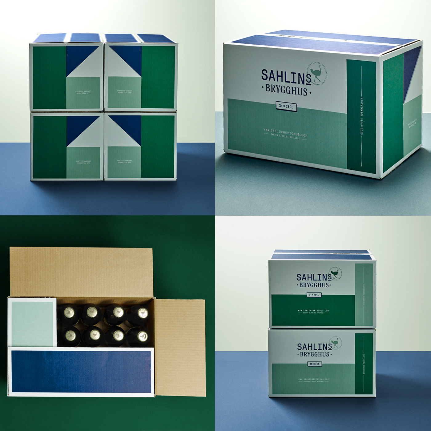
HOW? Inspired by a birds-eye view of the fields surrounding the farm and their unique patchwork we created a simple grid of squares that allows for ever-changing variation. The squares and grids used on the labels stand out on the shelf, creating a strong brand recognition. Using a simple and inviting visual language they are also easily recognizable. By calling on the heritage and tradition of Sahlins they appeal to a wide audience without being too retro.Stacked next to each other the grid based labels interlock, creating a stunning visual effect.


