

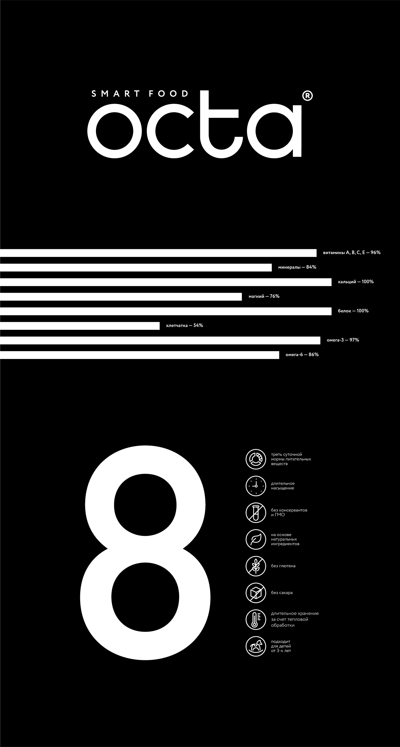
Octa — a functional drink with a new take on everyday food. One portion of Octa contains one third of recommended daily allowance of nutritional agents, vitamins and minerals and can easily substitute a proper meal. Natural protein and farmer milk lay at the very core of Octa.
The idea of “ingredients in sight” and infographics formed the basis for graphical language. Main nutrients of the product are located on the front side of the package, and are clearly indicated together with elements ratio through graphic elements. Colour coding was assigned to various flavours. Visible through elements’ names the drink serves as a colour itself. As the fluid level in the bottle goes gradually away the elements visibility also fades away and so an interaction with the product through contact takes place. Transparent elements solve several tasks at once: show the product, support differentiation and create interactivity.
Simple and clear solution is combined with the “Smart Food” descriptor, as well as the “Food of the Future” slogan.


© INSIGHT AGENCY
Art direction: Lidiya Kapysh, Irina Kosheleva
Design: Irina Kosheleva
Strategy: Nikita Podlipskiy
Project management: Janna Gitelson


