The visual identity
of the Warsaw University
of Technology
Logo
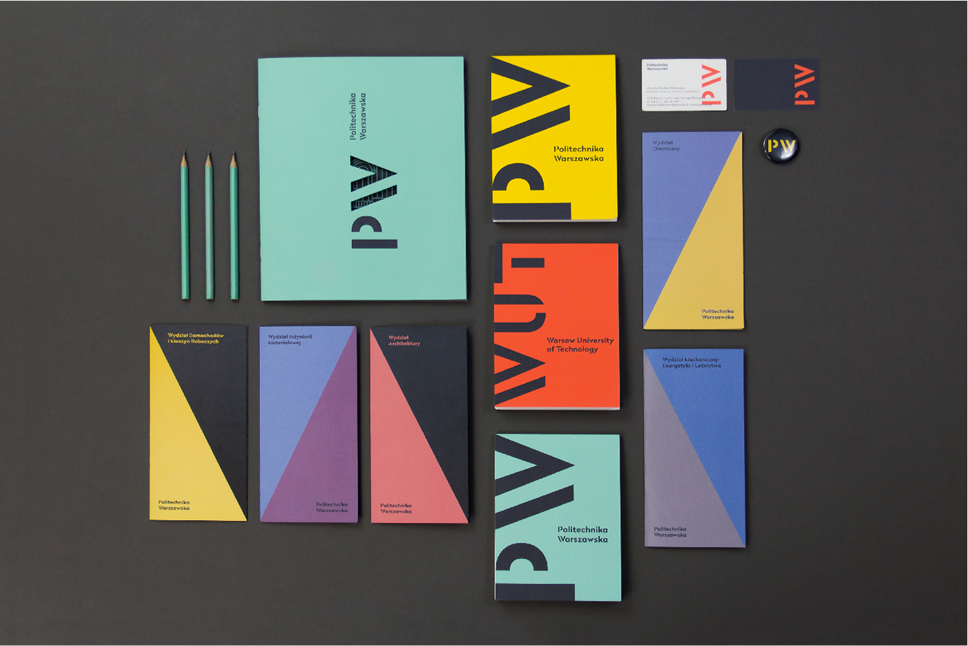
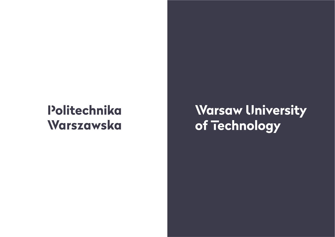
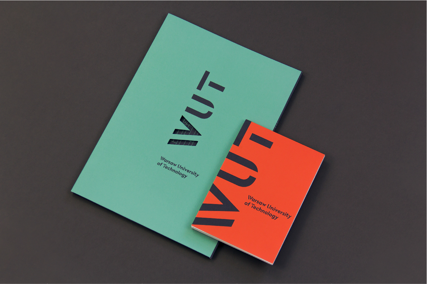
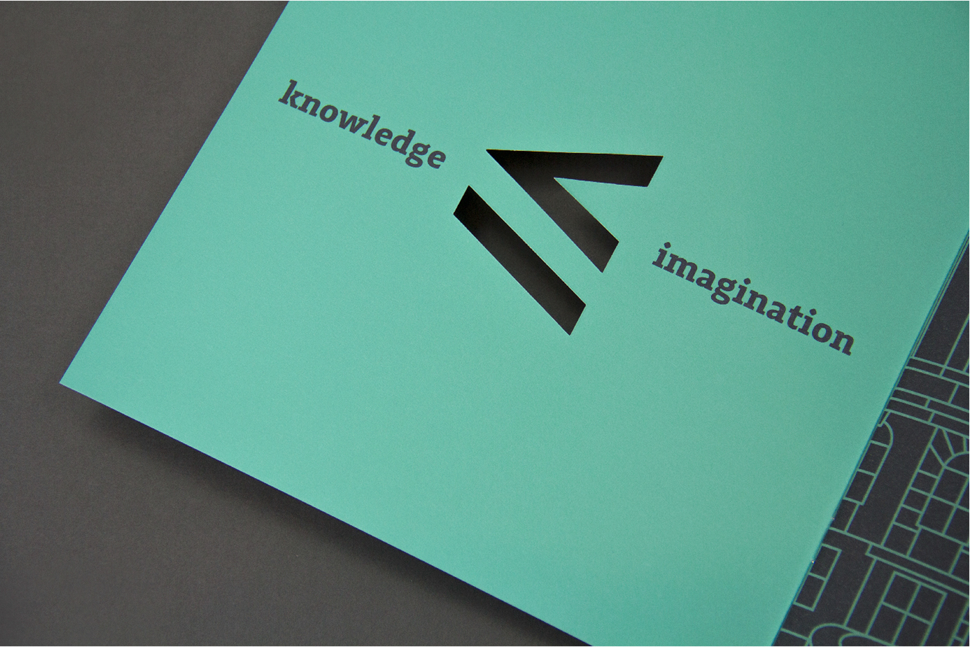
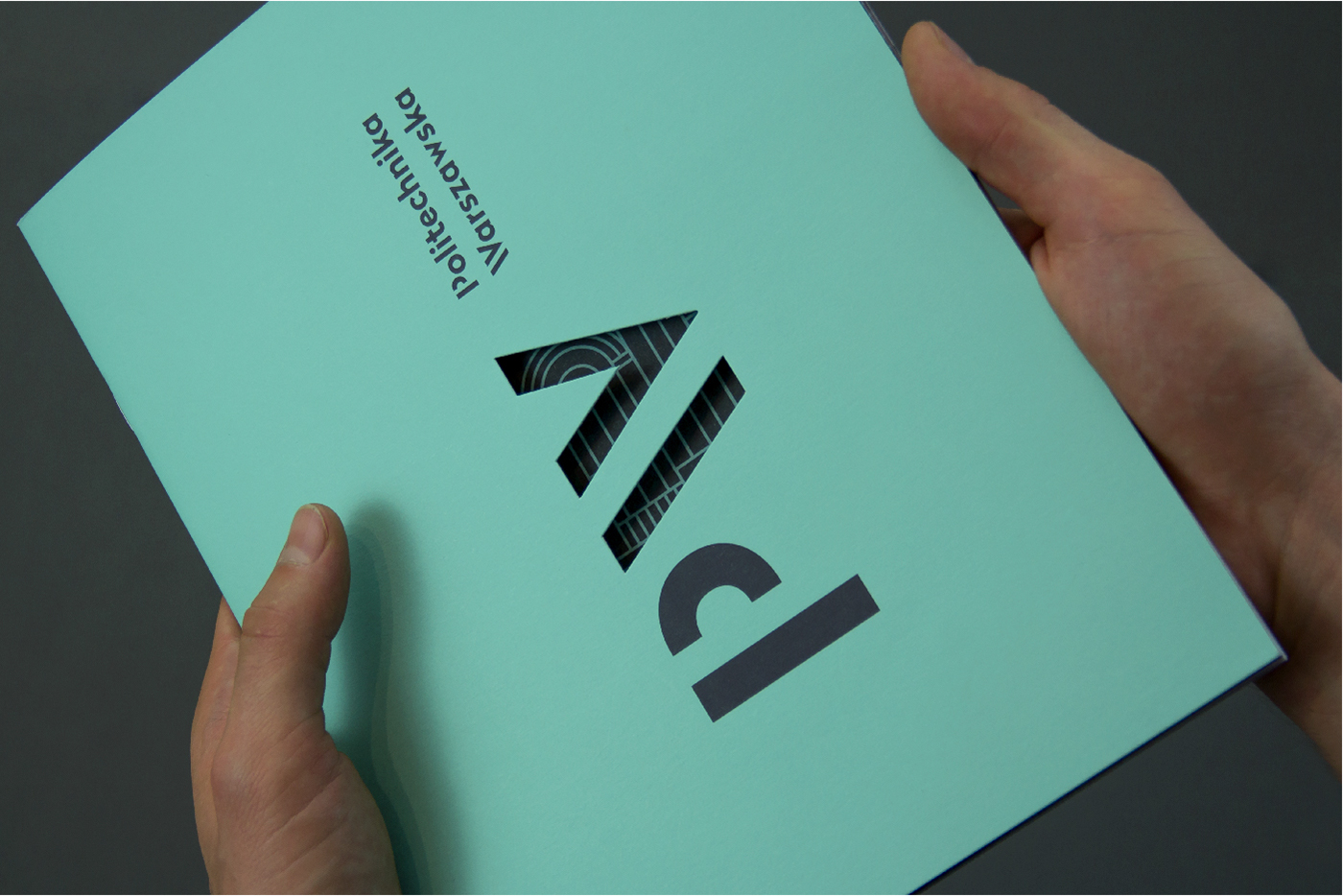
The new logo of the Warsaw University of Technology is based on typography. The idea—transforming the “W” into “≥” underlines the scientific character of the school but also reflects its position as one of the best universities in Poland.
Monogram
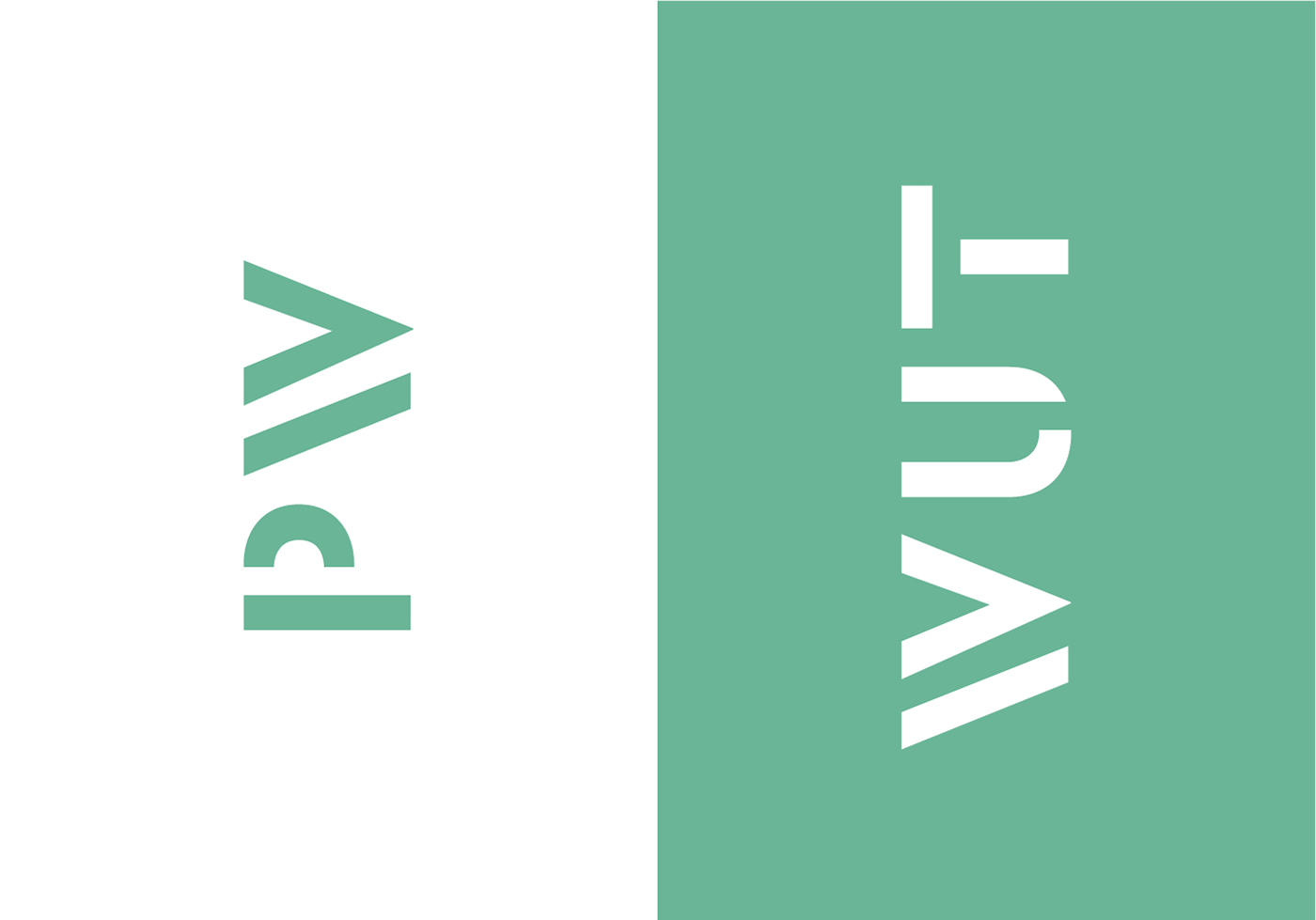
The “PW” or “WUT” symbol, when rotated by 90 degrees, becomes part of the school’s motto “imagination is greater(/equal) than knowledge”. Within the scope of the identity other symbols have also been created to express WUT values in a visual, consistent way.

Typography
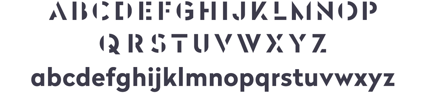
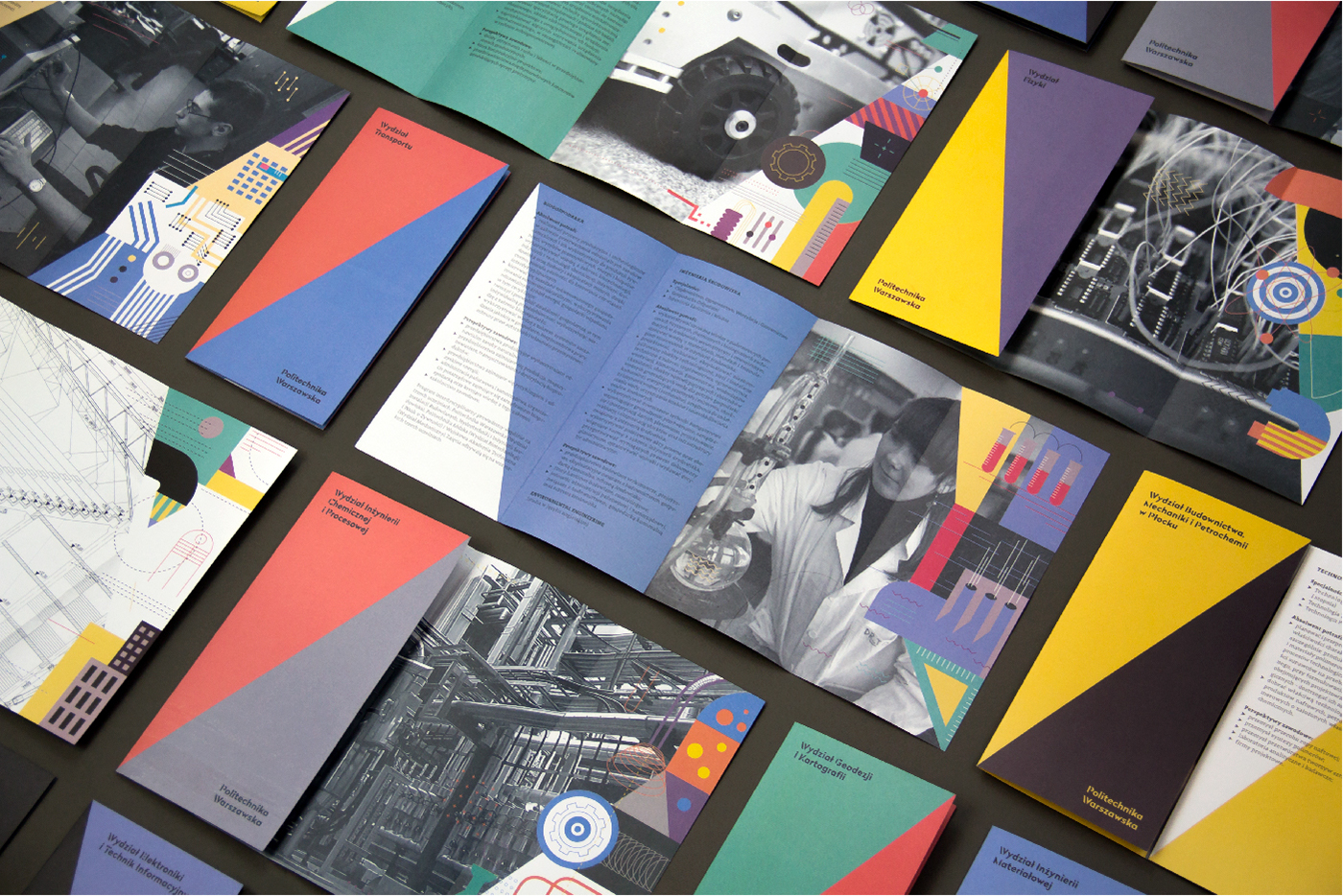
A custom typeface has been created in cooperation with Nico Inosanto of Nootype to serve as the basis for the lock-up and the Faculty names. The typeface Radikal WUT, with its distinctive stencil capitals and numerals, creates a unique visual system.
Adagio Slab (Mateusz Machalski), a versatile and legible typeface with a wide range of weights serves as the official font of the University. Thanks to it’s modern cut and slab serifs it achieves an ideal balance between style and functionality.

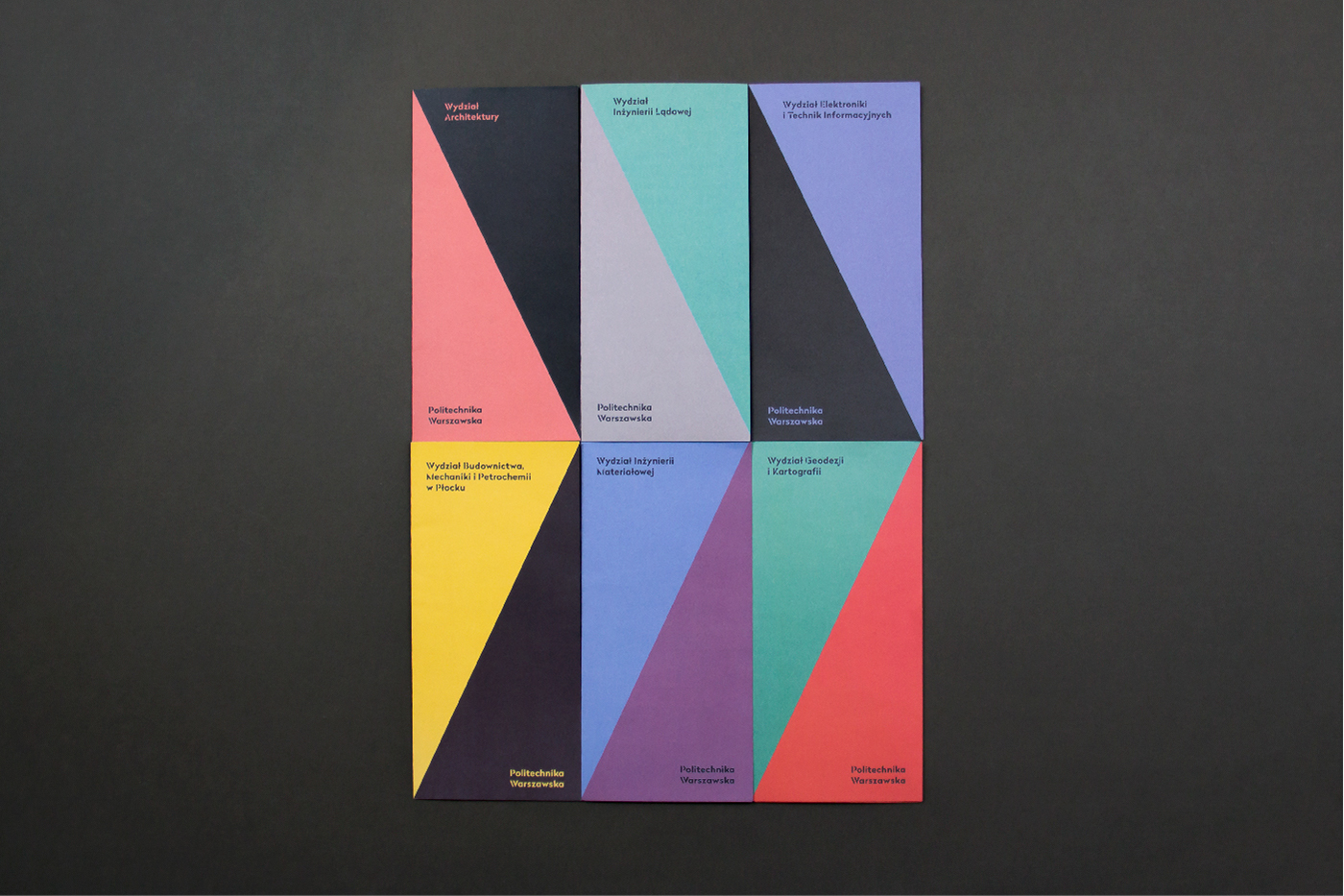

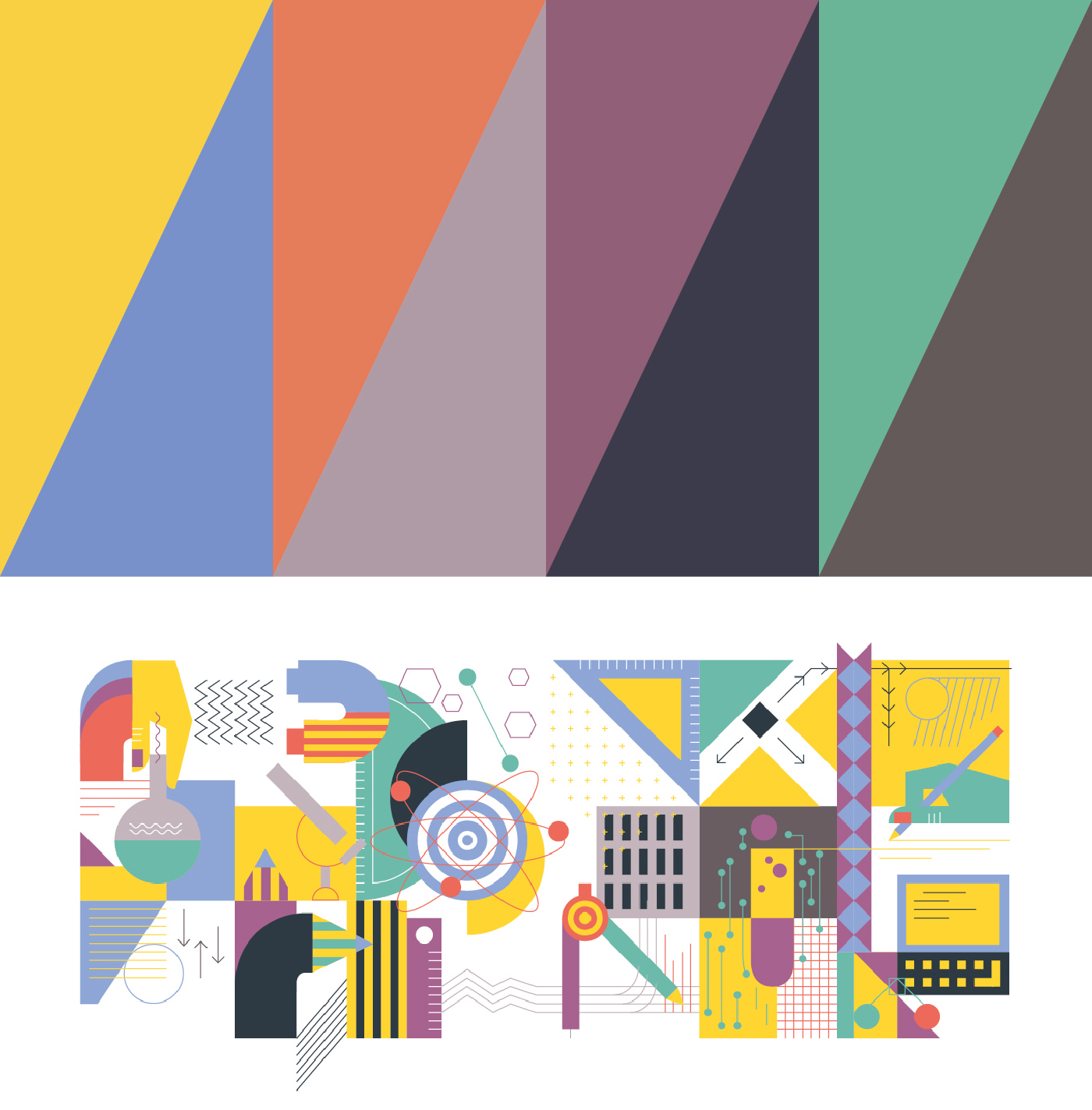
Colours
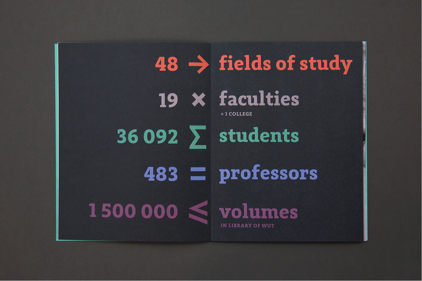
An palette of eight colours has been chosen to meet the needs all the units within the University. Thanks to this each faculty has had a chance to choose two colours which best fit its needs, and the school has a wide range of possibilities.
Departments
The new identity introduces a coherent visual language for the whole University—comprising 20 faculties, many institutes and bodies. Each logo within the structure is typeset in Radikal WUT—a custom typeface created in collaboration with Nootype. Traditional symbols of each Faculty have been redrawn in a consistent linear style—now it is apparent that they represent the same University, all the while preserving their autonomy and roots.

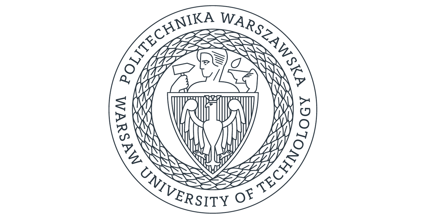
Emblem
Warsaw University of Technology next to the new sign uses also in official materials historical mark – an emblem. To unify the traditional graphic element with the new identification emblem has been redesigned in a linear way.
The new identity is a system of building blocks rather than a set of rules set in stone. This approach allows the identity to evolve and become a living visual tool for expressing the Universities message.
Design: Emilka Bojańczyk / Podpunkt


