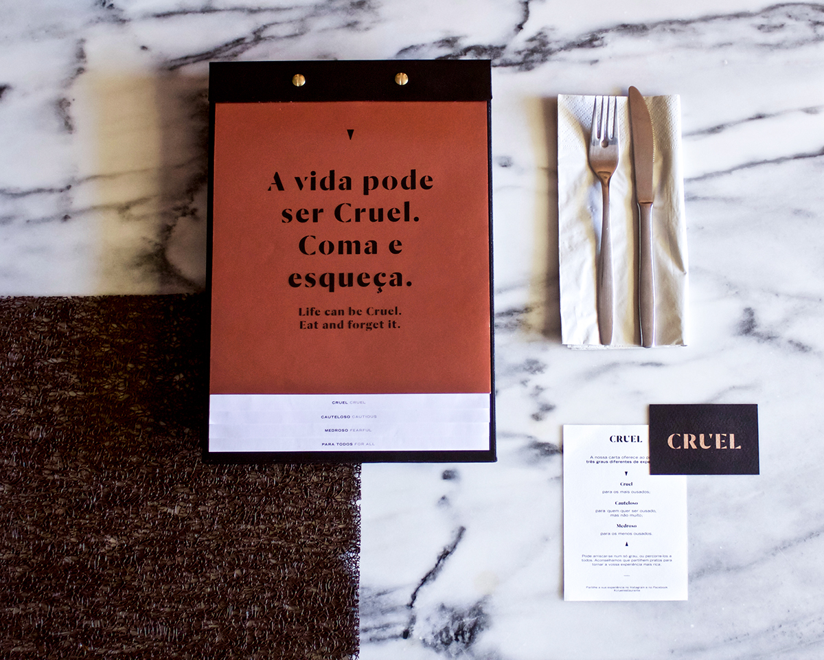
Life can be Cruel. Eat and forget it.
Cruel Restaurant
Opened since August 2015, Cruel has already become the place to be in Porto - its menu challenges the palate and offers a one of a kind experience with unique and irreverent flavors. The menu is divided into three levels of intensity, - cruel, cautious and fearful - satisfying the desires of those who like to take risks but also to those who prefer to play it safe.
Taking into account the restaurant's concept, the brand starts with an impacting typographic logo with considerable visual weight. The harsh cuts on the typography mirror the menu's concept, while still reflecting its sophisticated clients. The color palette and materials were chosen with the intent of extending the experience; one that must be felt with all four senses.
CLIENT
Cruel Restaurant
AREA
Branding, Web, Social Media
CREDITS:
WEBSITE DEVELOPMENT
Rafael Viana
PHOTOGRAPHY
Bruno Carvalho


