D A V I D B A R A T H . C O M
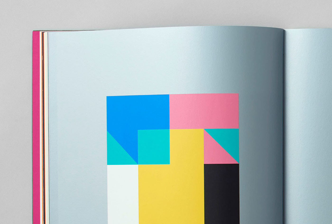
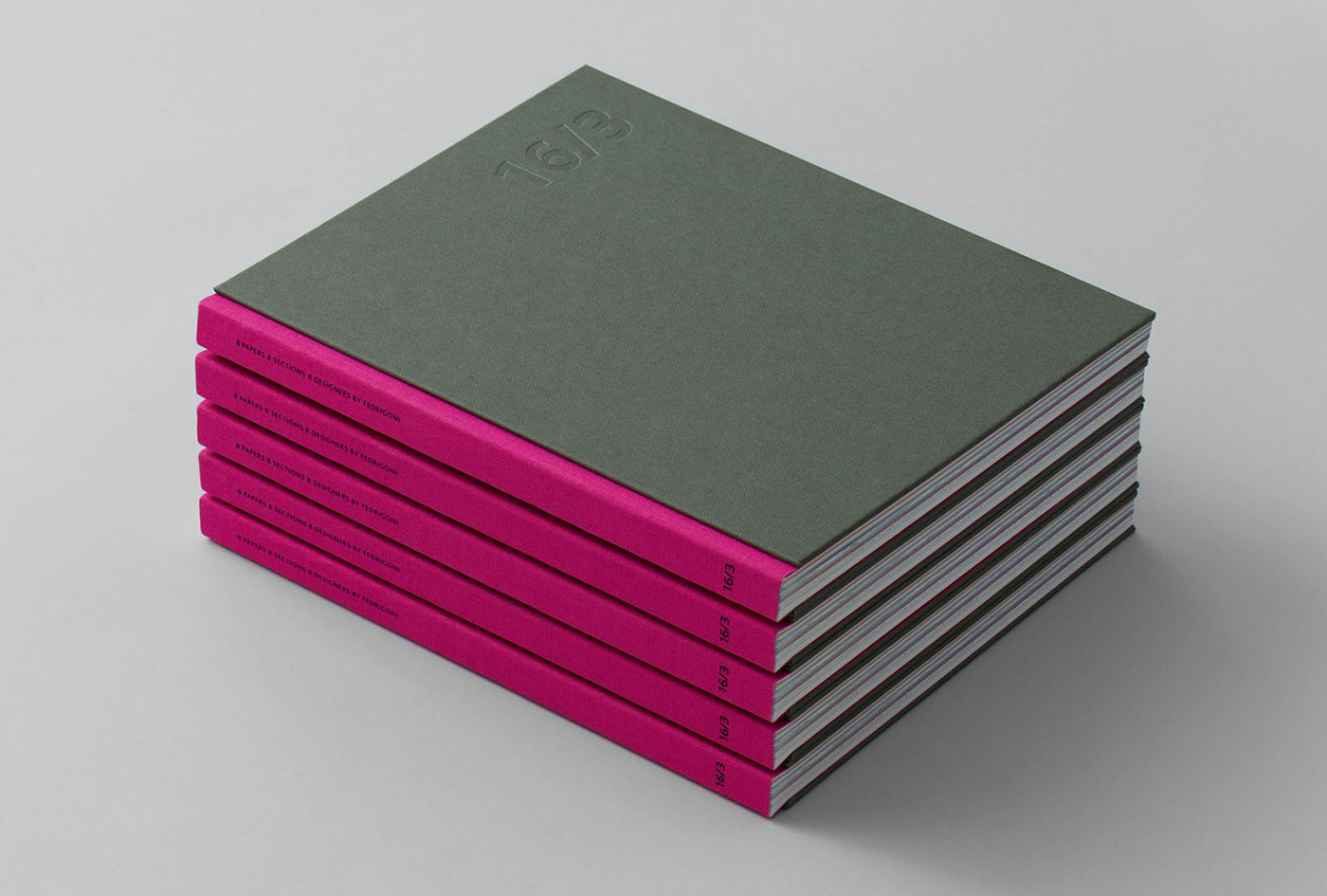
a project designed for FEDRIGONI, a paper producer in Italy. The volume 16/3 showcases the work of 8 selected graphic designers from around the world. Each of us was given 15+1 pages of a specific paper to work on and I was given the instruction to use 6 Pantone colors on Fedrigoni Stucco Sirio Calce 130 g, to create a unique artwork to be printed in a book. This being an art project and me being specialized in branding, I decided to use these pages for my personal branding, creating 15 typographic poster artworks from the 15 letters of my website address. The book has been launched in October at the prestigious Frankfurt Book Fair, at the THE ARTS+ creative conference, during an event led by the editors of Eye Magazine.


Designed in March,and published in October 2016.
---
16/3 Book Design: Thomas Manss & Company
Follow me on Facebook → facebook.com/DavidBarathDesign
Follow me on Instagram → instagram.com/davidbarathdesign
Visit my website → davidbarath.com


