
Wizzair.com redesign
early concept drafts and final screen designs
early concept drafts and final screen designs
Whenever a new project turns up in the house, we all end up becoming experts on things we have never even imagined. This time, we took to the skies, learned plenty about aviation services and by now almost all of us could in theory land a plane. Well, maybe not. What we did do, however, was what we do best: a brand new, shiny site accommodating a faster and simpler booking system. With a truly clever touch, we set to work by executing an in-depth research. Decisions regarding the new site were based on the results. The site went live and is now used throughout the most of Europe.
The task
Modernize and revamp the site. Brand new backend infrastructure will complement the redesign project.
Our research unearthed the weaknesses of the old site, highlighting the importance of speeding up the booking flow. We found that most visitors find the old site rather difficult to manage, thus we also included the reshaping of the information architecture in our list of priorities. That is a must, when you need to make head and tails of airport processes and regulations as a humble passenger.
We presented three different versions in terms of design. We were aiming to break away from industry standards; to avoid overcrowded, banner-ridden displays. After all, keeping the visitor’s focus of attention on the booking process is the number one goal of the site.
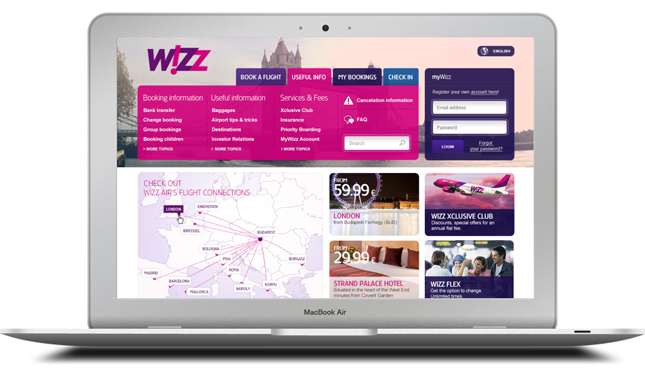
We were aiming to generate a home page, where users receive all useful information at once and which can also host sales messages without conflict or unnecessary noise.
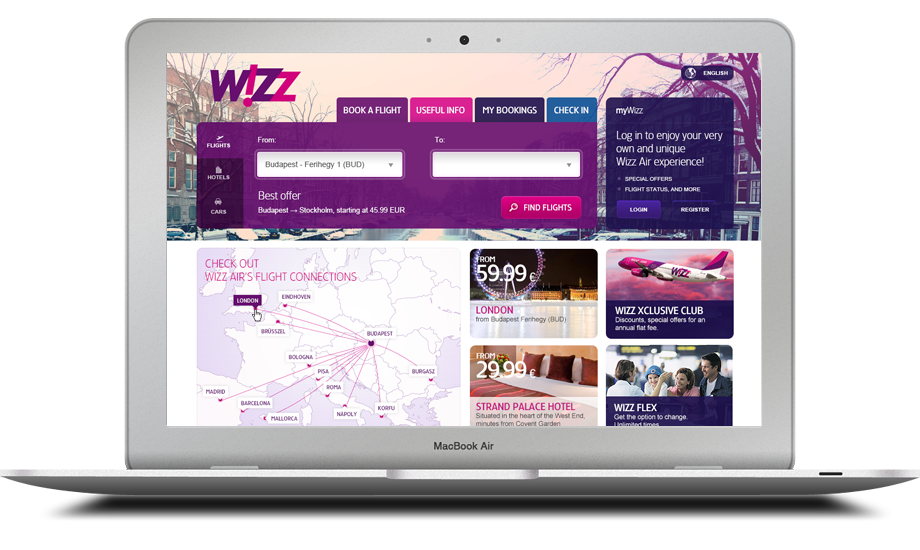
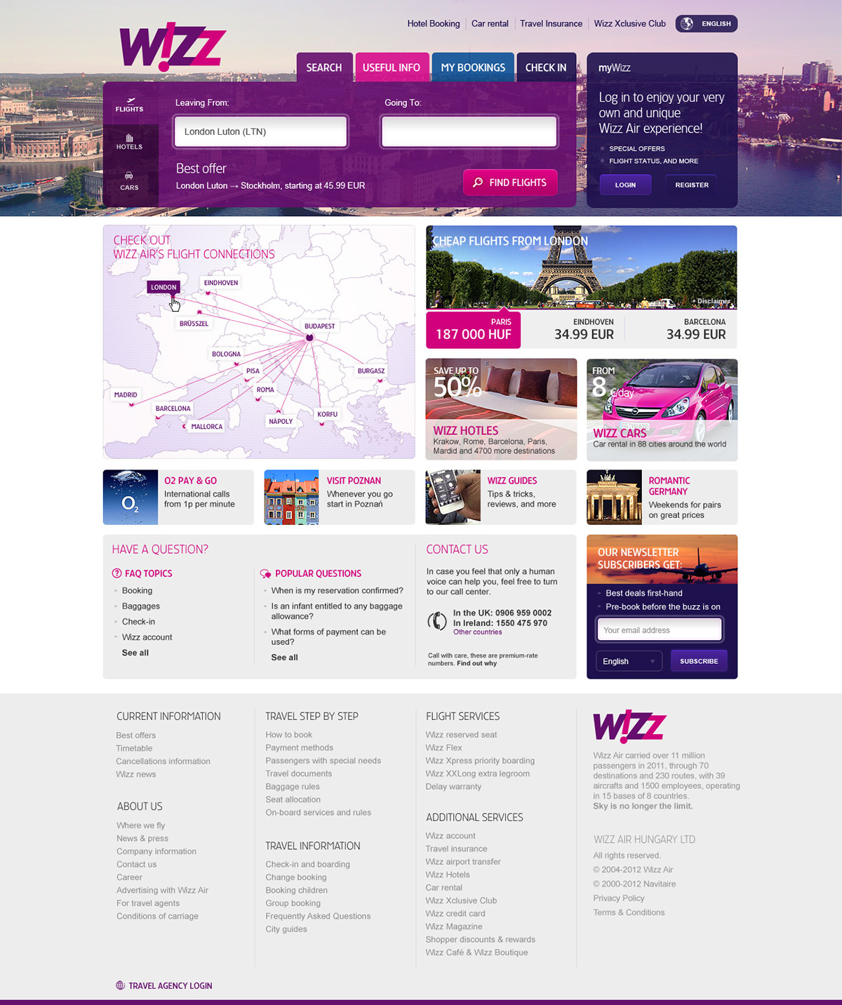
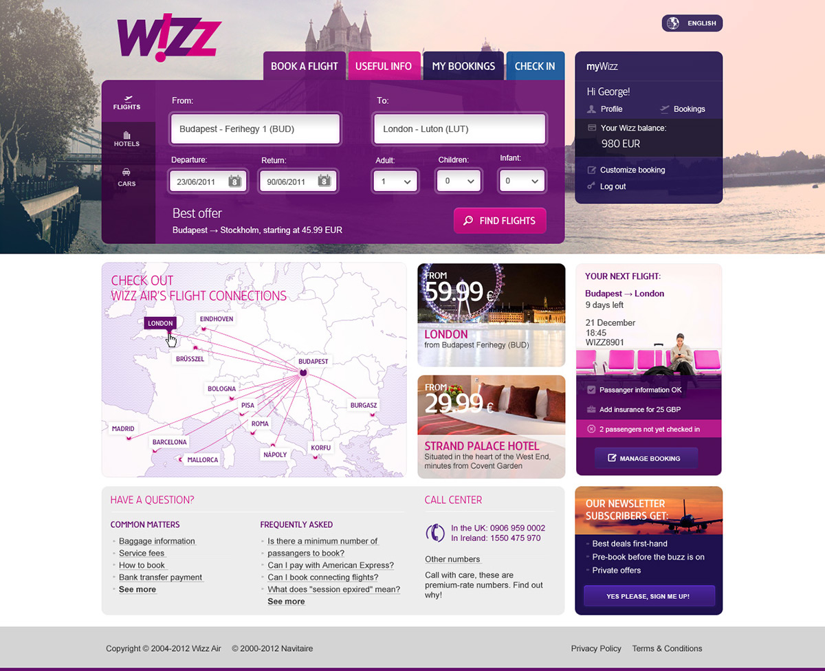
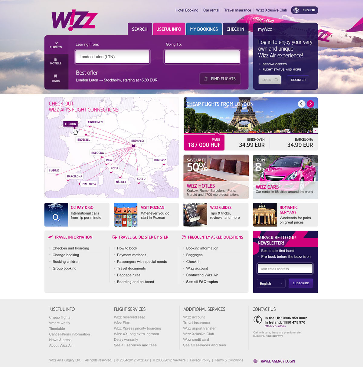
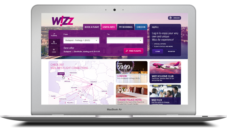
A custom homepage greets visitors, where customization is based on language and geolocation information.
We were aiming to generate a home page, where users receive all useful information at once and which can also host sales messages without conflict or unnecessary noise.
A custom homepage greets visitors, where customization is based on language and geolocation information.
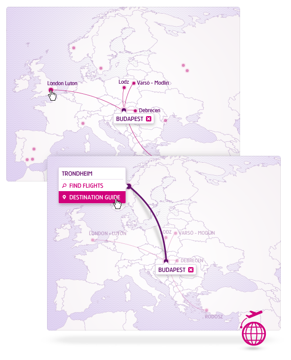
Booking flow
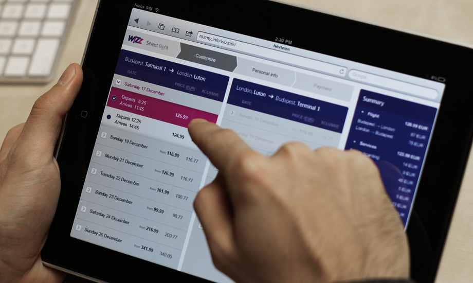
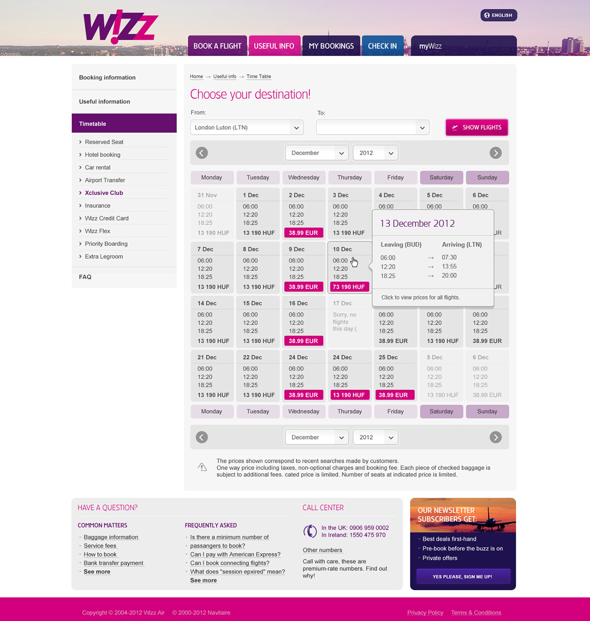
How about running a search for a destination and almost being there while you do so?
The result pages of 80 different destinations display huge images of the cities searched for. These beautiful pictures trigger your imagination and you are taken one step closer to your destination and towards completing your booking.
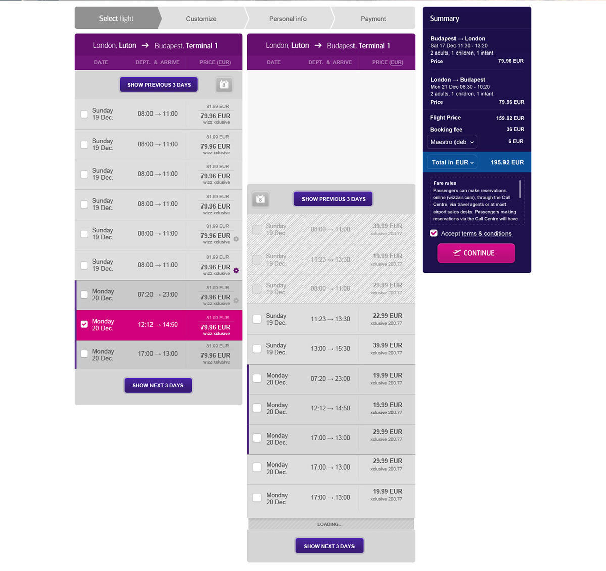
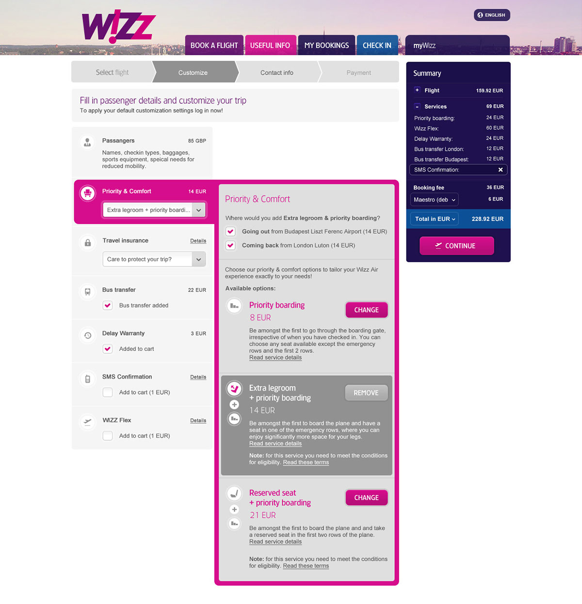
This is one of the most exciting pages featuring a fixed header and a floating summary box. The Continue button stays at the bottom of the page on the right throughout the whole process, thus the current price is displayed at all times, even at the first step.
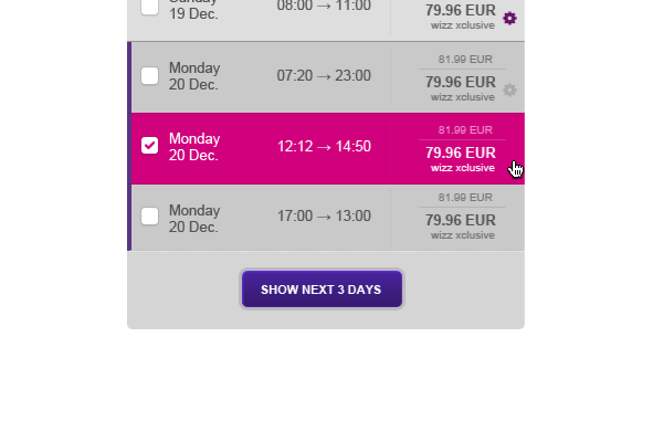
Two columns display the departure and return flights, so the entire trip can be selected in just one step.
How about running a search for a destination and almost being there while you do so?
The result pages of 80 different destinations display huge images of the cities searched for. These beautiful pictures trigger your imagination and you are taken one step closer to your destination and towards completing your booking.
This is one of the most exciting pages featuring a fixed header and a floating summary box. The Continue button stays at the bottom of the page on the right throughout the whole process, thus the current price is displayed at all times, even at the first step.
Two columns display the departure and return flights, so the entire trip can be selected in just one step.

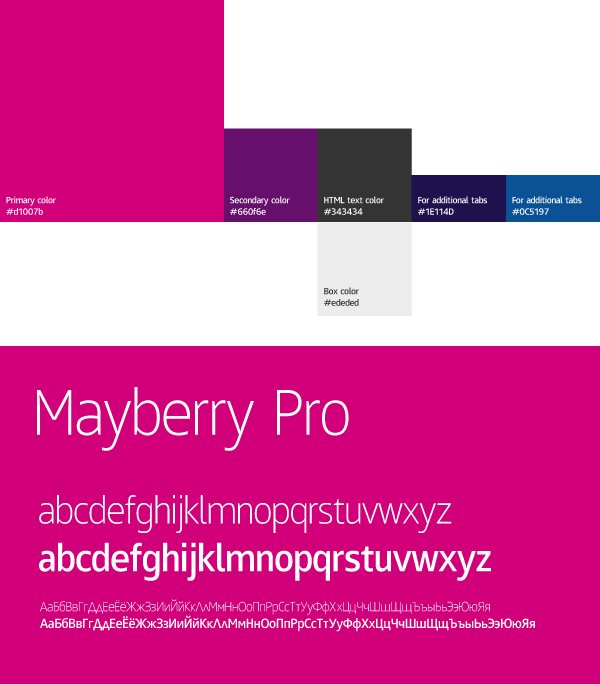
We came up with the two main colors used on screen and chose complimentary colors to go with them. A brand design booklet was also prepared, since it is crucial for partner companies to use the new design in proper ways.

Some stats
3 months of Competitive & UX research
402 users tested
247 wireframes
90+ html templates
89 psd files
3 months of Competitive & UX research
402 users tested
247 wireframes
90+ html templates
89 psd files
