Titan HST
UI, Web & Identity Design
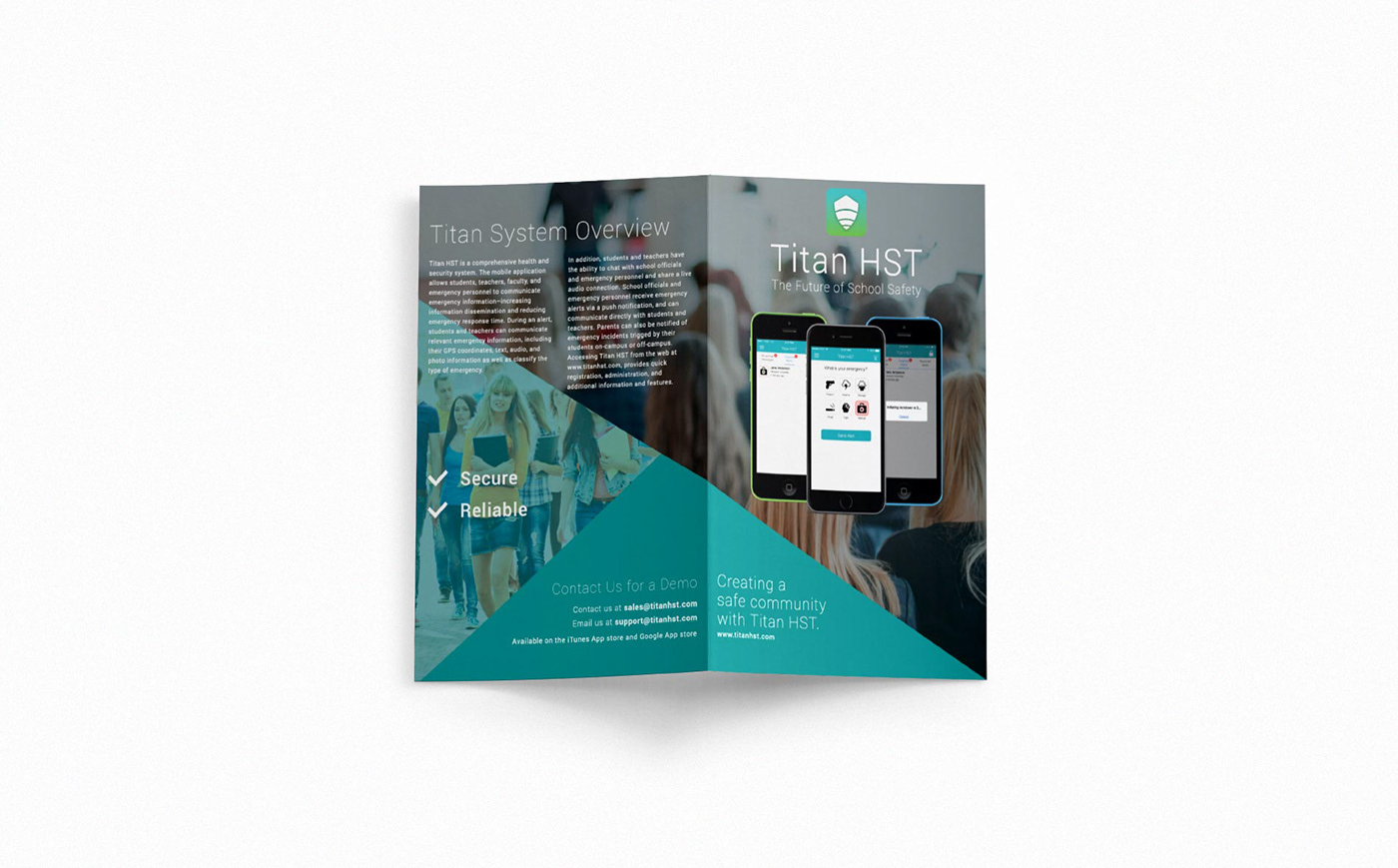
Titan HST services stakeholders and institutions focused on campus safety. Creating a visual identity reflecting trust and safety while tied to the usability of a mobile application was essential. A variety of media, ranging from print to web, were accounted for to fit within Titan’s new identity system. Titan HST’s logomark was formed by fusing together graphical concepts of cellular bars and protective shields. The bright colorful palette provides a humanistic and friendly veneer to the brand's core fundamentals of safety and security.
Modern styling paired with data-focused content were prioritized for the website. The overall design form and navigation were kept minimalistic while the integration of vivid colors and modern typography reflected the identity the leadership team was aiming for.