Fiat 500
Catalogue Design
Catalogue Design
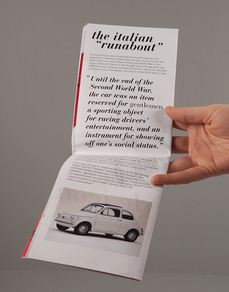
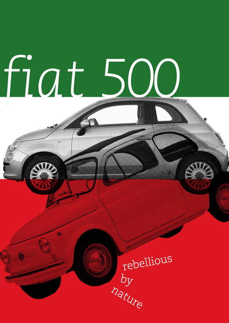
In my final project of second year I had to envisage an exhibition for The National Gallery inspired by an essay I had written during the year. I decided to use an essay I wrote about the Fiat 500 and how it is a design classic. The main part of the brief was to create a catalogue. I wanted to keep my design very "Italian" so I looked to Italian ads and magazines from the 1950s and 1960s to do with motoring. I liked the vibrant screen-printed quality a lot of them seemed to have so I tried to keep this language going through my catalogue. I used Bauer Bodoni for my macro typography and all continuous text is set in the slightly retro slab serif, PMN Caecilia. To tie in with the motoring theme I used a map like format and gave it a gloss belly band to reflect the title of style icon. The catalogue folds out to reveal a poster on the reverse. I designed three very different posters to create variety for the visitor.

Map-like format

Middle spread

Poster on reverse

Simplistic poster design

Hand drawn 500 image used in catalogue
PMN Caecilia poster


