Jane Austen Centre, Bath Brochure
A redesign of the Jane Austen Centre's Brochure Using a Unique Fold
A redesign of the Jane Austen Centre's Brochure Using a Unique Fold
I was assigned the challenge of finding a brochure I thought needed some work and then redesigning said brochure, but utilizing all the text and an interesting fold. The first challenge I had was finding a brochure that had issues. I really couldn't find one and then I decided to go a different way. I thought I'd find a place I'd love to design a brochure for and hope they had a sub-par one. Luck was with me and so I had to think, how to make the new brochure for The Jane Austen Centre really unique.
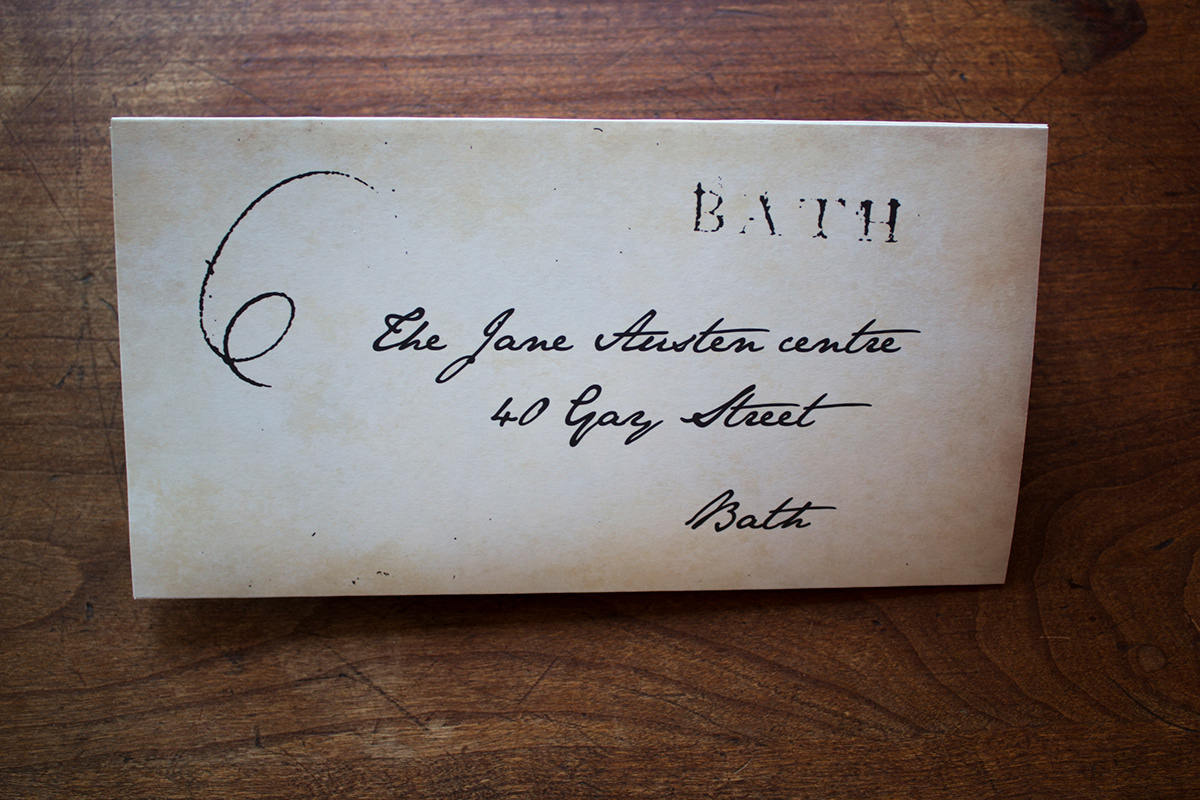
After much thought I stumbled upon the idea of folding the brochure like a letter in Jane Austen's time. This way, not only would it be a functional brochure, but a bit of a keepsake, like a letter from Austen herself! It took me awhile researching, but I finally was able to figure out the correct fold and then, the true designing started.
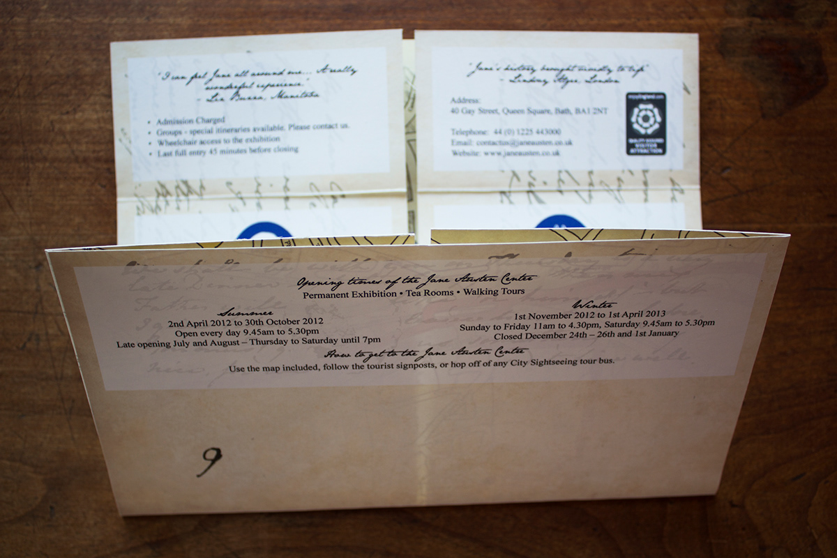
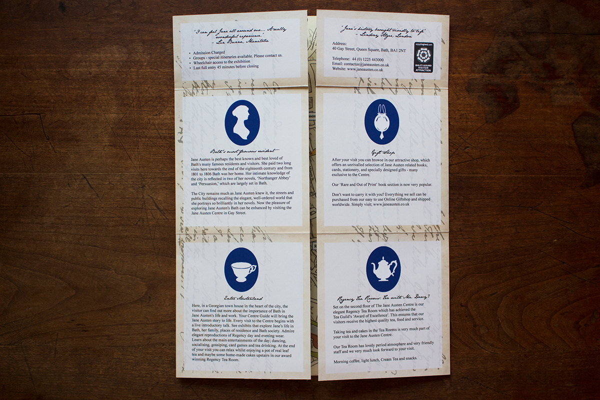
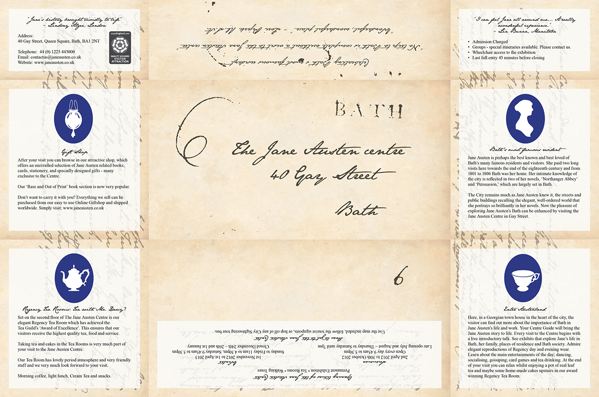
The information in the brochure could basically be broken down into five categories. Using the centre's own logo as a starting point, I created four more icons to go with the subsections. This then easily divided the content into little sections that could correspond to the various panels the folds created. I also thought that I find maps the most useful thing a brochure can give, so the entire interior was turned over to a map I drew in Photoshop with my Wacom. Function and form combining in happy symmetry. For the background, I used an actual letter of Austen's, drastically toned down to not interfere with legibility. For the headings I used a font based on Austen's own handwriting.
After much thought I stumbled upon the idea of folding the brochure like a letter in Jane Austen's time. This way, not only would it be a functional brochure, but a bit of a keepsake, like a letter from Austen herself! It took me awhile researching, but I finally was able to figure out the correct fold and then, the true designing started.
The information in the brochure could basically be broken down into five categories. Using the centre's own logo as a starting point, I created four more icons to go with the subsections. This then easily divided the content into little sections that could correspond to the various panels the folds created. I also thought that I find maps the most useful thing a brochure can give, so the entire interior was turned over to a map I drew in Photoshop with my Wacom. Function and form combining in happy symmetry. For the background, I used an actual letter of Austen's, drastically toned down to not interfere with legibility. For the headings I used a font based on Austen's own handwriting.
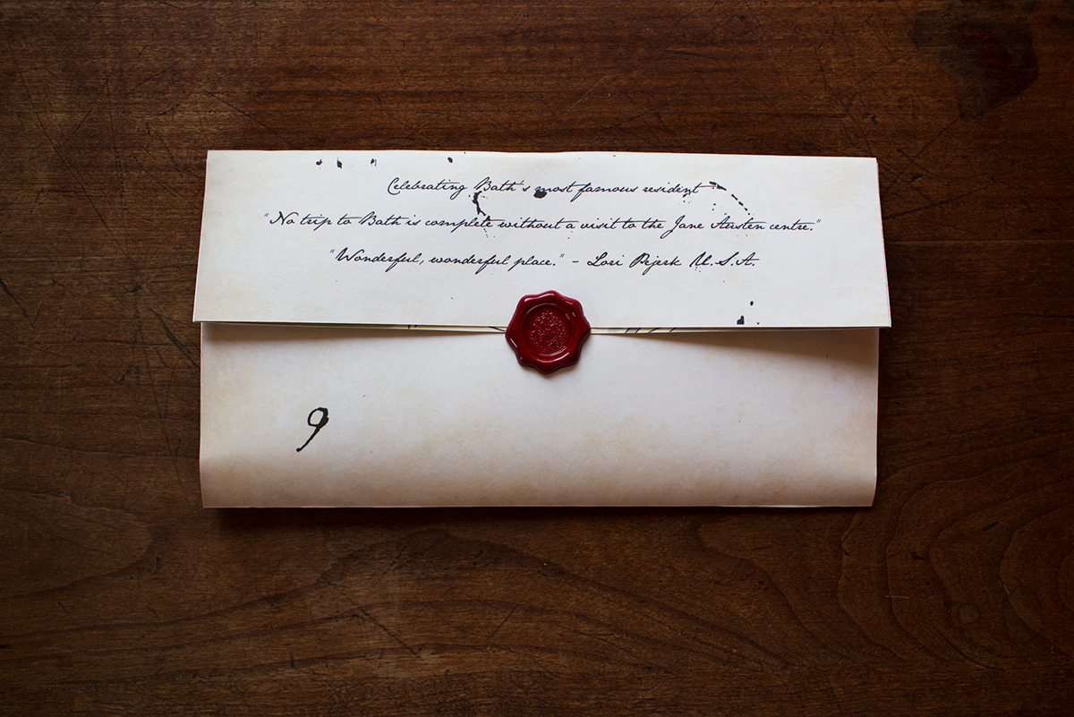
A faux wax seal sticker which can be purchased in bulk and used to add an air of authenticity. Originally I wanted to create one that was in the Centre's colors, but then I found out that at this time you could use only red or black wax, so it stayed red.
Opening up.
When you first open the brochure, you will get this nice little text area with all the information you could need, before opening up to the map, which makes up the entire final interior.

Map time!
The brochure's flat file.

The brochure's flat file of my illustrated map.

