Wisconsin Poster
Collaborative Letterpress Project
Collaborative Letterpress Project
The advanced Letterpress class had a guest lecturer and collaborative project that made us beginners a little jealous. Therefore when our teachers suggested that our class do a collaborative poster together, we unanimously agreed. We put all our ideas up on the board and voted on our theme being our home state, Wisconsin.
Naturally I instantly decided on a book theme, surprise surprise. I decided that my part of the whole would be in tribute to that book all little girls love, 'Little House in the Big Woods,' which was written by Laura Ingalls Wilder, who was born in Pepin, Wisconsin, and the 'Big Woods' is Northern Wisconsin. Because I was interested in getting better at doing the linoleum block cutting, I decided to do a little stylized carving of Laura's house in the big woods. As for the rest of my piece? I really wanted to have wood type that said 'BIG WOODS' with 'Little House In The' being as small and cute as possible. As luck would have it, the way the type fit together left a nice rectangle in the upper right corner which would easily fit a carving.
Naturally I instantly decided on a book theme, surprise surprise. I decided that my part of the whole would be in tribute to that book all little girls love, 'Little House in the Big Woods,' which was written by Laura Ingalls Wilder, who was born in Pepin, Wisconsin, and the 'Big Woods' is Northern Wisconsin. Because I was interested in getting better at doing the linoleum block cutting, I decided to do a little stylized carving of Laura's house in the big woods. As for the rest of my piece? I really wanted to have wood type that said 'BIG WOODS' with 'Little House In The' being as small and cute as possible. As luck would have it, the way the type fit together left a nice rectangle in the upper right corner which would easily fit a carving.
On the day of the big collaboration. Everyone had their pieces ready and we placed them in the Vandercook's bed and then looked at all the extra space. Into those spaces we placed all these various cuts that we had that were so 'Wisconsin.' 4-H logos, maps of the states, pictures of the dairy board building, cows, what have you. It really got fun once we had two presses going, so we had some interesting overprints with the cuts. Also, the prints varied widely from piece to piece. We don't ink the Vandercook, instead we hand brayer on ink onto the pieces and are therefore able to get tons of different colors going. Plus the paper itself had been printed with a background texture and design the week before. I would say that this project, while a ton of work, was the most fun I had all semester in Letterpress and hope to get to do it again sometime.
Big shout out to everyone who worked on this, Beth and Liz, Debbie and Deb, Chris and Chris, Becca, May, and Allyse. And yes, we did have a lot of duplicate names in this class, seeing if you add me, we had three Elizabeths...
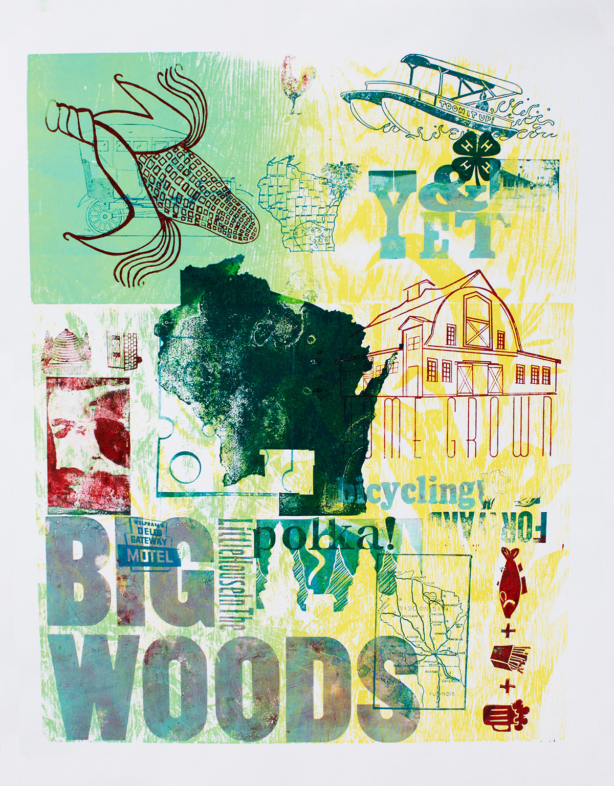
We all got to take a few prints home and this is by far my favorite. I love how the 'polka!' overprints the woods and the 'motel' which is slightly eerie and Bates like overprints my 'BIG.'

My intial layout. I used the show card to get the letters and then figured out the size I needed to fill with my drawing and then started sketching.
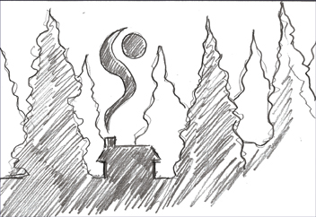
The finished sketch.

My block all cut out.
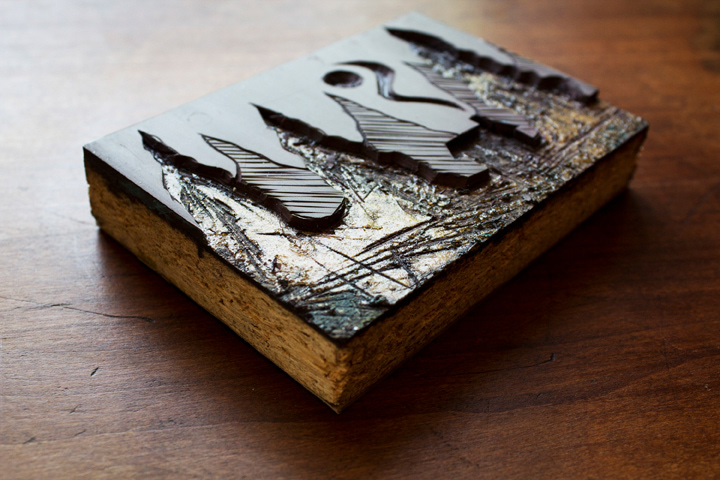
My block.
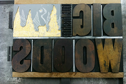
My section all set and ready to go. Look how clean that lino cut looks before the ink hits it.
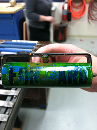
While brayering the piece, I noticed this nice happy accident, 'Forward' (the Wisconsin state motto) appeared on my roller right reading.
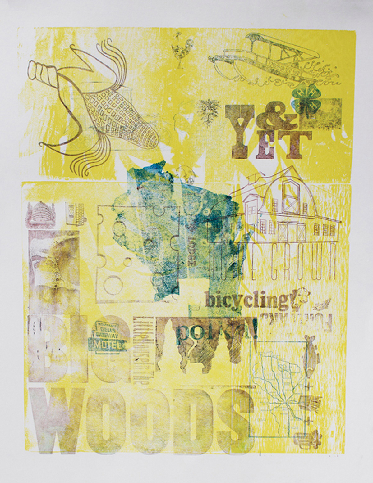
This great one with the kind of ghosting was a happy accident we discovered while stopping to clean the type. The ink all blurred together in a more uniform color of dark mauve, and is so pretty.

This is the one that I think my section turned out best on (which sadly makes the whole poster bottom heavy). The green with all the variations is perfect. Is it wrong that I want to cut this section out?
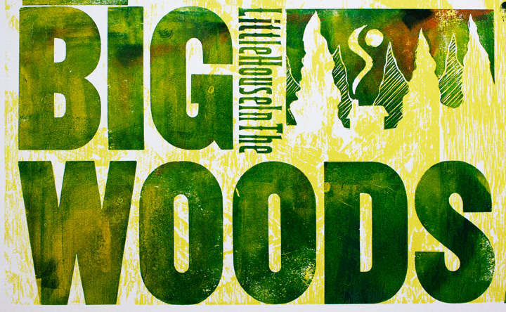
A close up so you can really see the cool color.
