sow;
verb
plant (seed) by scattering it on or in the earth
SOW is the identity for a two piece packaging design range for a variety of edible seeds.
It seeks to convey the essence of seeds, being the lifecycle they embark upon. Starting
from the earth, they grow from sprouts to plants bearing flowers and eventually return
back to earth in the form of seeds.
It seeks to convey the essence of seeds, being the lifecycle they embark upon. Starting
from the earth, they grow from sprouts to plants bearing flowers and eventually return
back to earth in the form of seeds.
SOW seeks to convey this narrative through both the imagery encasing the product, and
furthermore the form itself. The form or structure of the design is simple, yet through the
subtle details of stitching and textured stock, it conveys a very earthy feel.
furthermore the form itself. The form or structure of the design is simple, yet through the
subtle details of stitching and textured stock, it conveys a very earthy feel.
The big splashes of colour add another dimension to the packages, giving more depth
andconsistency by tying all the elements together including. Additionally the element
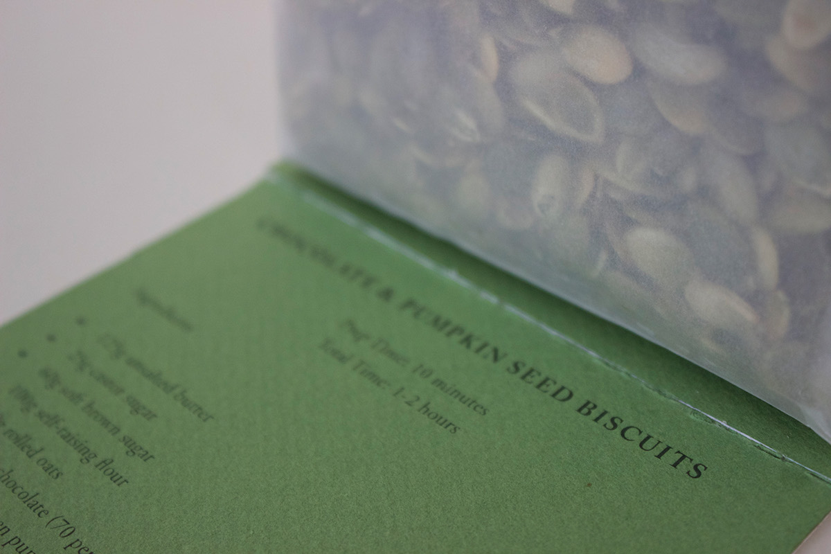
of a perforated recipe card, draws on the life-cycle of the seed, accentuating the human
life-cycle and traditions where recipes are passed down through generations. The ability
to removethis recipe card makes this packaging design dynamic but more importantly,
sustainablethrough it’s multiple use of the material. The simplicty of the design, which
doesn’t utilise any coloured ink and constrains the use of adhesive where possible, also
evidences the consideration of sustainability in this design.Overall, from the point of
purchase to the actual use, the form of the packaging changes, revealing surprises to a
small compact product much like a seed does itself.
andconsistency by tying all the elements together including. Additionally the element
of a perforated recipe card, draws on the life-cycle of the seed, accentuating the human
life-cycle and traditions where recipes are passed down through generations. The ability
to removethis recipe card makes this packaging design dynamic but more importantly,
sustainablethrough it’s multiple use of the material. The simplicty of the design, which
doesn’t utilise any coloured ink and constrains the use of adhesive where possible, also
evidences the consideration of sustainability in this design.Overall, from the point of
purchase to the actual use, the form of the packaging changes, revealing surprises to a
small compact product much like a seed does itself.