The Big Sky has announced it will be rebranding for the 2012 season. This concept was created in response to some of the aesthetic issues the previous brand had:
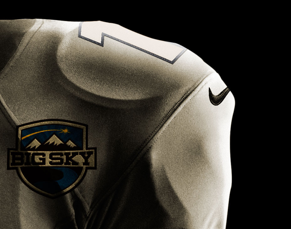
• Patches: The previous Big Sky logo produced a very generic-looking patch, as the logo itself could not be easily formed into a shape and fit onto a patch correctly. This gave teams (football especially) a more generic and bland look.
• Text-Heavy: While there is certainly nothing wrong with strong typography, I felt the former brand was a bit bland, and the fact that there weren't a lot of visual elements that added 'pop' did not help the mark. The shooting star is a perfect symbol, which is why I carried it over as the brightest and most contrasting element in the new mark.
• Lack of Regional Specificity: The Big Sky has teams located throughout the Western United States, often in wooded or mountainous areas. While there are some outliers, they are recent additions, and still fit the frontier-feeling of the new mark. Capitalizing on this unique landscape was a major focus of this concept.
The final identity proposal is below, click the cover to read the guide.