

DIY Album Art: Paper Bags & Office Supplies
DIY Album Art documents the hand-made aesthetic of the 1990’s punk and hardcore music scenes and its influence today. Going beyond the standard photocopied and screenprinted sleeves, these records are housed in aluminum foil, manila folders, cereal boxes and, as you may have guessed, paper grocery bags.
Author:
Photographer: Kimberlee Whaley
Publisher: Mark Batty Publisher
Publisher: Mark Batty Publisher
Signed copies are available directly from The MVA via our Supermarket store:

The cover utilizes debossing with foil-stamping on exposed book-board to evoke a letterpress feeling. The credits are stickers; a gesture that references a number of the sleeves contained within the book. These are placed into debossed areas so that the corners don’t peel.

1990’s hardcore records were often filled with piles of inserts containing lyrics and explanations of them, art, writing and manifestos. The endpapers are a collage of these inserts.

The first 20 pages of the book are a kind of “teaser” with a single book per page and no credits. An attempt to create some intrigue before the reader encounters the table of contents and any context.

Table of contents. Every piece of typography in the book is hand-made with typewriters and rub-down lettering.


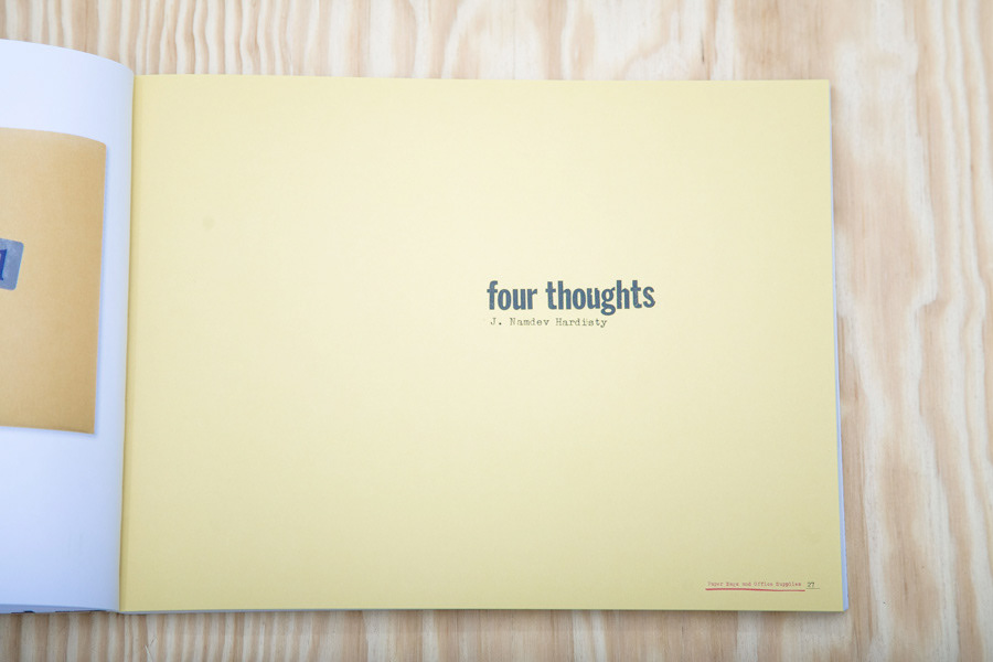
Essay divider page.
Color choices through-out the book are meant to evoke 1990’s Kinko’s Copies DIY aesthetics. Since changing paper stocks throughout the book wasn’t an option, we flooded the backgrounds of essays and appendices with the color of a stock copy shop paper.
Color choices through-out the book are meant to evoke 1990’s Kinko’s Copies DIY aesthetics. Since changing paper stocks throughout the book wasn’t an option, we flooded the backgrounds of essays and appendices with the color of a stock copy shop paper.

Essay page
The essays are meant to feel as though photocopies were bound into the book so any reference artwork was photocopied and scanned for these pages.
The spot color used for the running footer is a reference to a B&W copier that Kinko’s had in the do-it-yourself area in the 90’s that could print a 2nd color (usually red or blue).


To echo the design methodologies of what were often high-school kids with no design background (this beautiful sleeve for Mohinder not withstanding), we never articulated the grid or any default type or image sizes. Every image (including text which was scanned and therefore also an image) was eye-balled into place and none of the designers working on the book (there were 4 total) were allowed to cut and paste any element.We worked with a spare aesthetic that highlights the artwork and a set number of lay-outs to control the chaos that could’ve ensued from this method.

Page showing a double-sided Constatine Sankathi insert for a 7" record. Note the red, this is an example of the 2-color photocopier mentioned above.

Tree Records inserts
The book is divided up by record label. If there was sufficient content from a label we would make collages from the label’s inserts (similar to the endpapers) to break up the flow of the book and add variety. The spot blue is inspired by the aforementioned 2-color photocopiers.

Essay divider page
While the running footers are not totally custom, there are 20 different versions used throughout the book. Again this is a reference to photocopier design culture. If you know that you need 72 footers for each of the right-hand pages, then you have to make one, copy it, cut the copy out and paste it onto the original, and then copy those 2 and repeat until you have a sheet filled with them.
On the right, you can see a scan of the Letraset we used to typeset the essay titles.


