
Vizuálna identita festivalu súčasného
umenia Biela noc
Biela noc / Nuit Blanche zhmotňuje túžbu po (znovu) objavovaní mestského prostredia, ktoré prostredníctvom umenia nadobúda nový rozmer. Mesto sa tak počas jednej noci mení na interaktívny priestor, ktorého bežný nočný cyklus na niekoľko hodín prestáva existovať. Hudobné a svetelné inštalácie súčasného umenia vdýchnu život nočnému mestu a noc sa tak stáva „bielou“.
*
Visual identity of the contemporary
art festival White Night
art festival White Night
Biela noc / Nuit Blanche / White Night is the biggest and the most visited festival of the contemporary art in Slovakia.
Biela noc materialises the desire to (again) discover a city environment which is given a new dimension via art. A city becomes an interactive space for one night and its normal night cycle ceases to exist for a few hours. Music and light installations of contemporary art will breathe life into the city night and therefore the night becomes “white”.

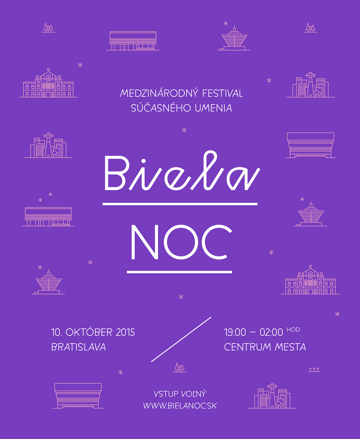
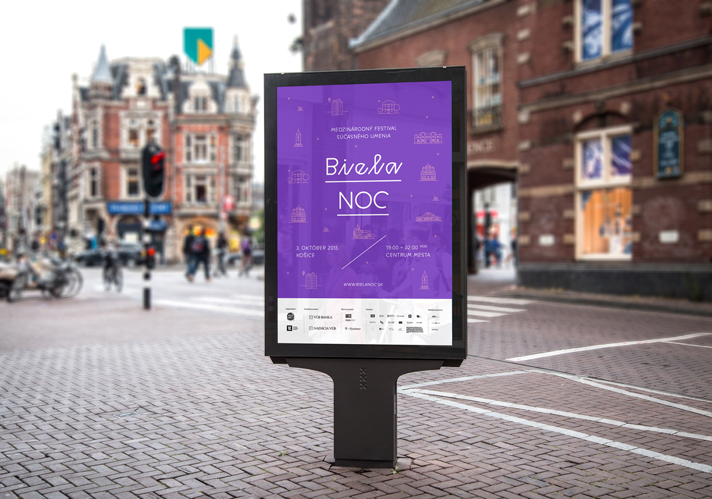
Biela noc sa po minulé roky konala v Košiciach, ale v roku 2015 po prvý krát aj v Bratislave. Mojim cieľom bolo predstaviť silnú, výraznú a zapamätateľnú identitu festivalu, ktorá sa nestratí vo vizuálnom spame mesta. Ako identifikačnú farbu festivalu som si nevybrala čiernu ani modrú, vybrala som fialovú, ktorá symbolizuje prechod medzi dňom a nocou a takisto zastupuje farbu noci, plnú svetla. Identitu som postavila na monumentoch mesta, ktoré som zobrazila pomocou ikon. Zároveň to boli aj miesta, kde sa jednotlivé eventy v rámci Bielej noci konali.
*
White Night Slovakia took place in two cities – Bratislava, the capital and Košice – the second biggest city in the east of Slovakia. My aim was to create a strong, significant and recognizable identity, that won't be lost in the advertising spam all over the city. I didn't choose the obvious black, I didn't choose blue. I came up with violet, which symbolizes the magical transition between day and night and yet it is still the colour of night, when filled with lights. The visual is also based on the monuments of the city, which I converted into the icons. At the same time these icons represented the actual venues where White Night events took place.


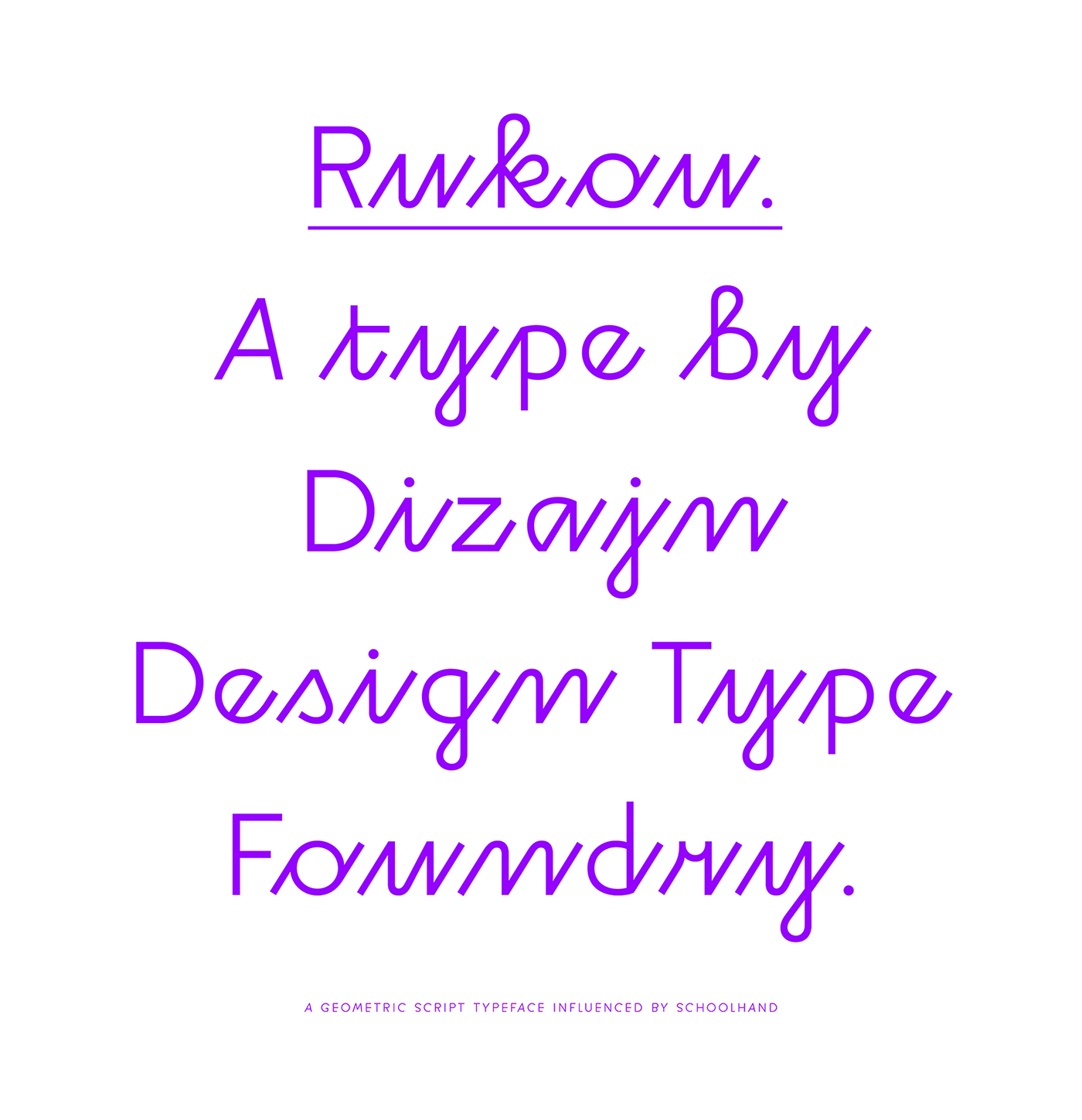
The icons are very geometric so I decided to use geometric typeface "Rukou" by Dizajn Design Typefoundry:
And this is the final look:

Examples of use:


Festival map – A3 format folded into A6:


Merchandise:


Festival catalogue:


Website design:

Thanks for watching!


