Wren Hall Corporate Identity & Branding
By Inchpunch Design & Communication
By Inchpunch Design & Communication
Wren Hall Nursing Home (situated in Nottinghamshire) wanted a brand new identity that would set them apart from the traditional look of the average nursing home.
Having invested in a new 46 bedroom extension, which included a state of the art day care centre and conference facilities, Wren Hall are anything but average!They wanted a modern logo which would reflect their new approach but still engage with their target audience.
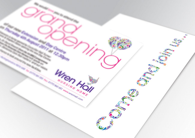
After our initial meeting to discuss ideas, we learnt that Wren Hall apply the following care map to all its residents: occupation, identity, inclusion, attachment, comfort and most importantly love. These elements are at the very core of Wren Hall's care ethos.
Discovering the importance of these elements we decided to integrate them into the new logo by creating a series of graphical icons. Collectively these icons then form the shape of a wren with a large prominent heart.
The vibrant colours of the logo promote the positive, energetic and inspirational attitude that Wren strives to deliver to each and every resident.
Having invested in a new 46 bedroom extension, which included a state of the art day care centre and conference facilities, Wren Hall are anything but average!They wanted a modern logo which would reflect their new approach but still engage with their target audience.
After our initial meeting to discuss ideas, we learnt that Wren Hall apply the following care map to all its residents: occupation, identity, inclusion, attachment, comfort and most importantly love. These elements are at the very core of Wren Hall's care ethos.
Discovering the importance of these elements we decided to integrate them into the new logo by creating a series of graphical icons. Collectively these icons then form the shape of a wren with a large prominent heart.
The vibrant colours of the logo promote the positive, energetic and inspirational attitude that Wren strives to deliver to each and every resident.