Derwent Logistics Folder
By Inchpunch Design & Communication
By Inchpunch Design & Communication
As a brand new start up business venturing into the already crowded world of shipping and logistics, Derwent knew their promotional material would have to visually stand out from the competition and establish themselves as a professional service provider.
Entrusting Inchpunch Design to deliver a unique solution, out first step of the creative process was to analyse their competitors marketing. The common theme throughout was the use of static transport images which made them all look very similar.
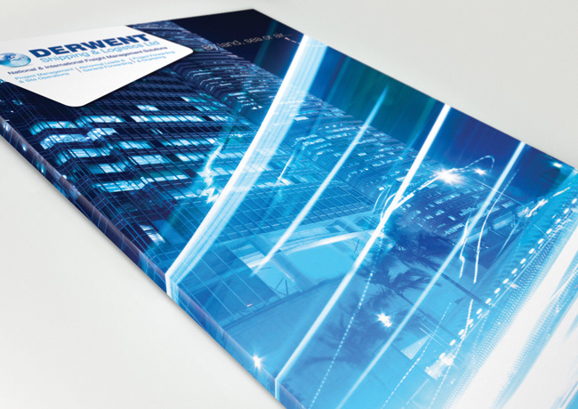
Our approach was to focus on the actual 'motion' of the business rather than the vehicles involved. We chose a really dynamic front cover image and digitally introduced dramatic 'time lapse' speed lines to convey a sense of speed.The whole image is coloured blue to reinforce the blue of the Derwent logo.
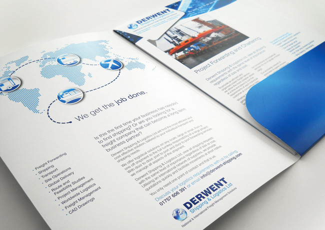
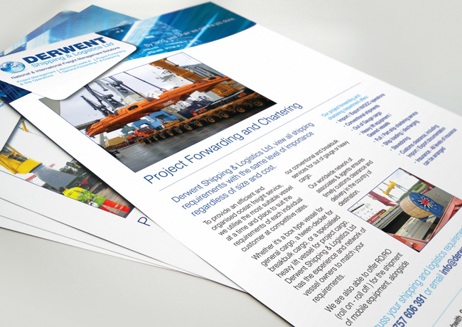
The motion theme is also applied to the folder inserts and all other marketing collateral.
Entrusting Inchpunch Design to deliver a unique solution, out first step of the creative process was to analyse their competitors marketing. The common theme throughout was the use of static transport images which made them all look very similar.
Our approach was to focus on the actual 'motion' of the business rather than the vehicles involved. We chose a really dynamic front cover image and digitally introduced dramatic 'time lapse' speed lines to convey a sense of speed.The whole image is coloured blue to reinforce the blue of the Derwent logo.
The motion theme is also applied to the folder inserts and all other marketing collateral.