BACKGROUND
Around the beginning of summer in 2014, Agatha Mutheu reached out to us to share her goals to start a new clothing label in Kenya, Africa. Agatha had described her desire to create a brand that offered well made clothing at affordable prices made locally in Africa. The reality was that no such brand or product existed in East Africa and it was in light of the contrast between high cost high fashion and low cost low quality garments that Dichotomy was born.
DISCOVERY
Looking at the current landscape of fashion brands in Africa, Agatha and our team wanted to present a brand that looked distinctively different from the rest. We began the discovery process and focused on the establishing the visual direction of the brand through the moodboards.


DESIGN
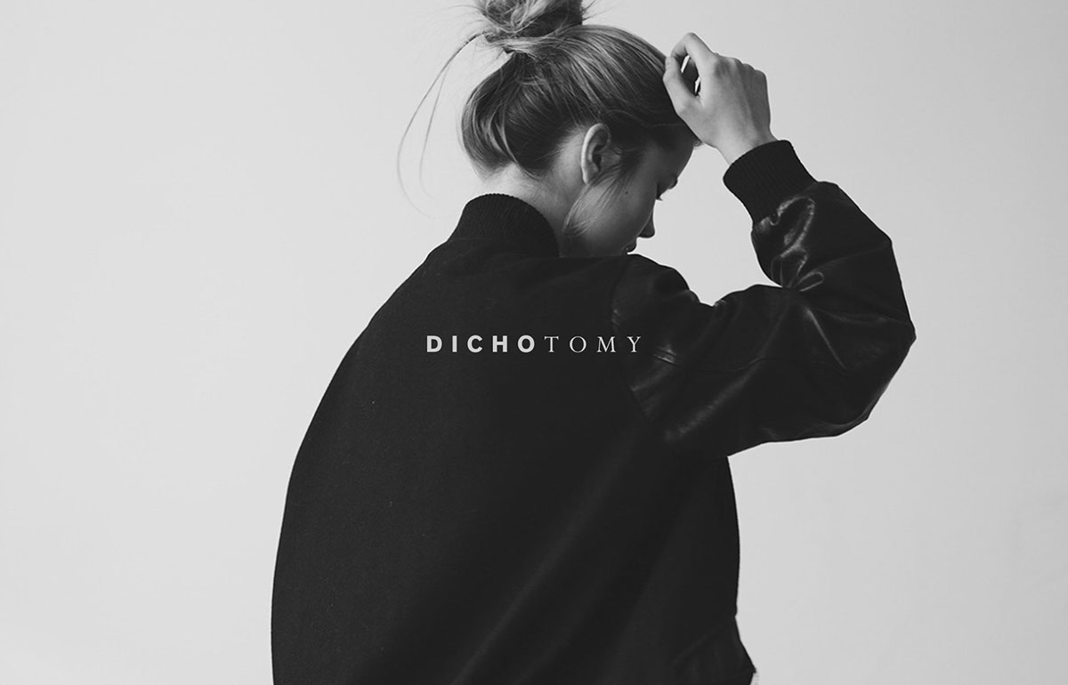
Going into the design process, we focused on the aspects of contrast and balance. Together with Agatha, we had wanted to stay away from any visual cues that would make the execution of the identity appear too obvious. After exploring our possibilities, we focused back on the wordmark and type selection. To convey the aspect of duality in the brand, we paired two contrasting fonts together—using Akzidenz and Perpetua. Akzidenz, to us, offered a strong and masculine personality while Perpetua, to us, was one of the most pretty and perhaps feminine serifs designed. The pairing provided a nice balance and interest to the wordmark.


