BACKGROUND
We were following Sunday Suppers and the work by Karen Mordechai ever since we started the studio. Karen caught us by surprise when she reached out through email to inform us about her upcoming project, ILĀ. Karen’s cookbook had been so well received and so it made perfect sense to us when she decided to create her own line of essential ingredients. After some brief introductions, Karen got us up to speed with the exciting progress that had already been made for the project
DISCOVERY
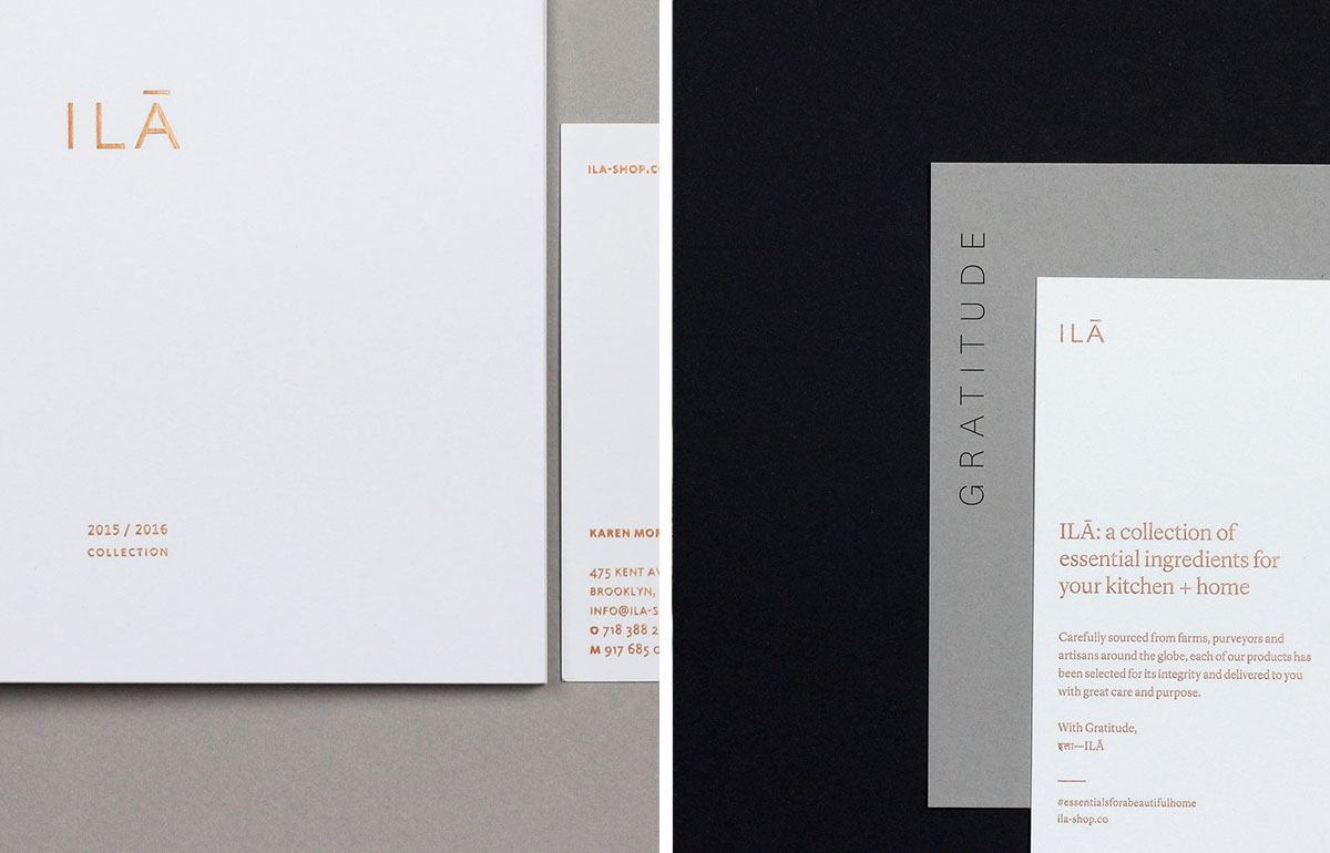
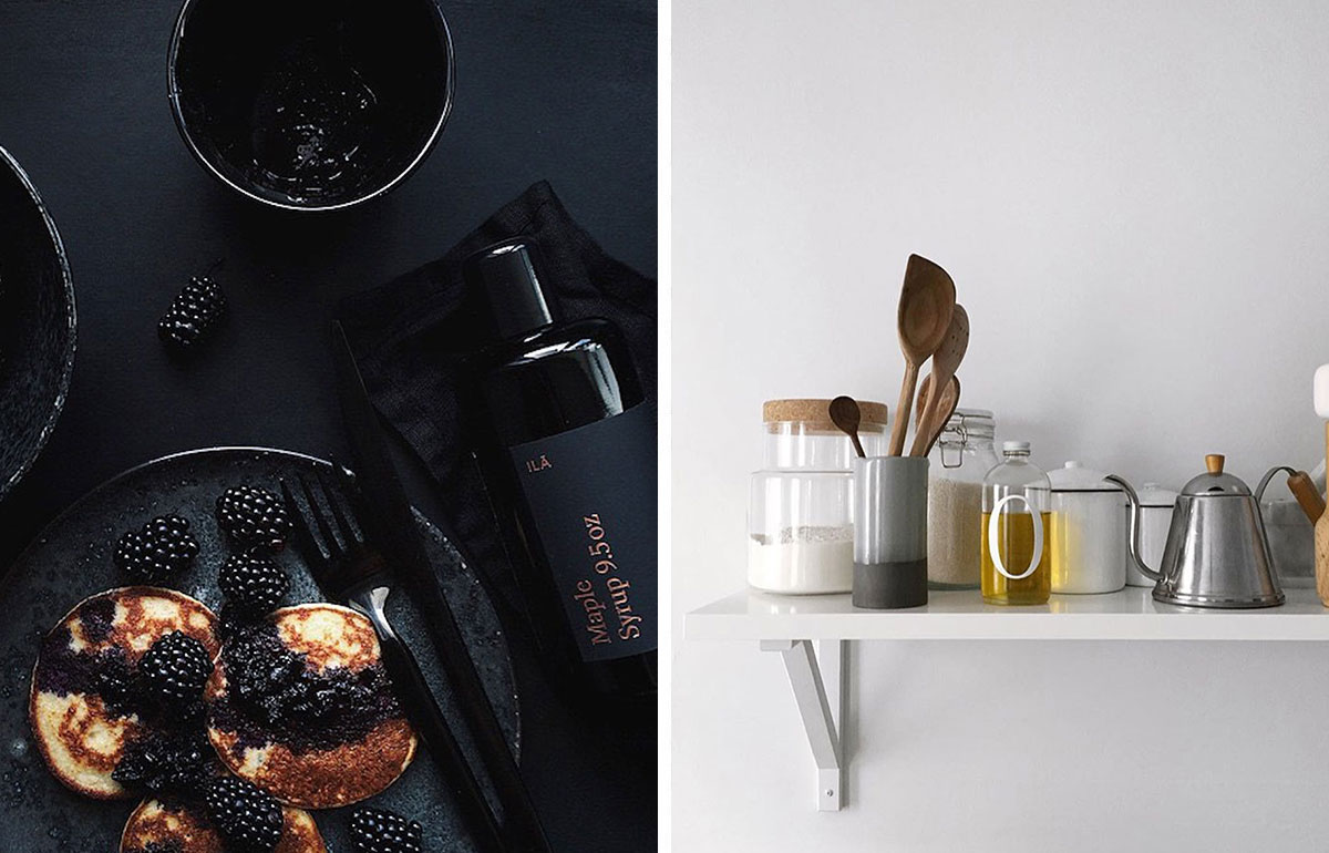
Once we got on board the project, we quickly worked through the discovery process to identify the brand direction for ILĀ. Karen informed us of the meaning behind the name; coming from its origins in Sanskrit. The original Hindu mythology describes a dualism in gender for the character of ila. Karen and our team used this as inspiration for the white and black collections of ILĀ. It was also important for us to establish the look and feel of the brand early on to craft the vision Karen had already begun.
DESIGN
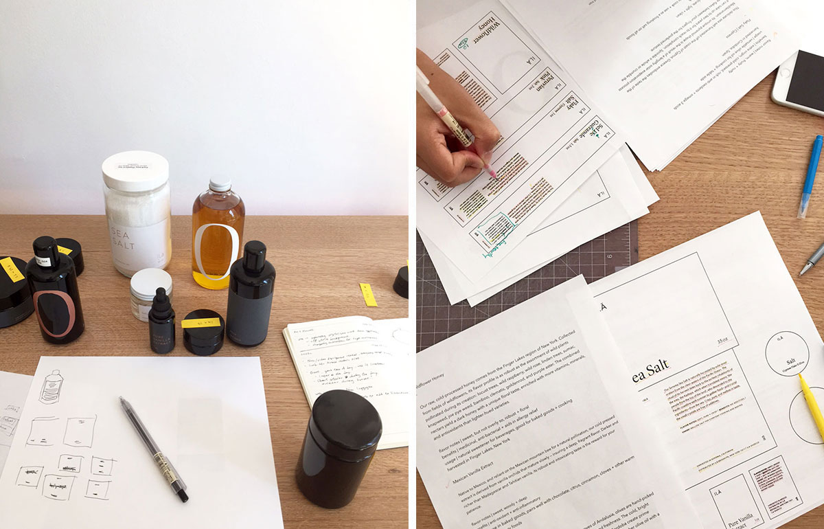
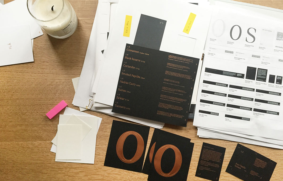
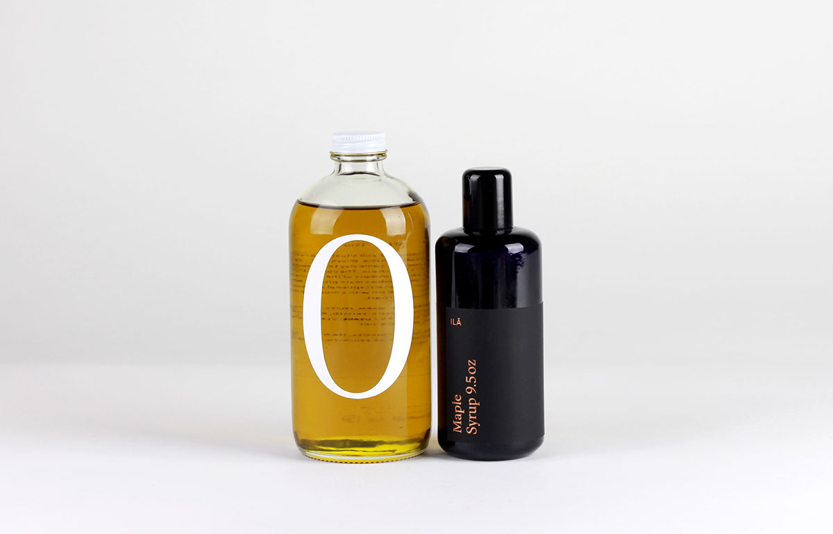
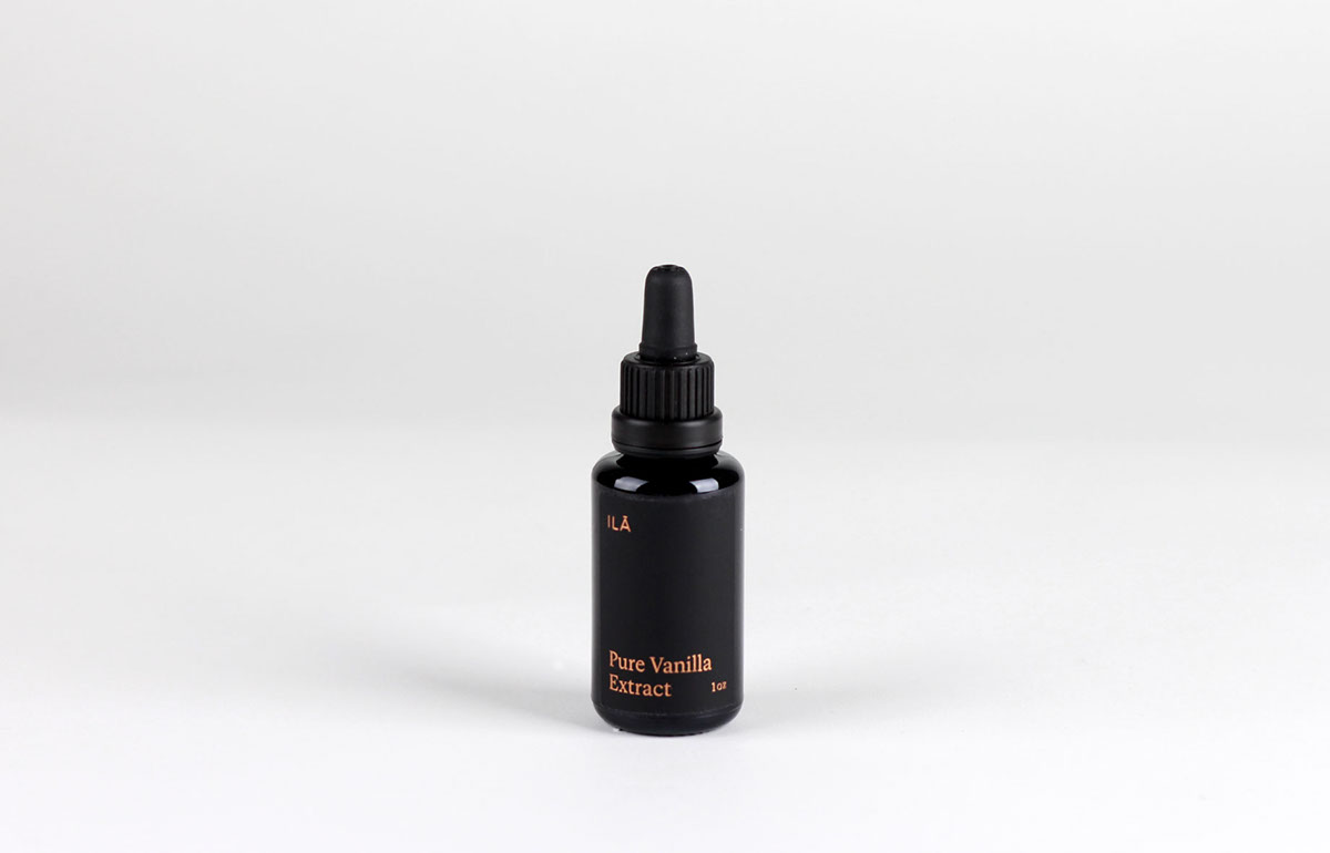
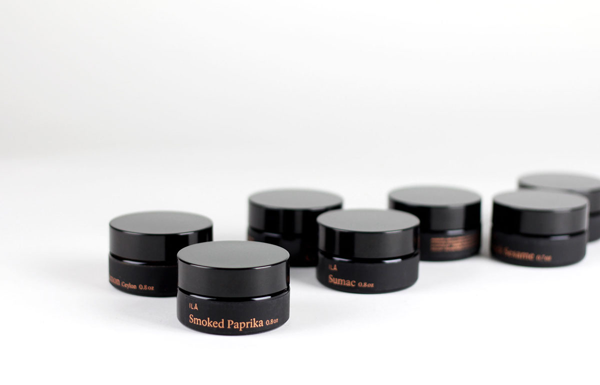
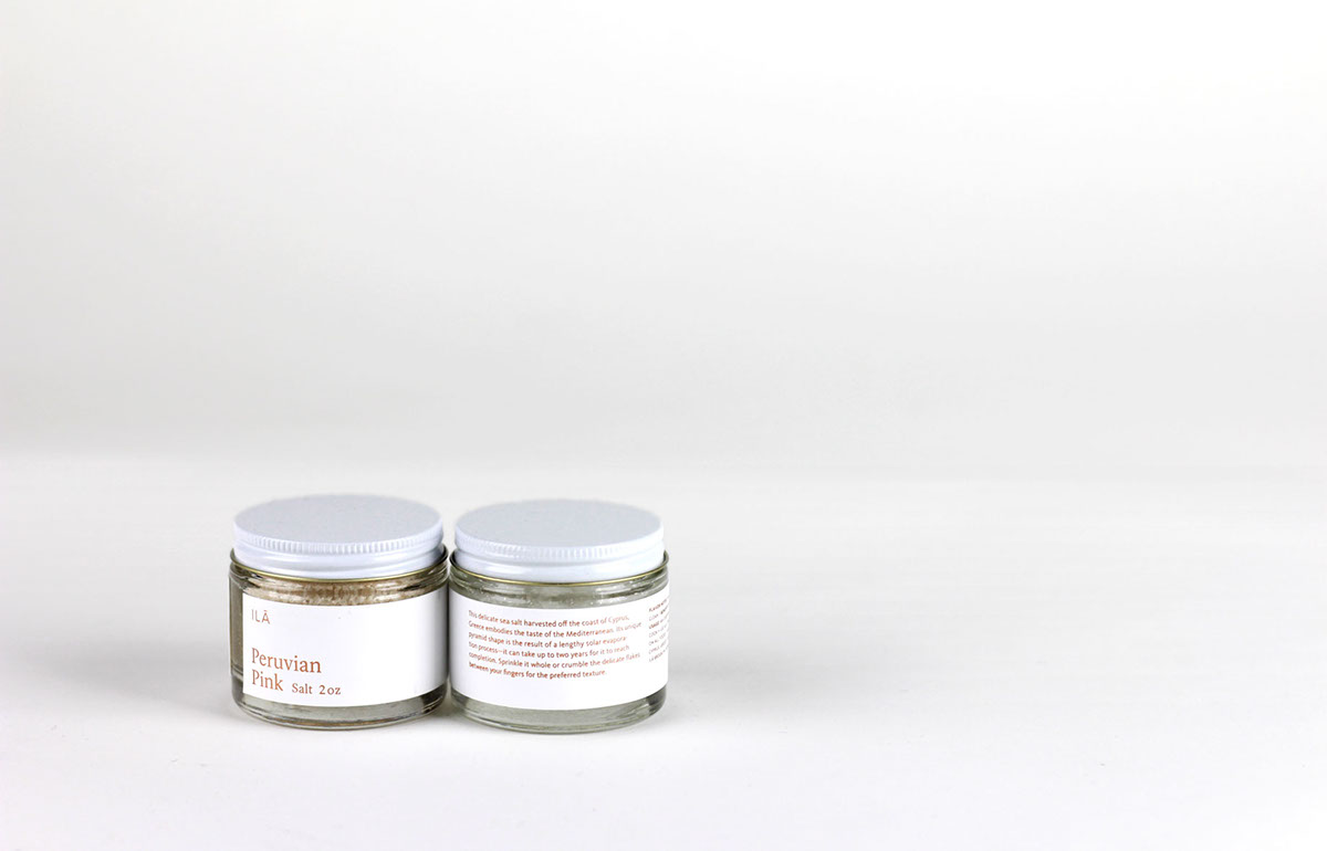
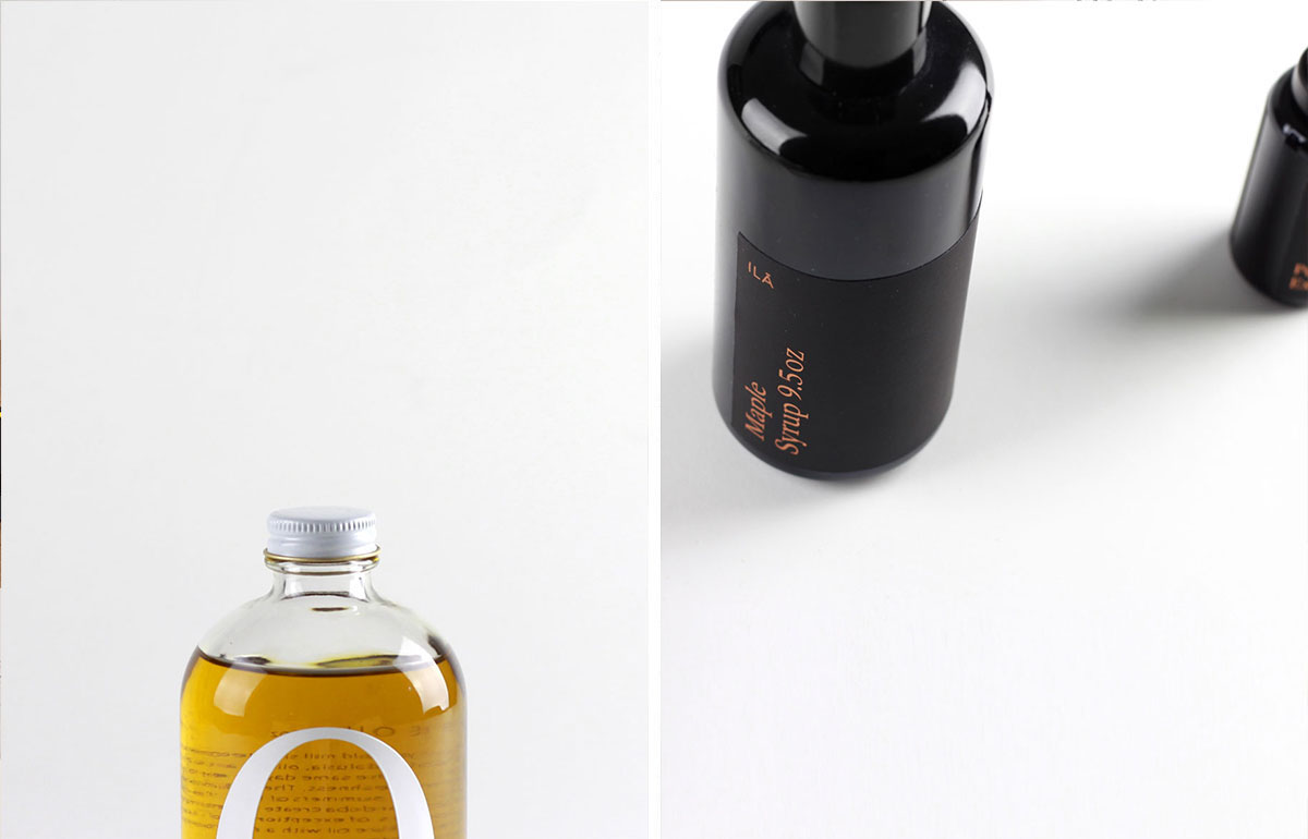
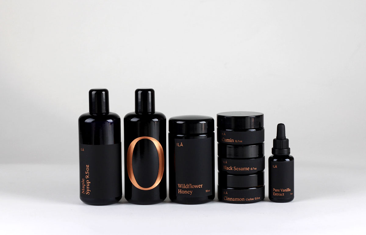
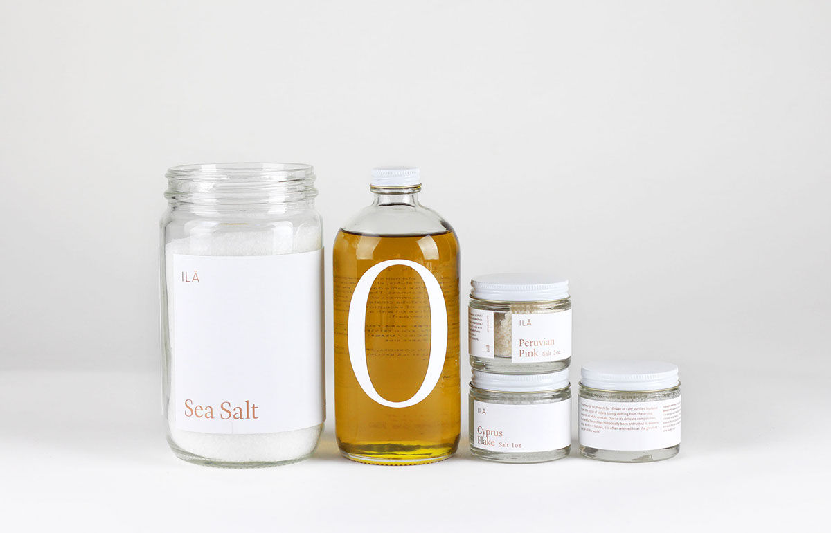
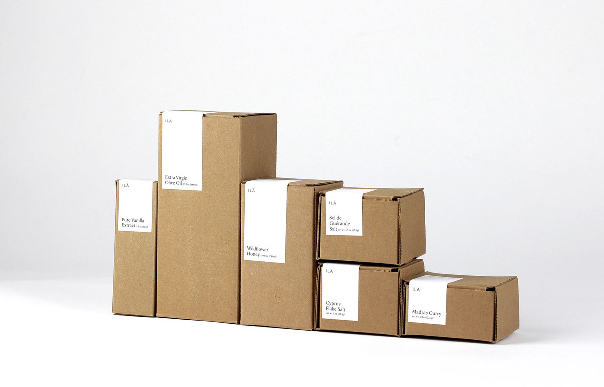
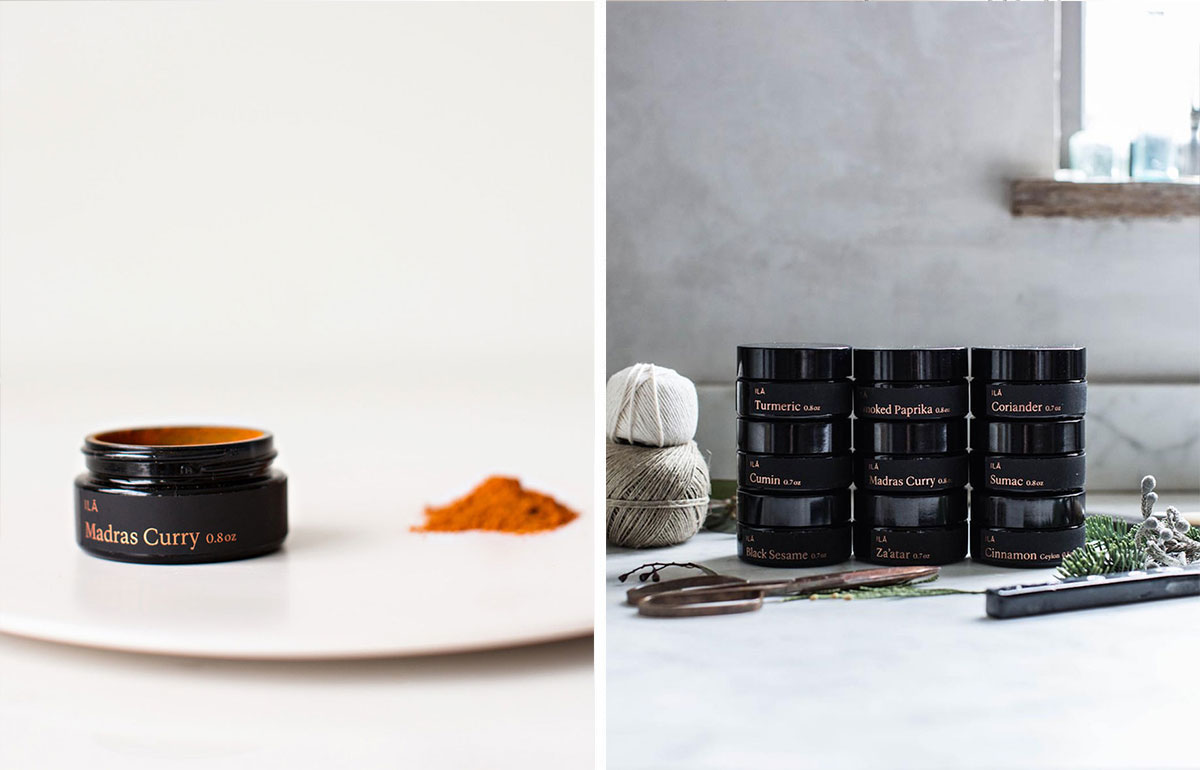
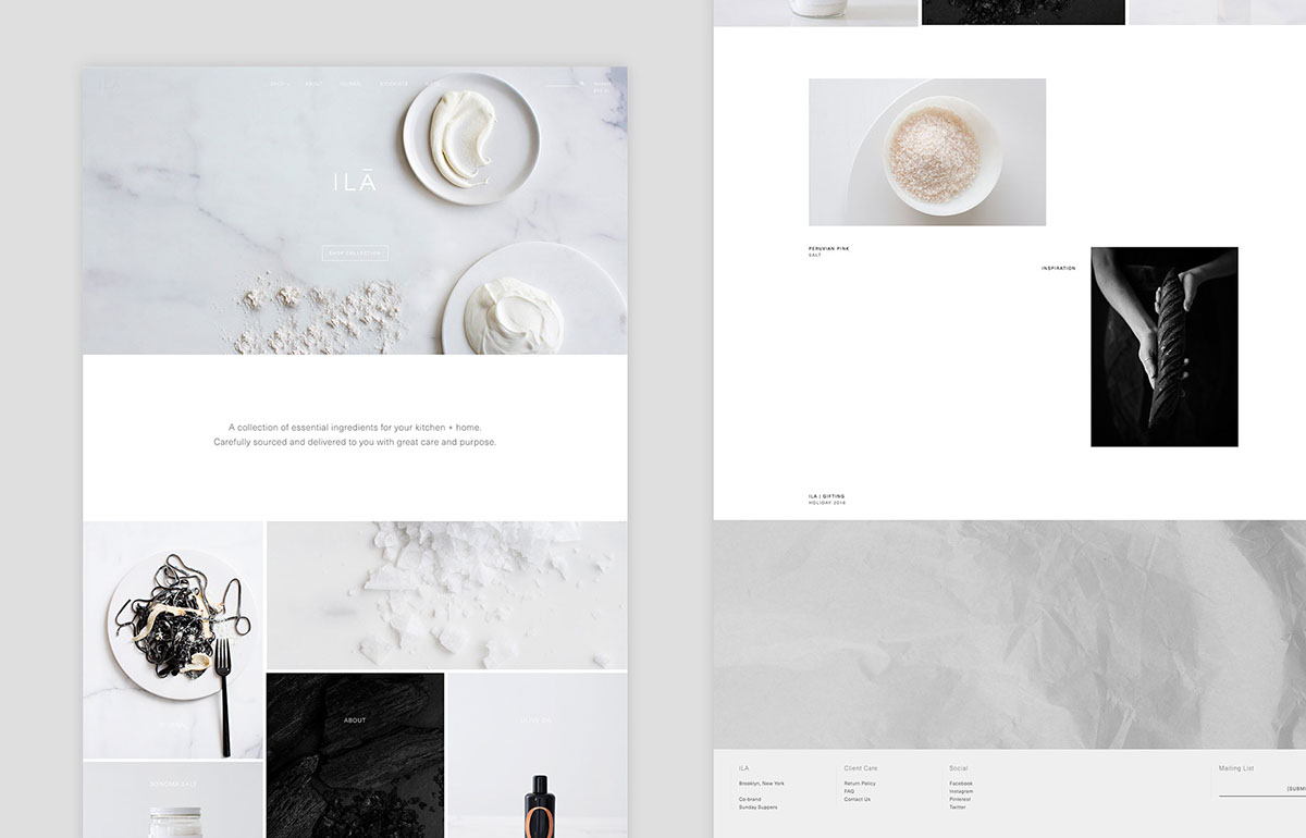
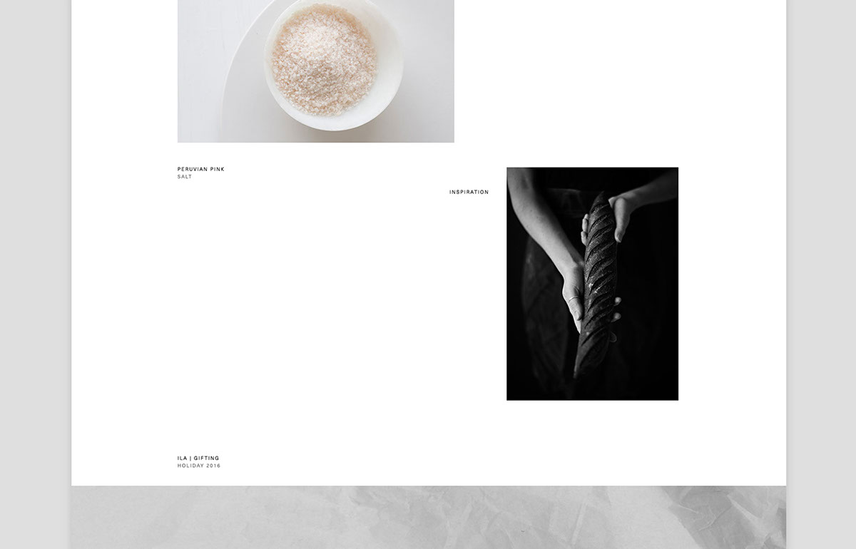
Going into the design process, we wanted to focus primarily on the word: essential. We looked to draw inspiration from the nature and story of Karen’s ingredients—being sourced from the best places from around the world. The purity of the ingredients stood out to us and we wanted to achieve a packaging design that stayed true to that aspect. The final packaging labels uses Neenah Plike paper in white and black with copper foiling. When applied to the gloss surface containers, the Plike stock creates a nice contrast with its matte smooth finish.
To see the website, visit:
www.ila-shop.co