
This is an editorial inforgraphic that I made for my digital storytelling class this month. We were given a pretty broad brush to design with, yet I made a decision to keep my project simple and clean. I like for information to be presented elegantly, so I made my graphic visuals neat and simple. The color scheme has two sides, positive and negative, which I wanted to use for the portrayal of good vs. bad. Yes, I realize that my brainstorming page looks as though it is something the criminally isane might throw together, but it works for me.


Here are two of the visual graphics I designed for my project.


My work space...
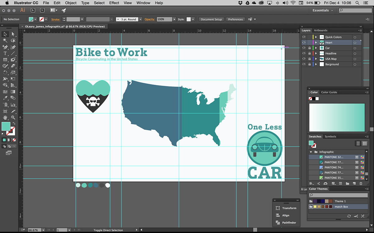
Here is my workspace with the guide lines visible. I designed a pretty simple grid system for image placement. It is a 4x6 grid with two wide verticle gutters and one horizontal gutter. The center was kept as a spacial area for my map bar graph. I gave myself four areas for type around the map. My color scheme was kept to six colors, four shades for information (positive), a background color and an 80% gray to use for car related (negative) elements. I also created a nice trick for myself in the lower left corner - my quick colors! I used the paint brush to dab the colors for my design in the lower left corner. When I need to color something, I am able to quickly use the eye dropper tool to change fills and strokes. I also have saved my my color palette under my swatches.


....and here is my final project. Every visual elemet was designed and created by me for this project. I am pretty happy with my design : )


