Cappelen Damm dictionaries
–
–
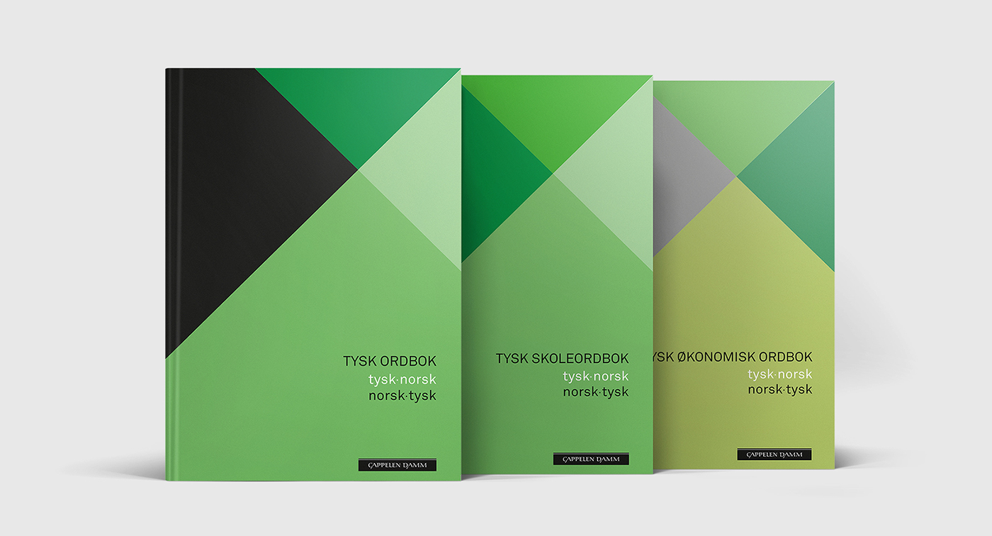
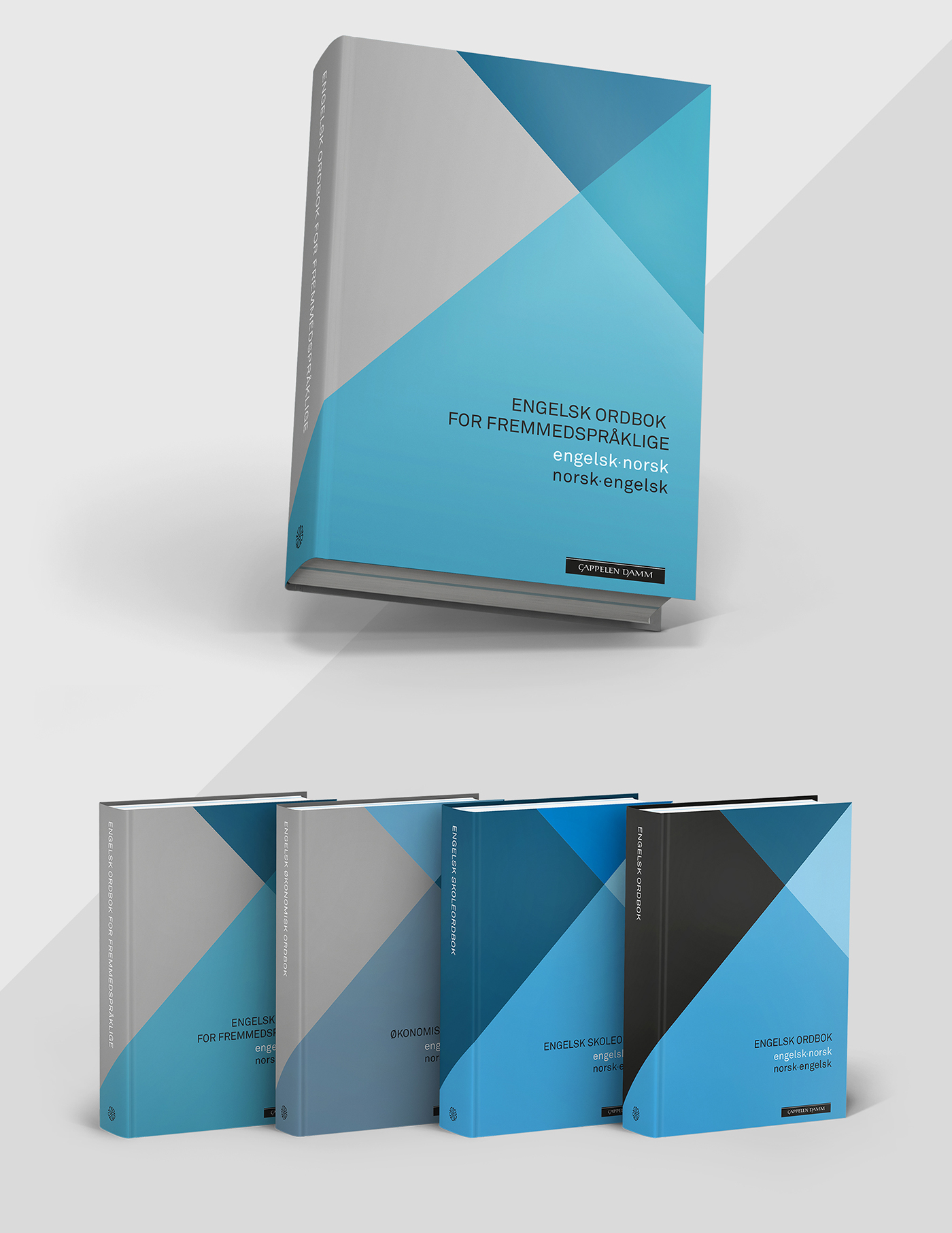
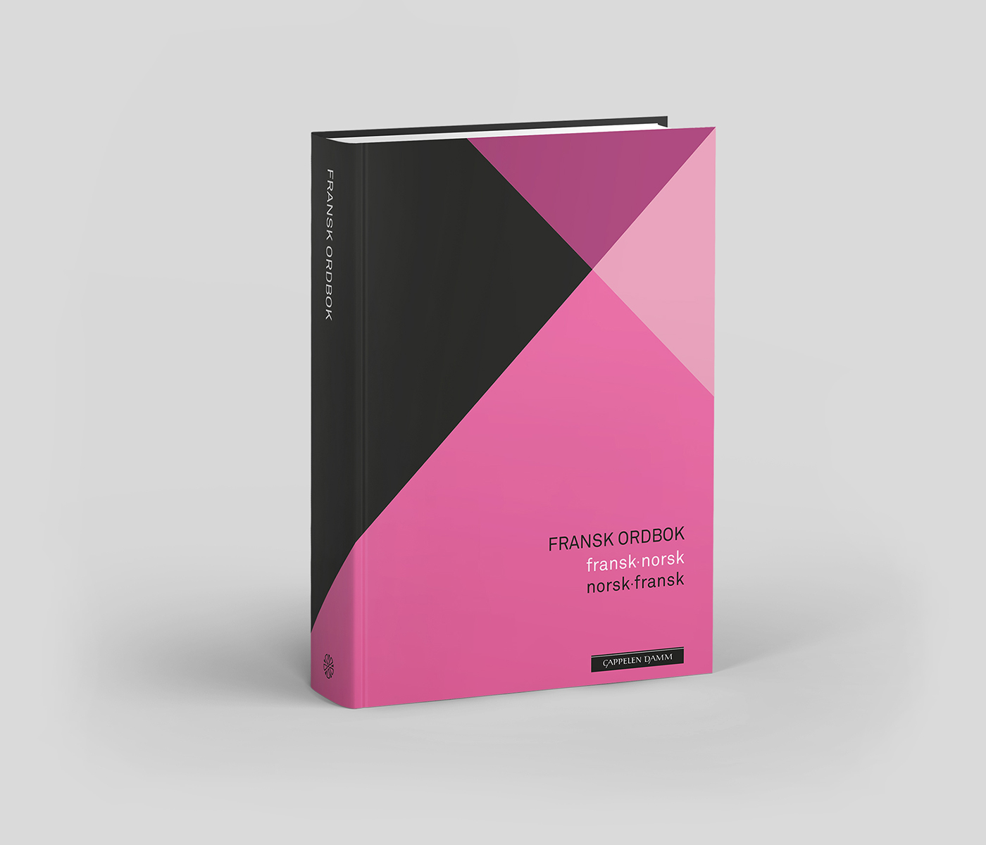
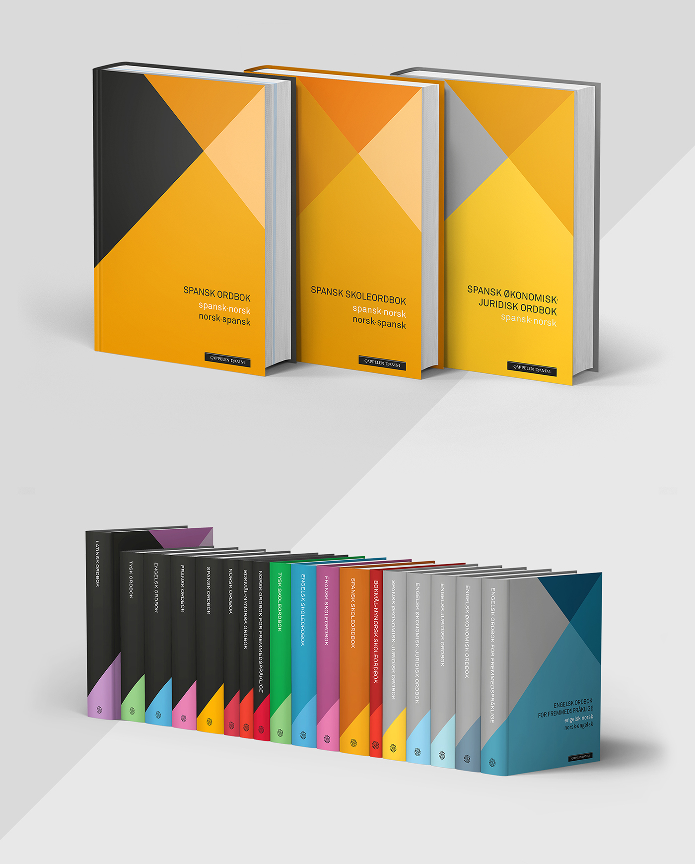
Tank was given the task to develop an iconic brand for
Cappelen Damm dictionary series. The solution includes
cover design for three series, developed for different
target groups. Each language is given a significant colour,
which appears on the book cover.
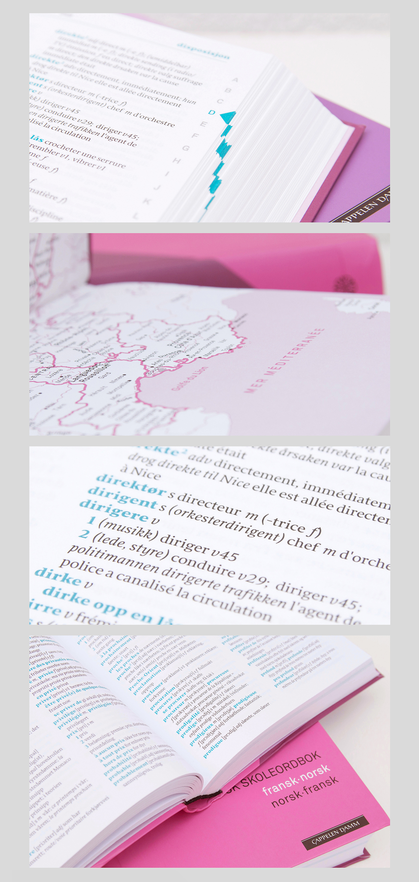
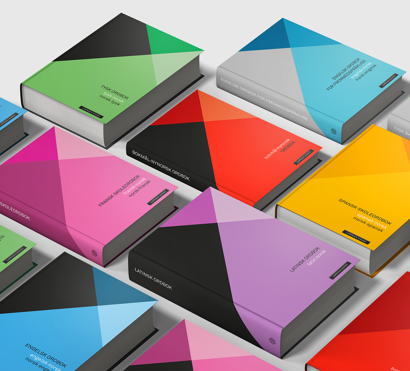
The design of the book matter is consistent for all series
and languages. Tank chose the font Sirba(Type Together)
after a thorough research process. The font was chosen
for its esthetic qualities as well as legibility in small sizes.
It´s complex yet friendly, and provides necessary faces
and contrasts which are needed in a dictionary. The main
entry words are set in bold and a significant colour through
all the books, improving legibility and helping the reader in
finding the word in question.