A brave idea for a business needs strong branding.

The owners wanted to open a totally pink café and shop. We wanted to help them infect the inhabitants of Poznan with their idea.

We decided to launch the “Pink Epidemic” at popular meeting spots in Poznan. In the brand’s Key Visual we suggested pink changes to the city’s symbols.


The pink-coated statues of the Bamberka and Stary Marych directed the customers’ attention to the new place and helped make remembering it easier.

It is indisputably “the most pink cafe and shop in Poznan”.

When we undertake comprehensive branding, we guarantee its power and coherence. For RÓŻOVE: a Communication Strategy, Naming, a Claim, a Key Visual, Branding, Website (RWD), Corporate Identity, Ambient, BTL & POS Materials, Social Media Ads.

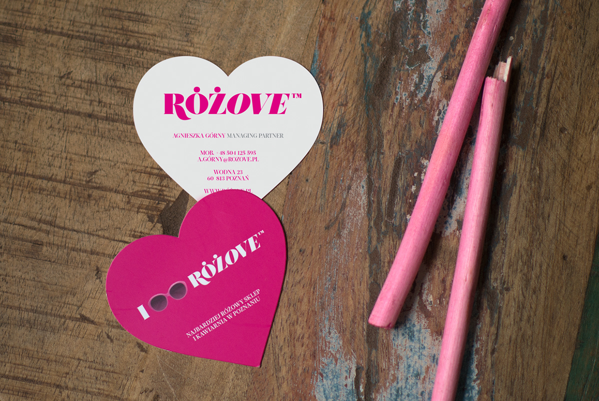
We support a brave idea by catering to every detail. All the materials associated with the RÓŻOVE brand radiate a love for the color pink.


RÓŻOVE builds its brand through honest and coherent communication.

Each material channels the same benefits and emotions. Everybody that experiences them becomes “infected” with the same, positive, RÓŻOVE energy.

A once brave idea – today a bustling establishment that captures its customers hearts with brand-name accessories.

RÓŻOVE still astonishes its customers with its selection and unforgettable atmosphere. Birthdays, meetings, workshops, shopping – pleasure now has a new color!


The world’s most pink, positive and open spot has just opened in Poznan.
Różove – a unique concept of combining a shop and a cafe, where all the products offered are colored pink. Its brand concept and communications strategy has been comprehensively crafted under the eye of the agency Minima. The premises have been designed by the art studio mode:lina.
“We see the world through rose-colored glasses. We’re open to any rosé vibrations. Positive meetings, events, conversations, pink merchandise and pink snacks. Nothing positive is alien to us,” – Agnieszka Górny, one of the establishment’s owners, briefed the agency. The challenge was to create a communication in such away that channels the positive energy and dedication of the owners. The agency faced the complex assignment of building a brand, starting with the brand name and logo, followed by key-visuals, a website, and, finally, Facebook. The key-visual is based on the idea of ambient (elements of the Bamberka girl and Stary Marych statue having their color swapped for pink) in order to evoke the curiosity of the local community and highlight the love for the color pink.
The concept is grounded on the fact that the establishment has network potential, so symbols characteristic to a given city, with elements changed to pink, can help promote it in a different locale. The power of Różove lies mainly in the consistency with which it inspires people with positive energy through a sincere and coherent communication and, owing to its unique open kitchen, a homely atmosphere.


