

Food Packaging
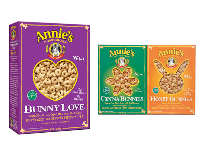
Annie's Homegrown cereals packaging design.
Annie's wanted to enter the cereal category so challenge was to come up with a "breakout" design that would get attention on a crowded and noisy shelf. This design used bold color blocking to create a strong presence and a shaped "window" photograph for appetite appeal and to show the product in a non-traditional way.
I even got to exercise my copywriting chops and coined the phrase "No icky additives or pesky preservatives".
I even got to exercise my copywriting chops and coined the phrase "No icky additives or pesky preservatives".
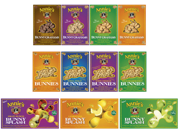
Annie's Homegrown packaging design system roll out.
The cereal design worked so well and was such a success that it was later applied to their pre-existing product portfolio too.
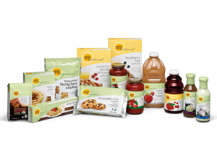
Packaging design system for organic and natural brand. SUPERVALU wanted to launch a new organic and natural foods private label brand. This system had to work across all packaging formats, shapes and sizes and also strongly differentiate between natural and organic products.

Brand identity and packaging design for a new Asian brand.

Emerald Nuts packaging design. This started out as a brief for a small evolutionary tweak to their existing design. A purple and teal foil pouch that looked like it came out of a 1980s movie theatre. I created this design as a far out "long shot" and they decided to rethink their plans. The client got so excited that, six months later, they had new TV spots debuting during the Superbowl.
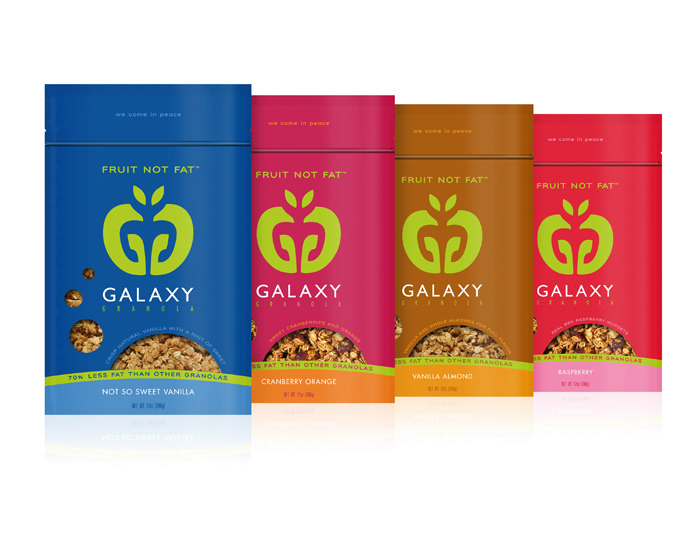
Galaxy Granola packaging design. A local company in Marin County, Galaxy Granola use applesauce instead of oils in their recipe. The product is therefore very low in fat and healthy as well as being pretty tasty! At first glance you read it as two Gs (Galaxy Granola) that make an apple shape. It takes some people months before they notice the Alien in the negative space…
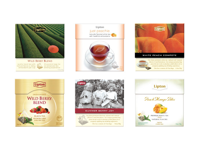
Concepts for premium fruit teas. Lipton had a product in Europe, fruit flavored teas in a unique pyramid bag, that they wanted to launch here. These early stage concepts explore a super premium positioning for the new product.
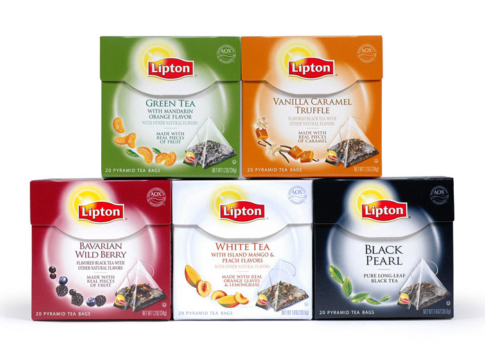
Final packaging design for Lipton premium fruit teas.
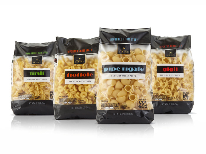
Packaging design for Safeway Select Italian Pastas. Created for Anthem SF.

Brand identity and packaging design for Good Start, Nestlé's premium infant formula.
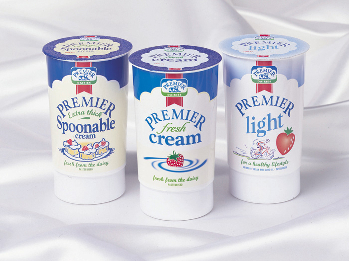
Packaging design for Premier Dairies.
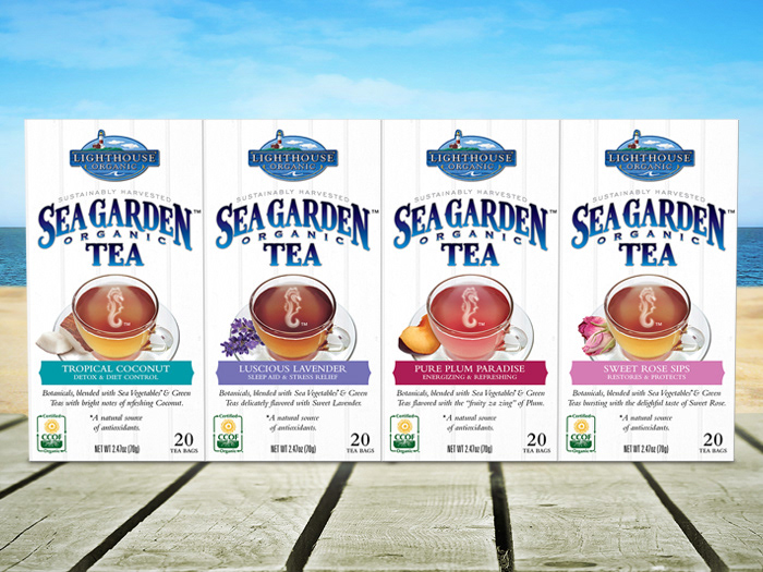
Lighthouse Organic Sea Garden Tea. Brand identity and packaging design for a new tea made from "sea vegetables". The company, based in New England, launched the brand in 2015. This design solution was inspired by the carved signage and design cues of coastal Maine.


The one that got away! This design for a redesign for Fantastic Foods was one of two that went into focus group testing with consumers. The concept of the global map and the top down view of the plate to communicate a "world of flavors" idea was winning in research but the moderator, in their infinite wisdom, worried that it was the food imagery that was swaying the consumer. The solution was to switch out this photography with the one in the other design. Problem was, that was not a top-down shot so the design pretty much didn't work with those shots at all and that was the end of that.


