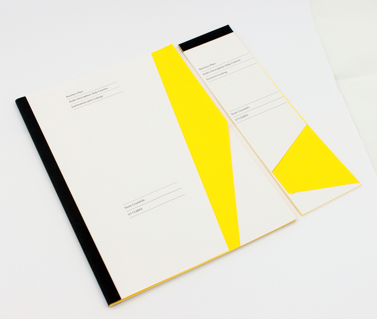


Part of my projects involves costing and planning the implementation of my work. I wanted to present this often very dry information in a more graphic way, playing with the visual language of an office environment by parodying the look of carbon paper pads.
All my text is designed to look like a pre-printed form, using dashed lines and a large margin to create a felling of mash production. On top of this all images were printed in black and white on the yellow paper, making them look like the carbon transfer sheet.
