BRAND IDENTITY for PRIVATE PRACTICE
COACHING PSYCHOLOGY SERVICES
BRIEF:
1. Symbolic, abstract mark, which express an idea of: self love, self esteem; freedom and rejuvenation of female's self confident. A logo which picturize woman's internal beauty.
2. TYPE : signature looking type of tricky Czech characters (the need of diacritic "dashes" limited our choices).
3. Colors and it's range were not clearly specified. Logo style was defined as : Creative, Clean, Simple...
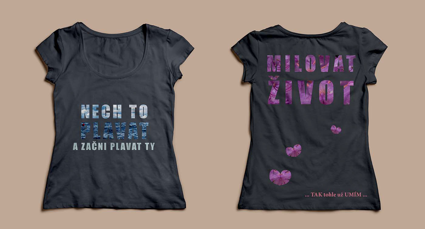
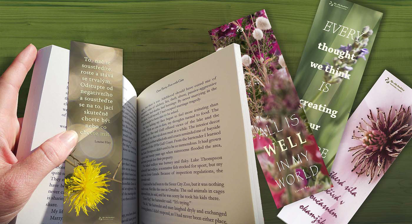
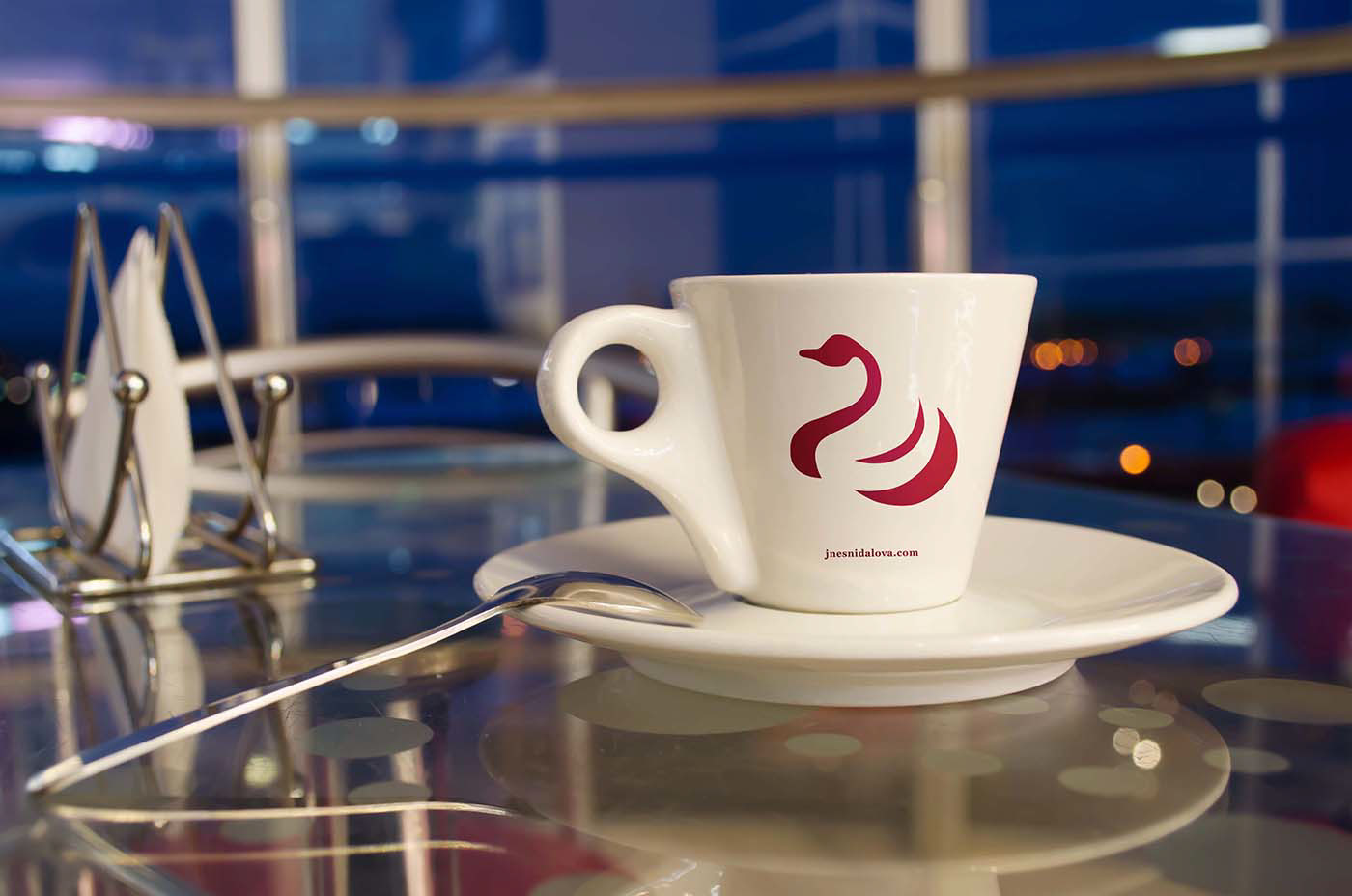
4. Main usage of the logo: web-site, small print-outs, stationary, series of e-books and printed book's covers, CD's covers, print on demand small gadgets.
5. Initially I was asked to combine symbol of blooming flower (a rose) and a heart. So I drew dozens of those two in various combinations and scale. With no great success I'm afraid... With those particular tandem of rather overused motives...it was hard to avoid a tattoo looking design ;o)
5. Finally client decided, that the symbol she really would like to have as an own brand mark... is a SWAN, created with strokes-like looking elements, no solid shapes.
I love graphic stylization and enjoy drawing animals... so I quickly sketched a wedge of swans and one of them happily won the competition.
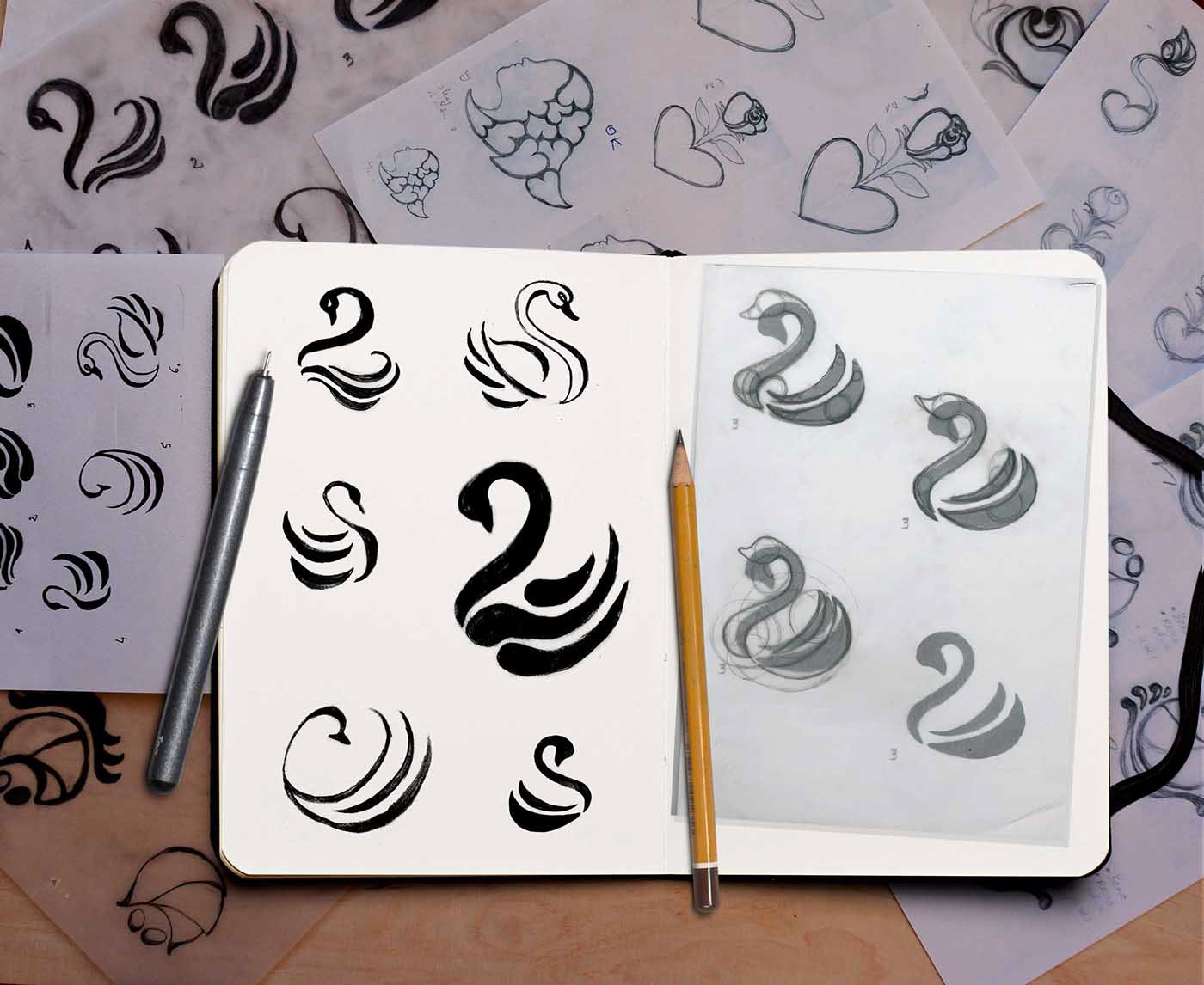
Trying to find a proper script font – free, easy readable, elegant looking and... equipped with all those Czech dashes and others diacritic marks
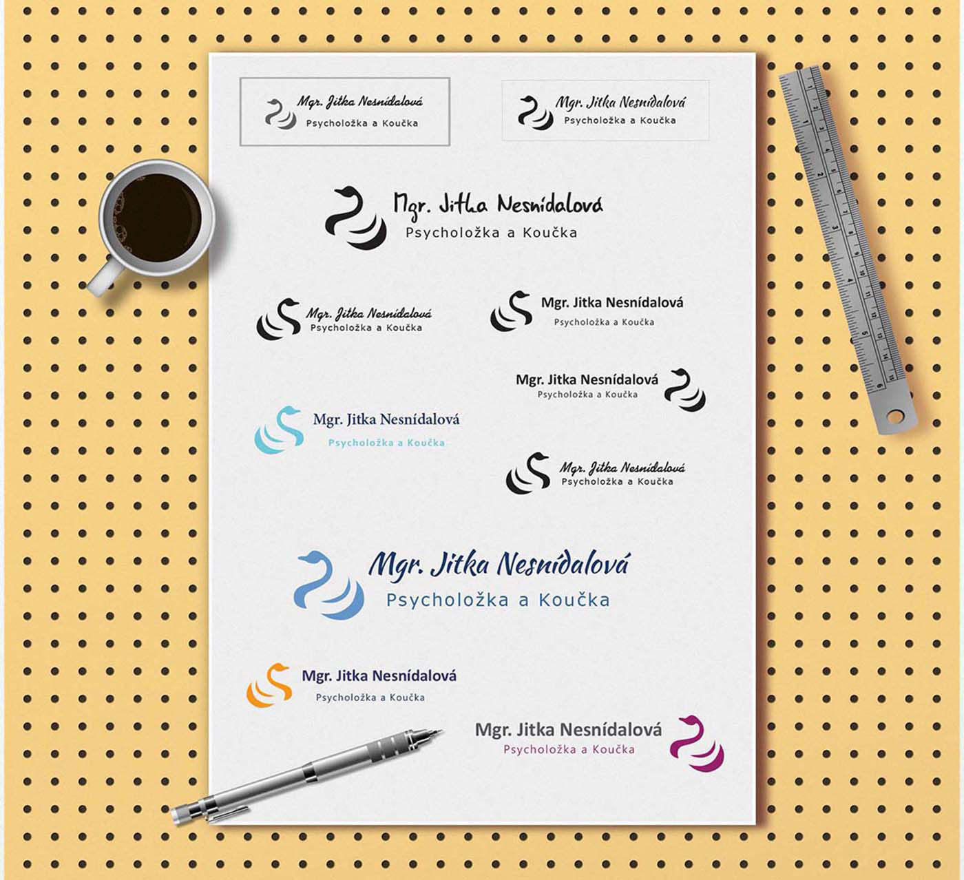
Creating a brand identity design for a small business we must
think about the most economic way of final usage.
It's easy to design a stationary set for professional offset printing.
But how to implement your design for avarage home printer and its unpredictable way of processing your neatly, polished design?
We want it or not, clients often need to have it not as high quality and safe *pdf file, but... as a MS Word document template... So we must keep in mind the Word's colour's limitation and the artificial 3-5 mm margins, almost all plain home printer have had defined.
CD's covers for audio books and other audio materials
(on-line couching course)
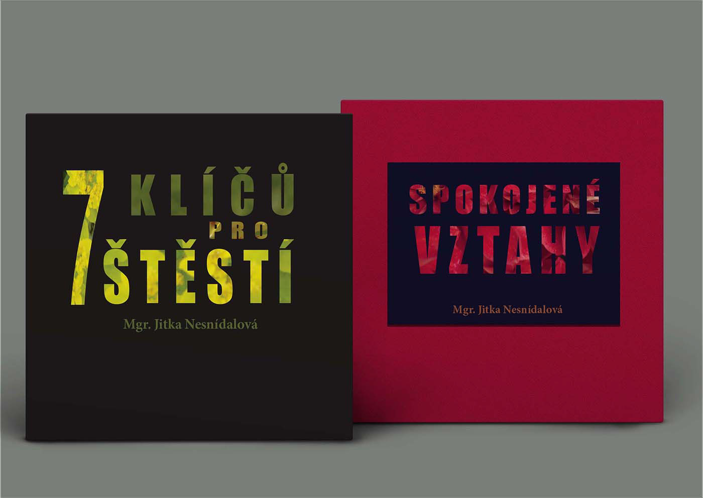
Covers design for the various course books
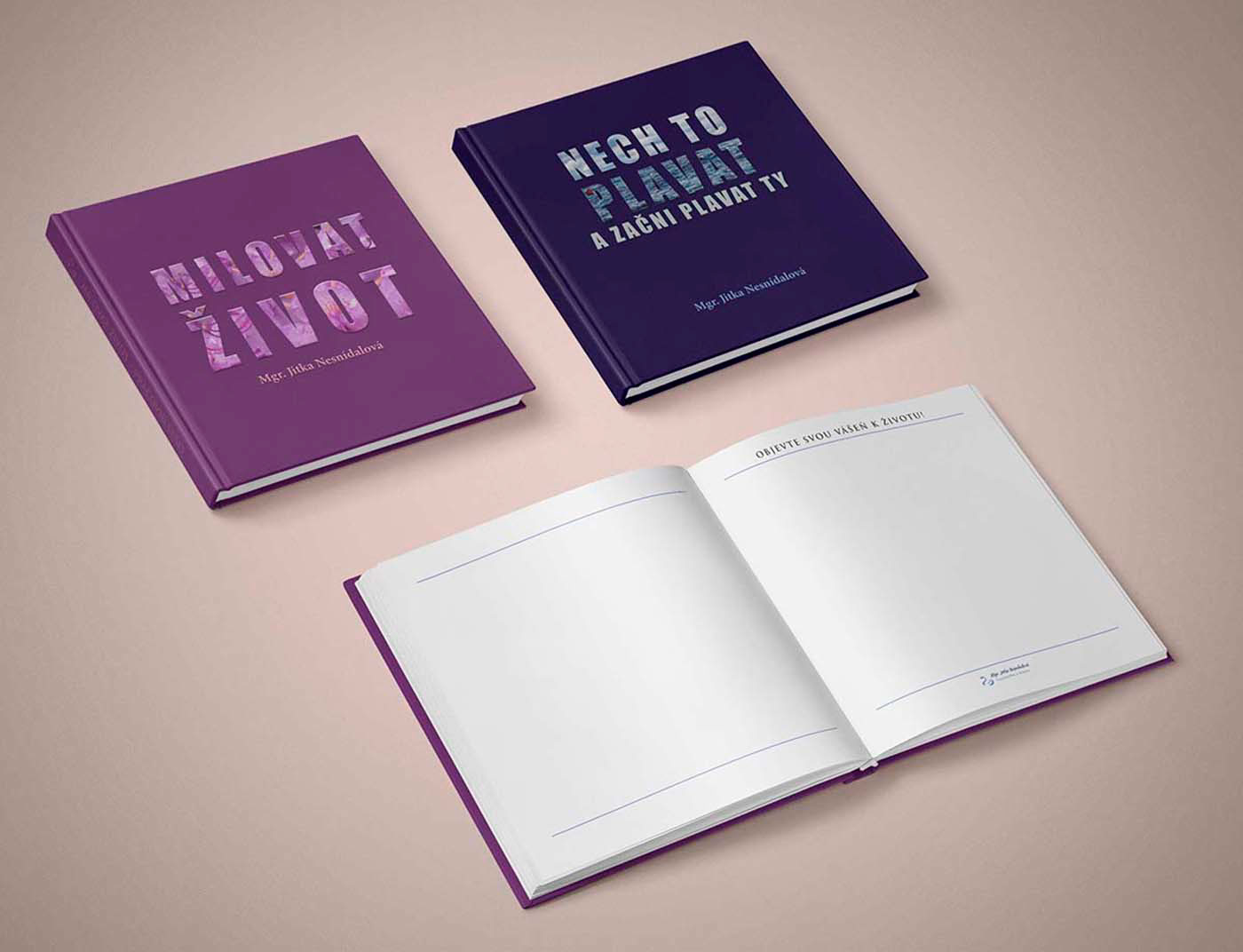
I needed to design them as series of books, which could serve as the note books, diaries, work books.
So I decided to keep the solid looking font and change only the photos for every book's background, choosing them by purpose – according to the topic of the particular course.
I kept in mind: symbolism of the used photos and cover's colours (love, hope, our BLOOMING life or... WATER – "let it be/go and start to be yourself " (in Czech is expressed by quotation Nech to plavat...
– "let it float, drift... and start swimming"
Alternative, made on demand more girlish "light and bright" style of books covers.
5 different titles needed to be design in a consistent style, so they visually have a 'series look'. I decide to differentiate them only by the background colours filters. I've chosen light yellow for its optimistic look and good readability.

Thank you for watching!
I appreciate any comments you may have


