


—
PROCESS
VJTimes was the old type used for text, a custom (increased x-height) version of the Linotype Times


As based on Linotype Times, VJTimes kept a lot of the inconsistencies and strange decisions accross the family...

... which were obvious things to improve

Contrast was far too high in certain parts of the letters for a text face. It was also a big problem in rotogravure printing

Also considering the family, the semibold was made lighter to better mark the transitions and allow for finer typography

Caps had their weight and proportions balanced to the lowercase – and gained a more contemporary look

Distinct sets of diacritics were made for upper and lowercase – they were also positioned correctly


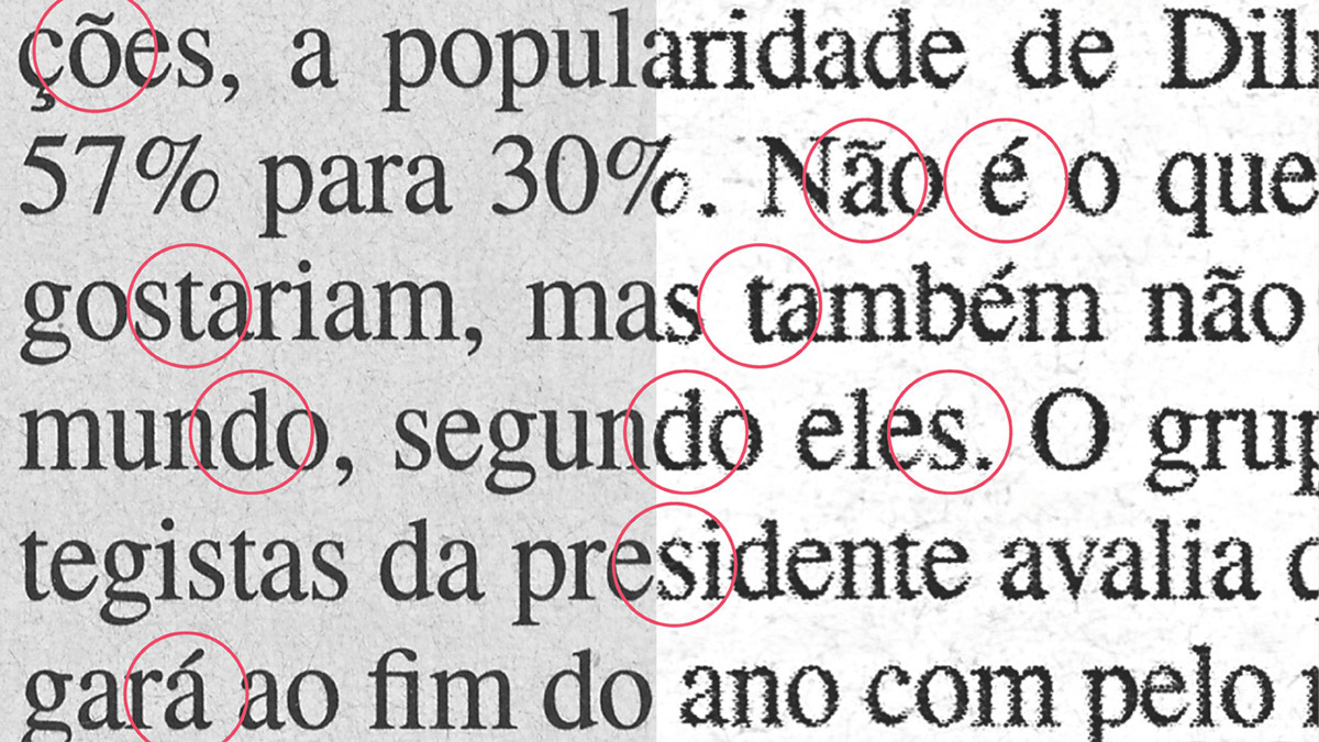
Screen optmization (hinting) between the old VJTimes (first line of every group) and Veja Serif (second line)

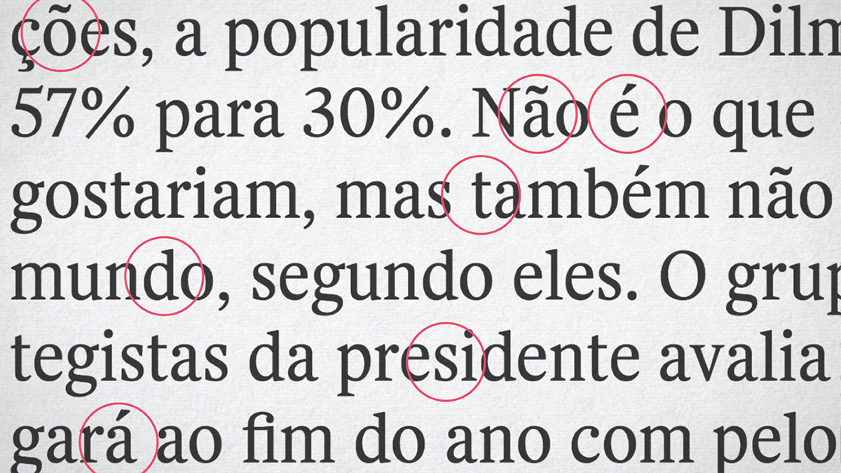
Closeup of common screen reading sizes. VJTimes (first line of every group) and Veja Serif (second line)


