It's a piece of cake.
OVERVIEW
Savor is a cooking magazine targeted to young, professional food lovers who are interested in having a greater role in the kitchen world. Its goal is to connect the audience to the latest cooking trends without making it a hassle. This magazine provides a new approach, making cooking easier for a fast-paced lifestyle. Savor is for the manly man who takes pride in cooking the food they have hunted. Savor is a confirmation of how simple and fun cooking can be; making bold statements. Savor is the new way to cook.
STRATEGY
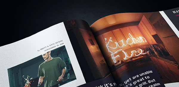
The content of the magazine ranges from cooking tips to recipes to best places to eat. Savor is built in a strong layout that allows permutation from article to article leaving room for individuality. Savor showcases a light and easy to navigate layout; a content focused magazine that will reinvent cooking. Savor’s identity is a statement of masculinity and style. Savor emphasizes in keeping it simple and it reassures its masculine approach by strategically placing advertising pieces.
SOLUTION
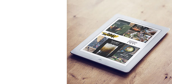
Design-wise, the magazine needed a light and simple layout that could feature easy reading articles. Text and images were key in this project; every text and photo were designed and developed in order to appeal and function. Bright colors, sharp high-quality images, and bold typography helped every article to be authentic and to have personality. Savor masthead suggests the ability to change by interacting with the image in place; an adaptive logo treatment that blends into perfection with its context. Copy also played an interesting role in this design process, making bold statements, Savor embraces a reinvented cooking lifestyle.