Washington State Convention Center
Elevating the Guest Experience
Seattle, WA
The voicemail was from the wife of a long ago co-worker with a request to contact her about a project interview. With that call, we began the design of the new Interior Environmental Graphics Program for the Washington State Convention Center.
WSCC has over 400,000 visitors each year, and the graphics and sign system to greet, guide and direct guests didn’t present the Center in the best light. Our client referred to the wayfinding as ‘airport signs’. This wasn’t a big surprise, as the architectural firm responsible for the original building and signage designed dozens of airports each year. He hated the signs. We told him we could help and got the assignment.
Tired system, outdated technology
Built on a challenging in-city location, the success of the original building led to the creation of three expansions, spreading across several city blocks and creating the largest meeting and event facility in Washington State.
There were several problems with the existing graphics program. Somewhere along the way, the design vision of the original program was lost, along with the building blocks of a good communication system: consistency, continuity, and a design language that connected with the audience. Sporadic updates resulted in a confusing mix of directions and a breakdown of the hierarchy needed to direct guests from the entrance to their meeting room and back out the door to their hotel. Contemporary technology features were absent.
From Complexity to Confidence and Comfort
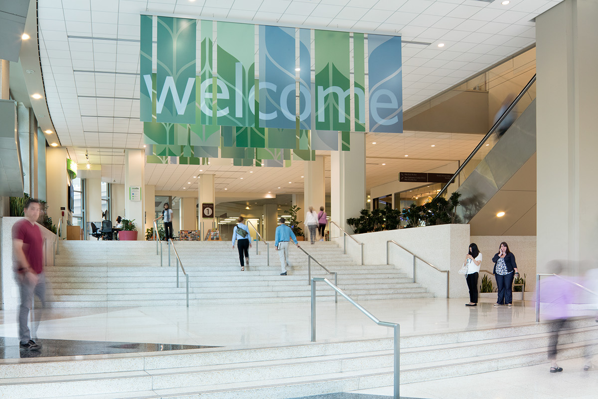
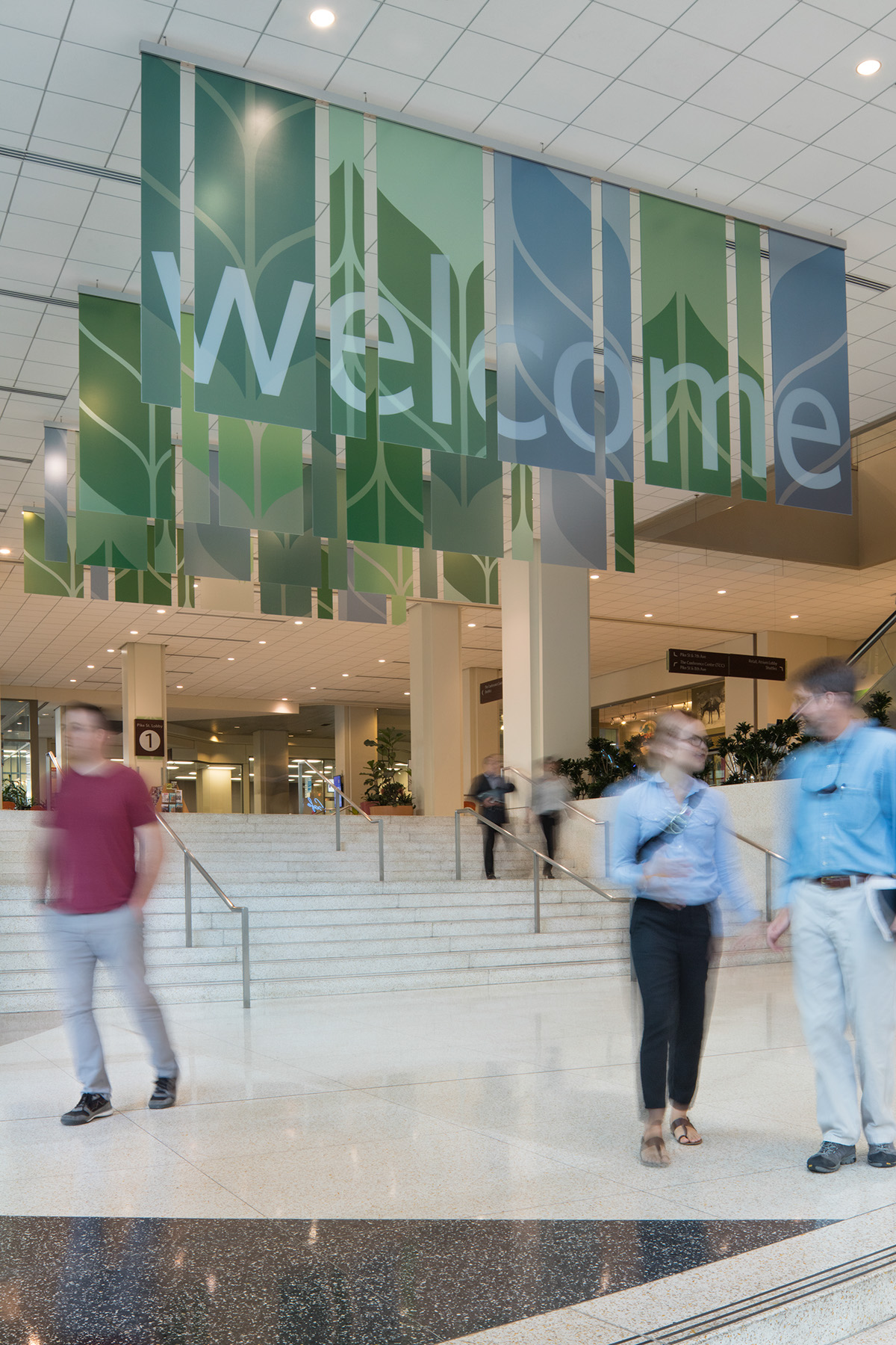
EHS Design led the $21 mil. interior renovation Master Plan, and had recommended changes, including adopting a hospitality tone. The new interior design includes refreshed colors and materials, finishes, lighting, furniture, and a new fireplace, a popular gathering spot for guests.
We told the client team we could build on the hospitality theme and improve the User Experience. Our design goal: develop an easy to understand, branded information system to help users navigate with confidence and comfort.
Our team felt a friendly, approachable design was needed, and required a solution signaling a new era, with a final product authentic to the existing and updated spaces.
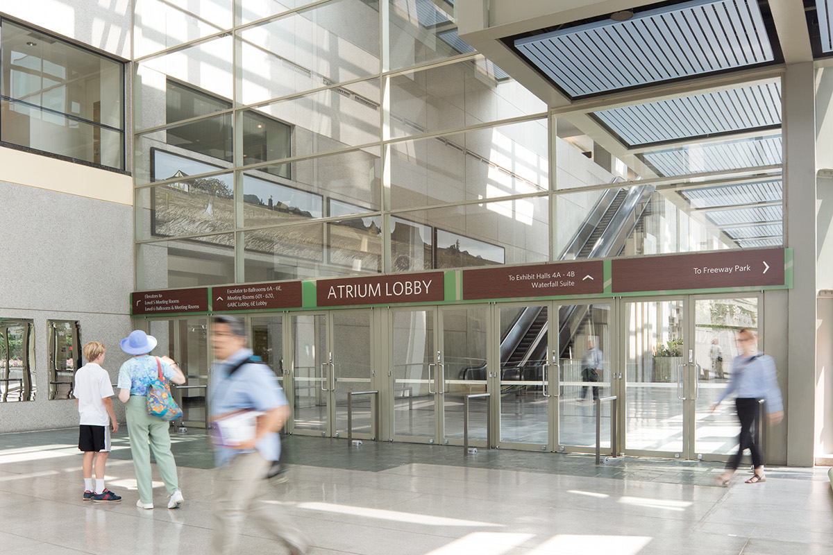
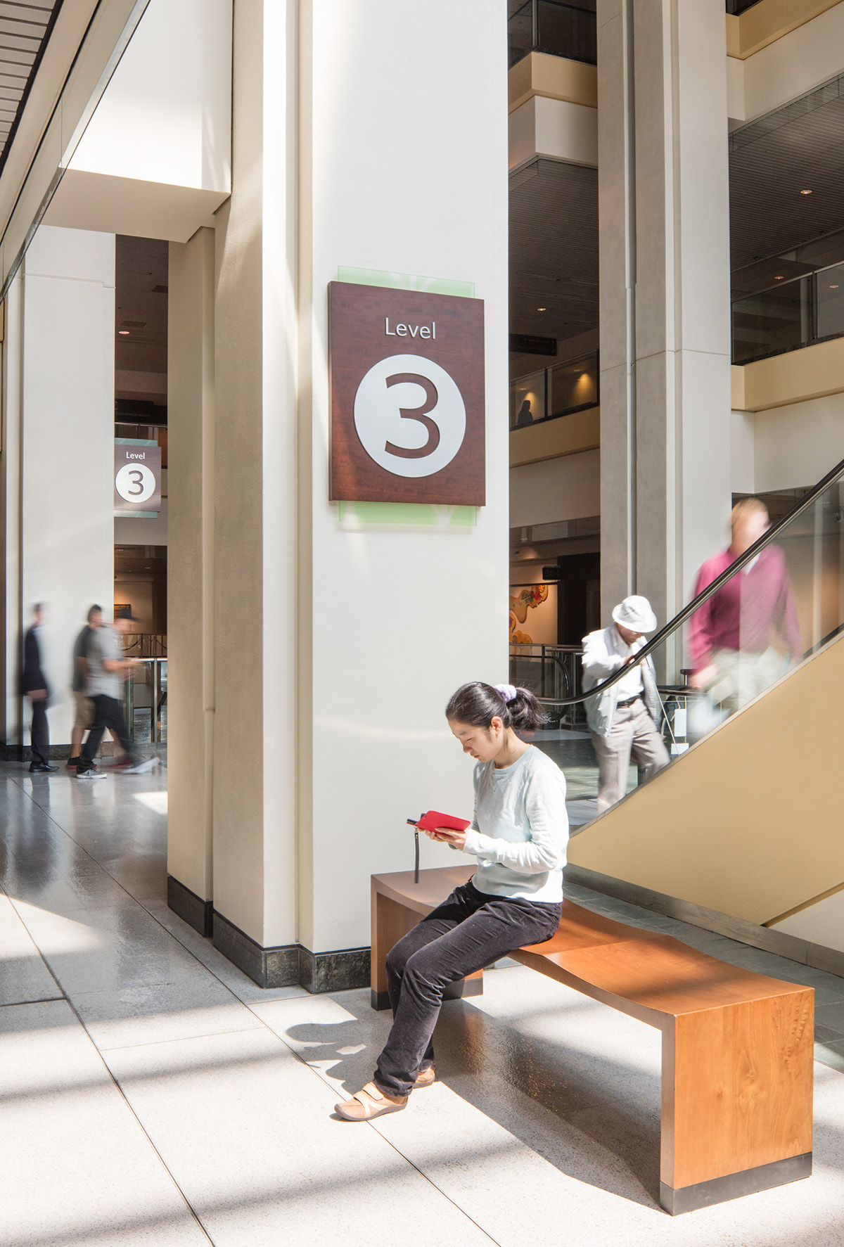
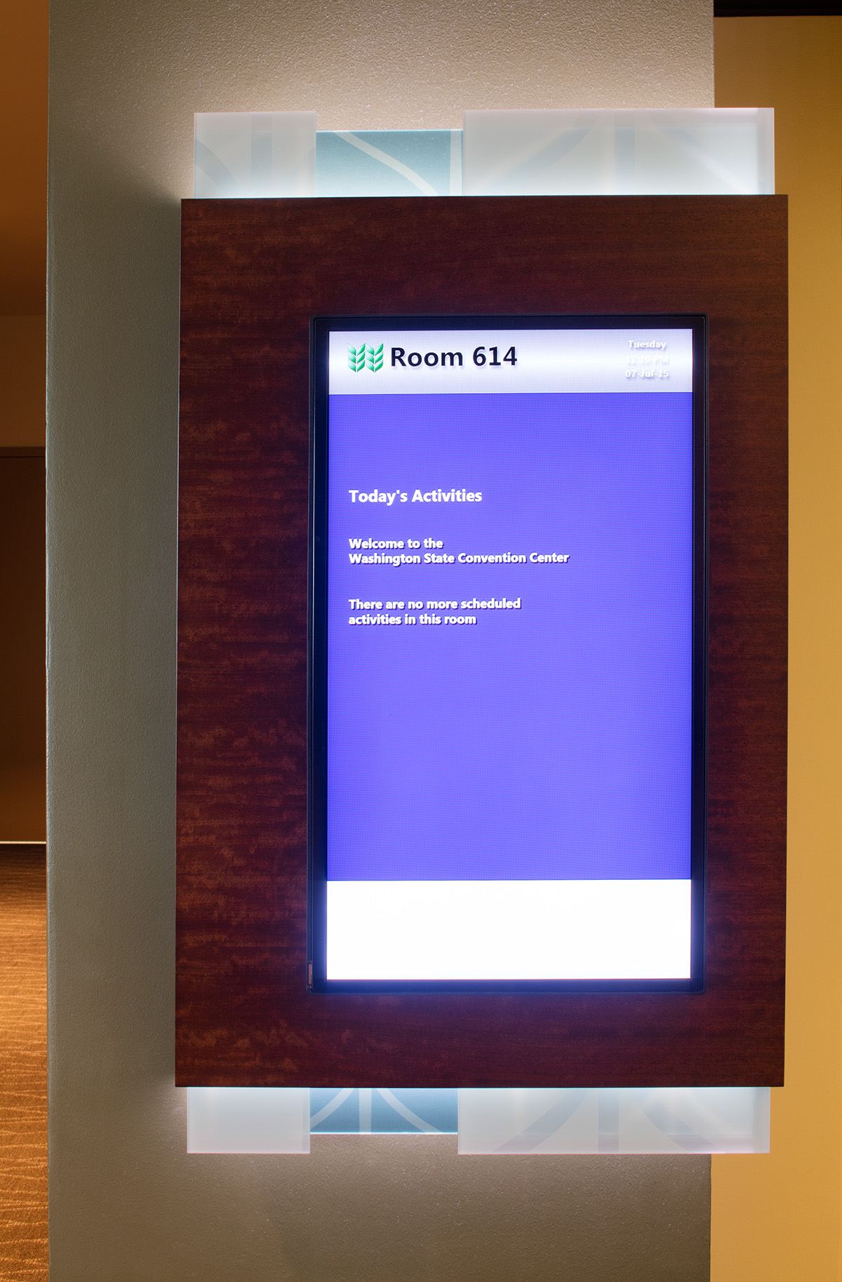
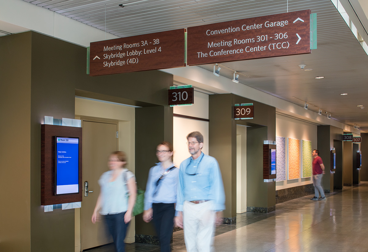
The overall design is deliberately oriented towards a clean, contemporary look. The color palette includes warm brown wood, greens and blues, and silver accents. In addition to this foundation, we incorporated the WSCC logo and color palette, embedded in 3form, a translucent, co-polyester resin, which has a soft glow when illuminated. To add to the contemporary feel, we choose a clean, modern typeface, and designed the signs with a thinner profile. We added a Red Carpet treatment to greet visitors, incorporated technology at key locations and developed a consistent, easy-to-follow graphic language for visitors.
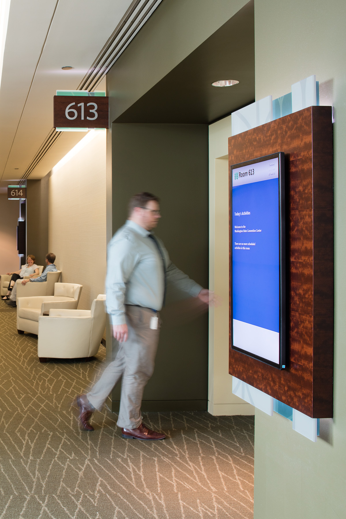
The initial Phase of the Environmental Graphics and new technology is in place with the second Phase complete by the end of 2014. For a preview: https://vimeo.com/106017905
In the end, we've improved the user experience and brought a unique, site specific, and highly functional Environmental Graphics program to WSCC.
Thanks to the project team: WSCC, EHS Design, Square Root Design, Tube Art Sign and Display and the MCD team.

Credited: Lara Swimmer. Lara Swimmer Photography.


