Logo and Branding
AKI-TO
The Brief: The aim of this project was to explore a brand identity for a Helsinki-based hotel called AKI-TO. This particular brief was taken from briefbox.me and was used as a self-initiated exercise for myself to better my skills as a designer.
The Briefbox Brief: A luxury hotel is opening its doors in Helsinki, Finland. The owner is looking for a young designer to create their new branding. The hotel – owned by two young Finnish architects – is all about modern simplicity; the interior especially emphasises their love for minimal design. They want their brand to reflect the hotel and its architecture.
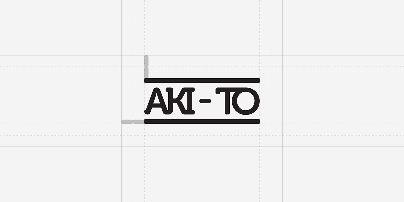
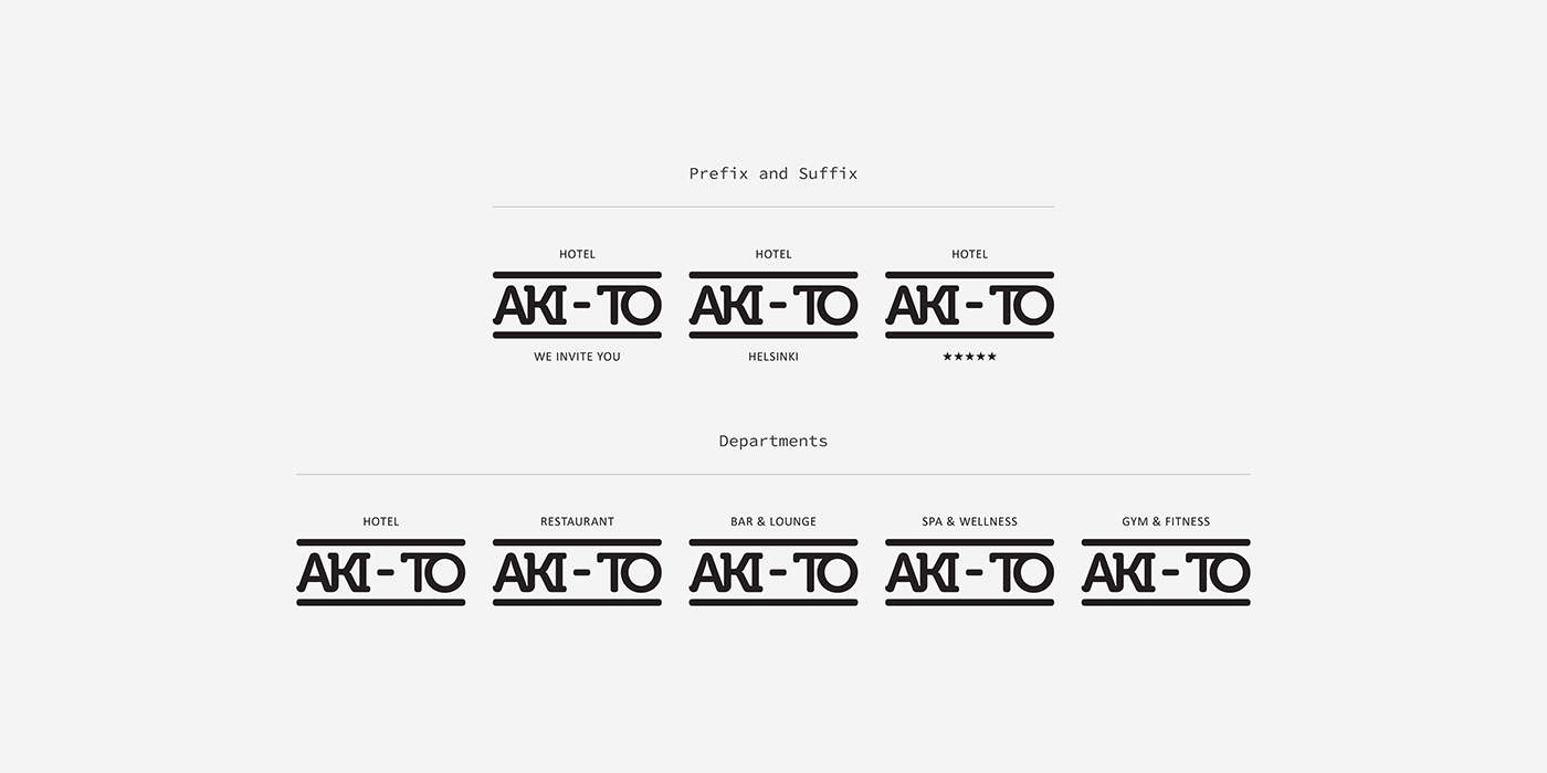
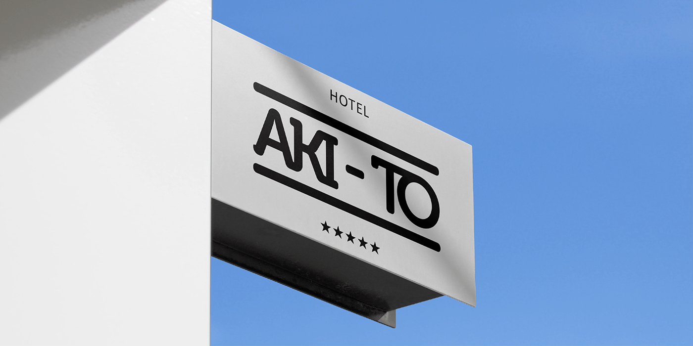
The Outcome: The result is an easily identifiable and minimalistic wordmark that sports a play on the Museo typeface. Museo was chosen for its characteristic and charming appearance as a slab-serif font. This, along with the careful use of an upper and lower thick frame for the logotype, accurately reflects the blocky and slab-like appearance of modernist architecture of the Regional Functionalism style in 1950s Finland.