JYOC | Johannesburg Youth Orchestra | Rebrand
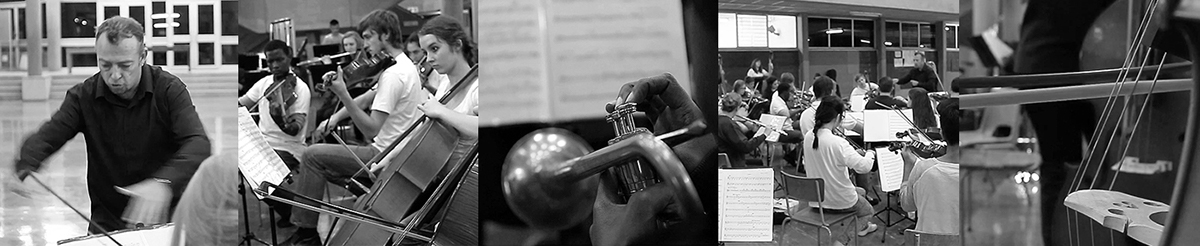
The Johannesburg Youth Orchestra had lost relevance and needed a new brand identity that reflects what it is today — an orchestra for the modern age. Ways were explored to capture its essence in design. How the sound of the orchestra be translated into an identity? Experimenting with notes, instruments and arrangements, the answer was found.
The Concept
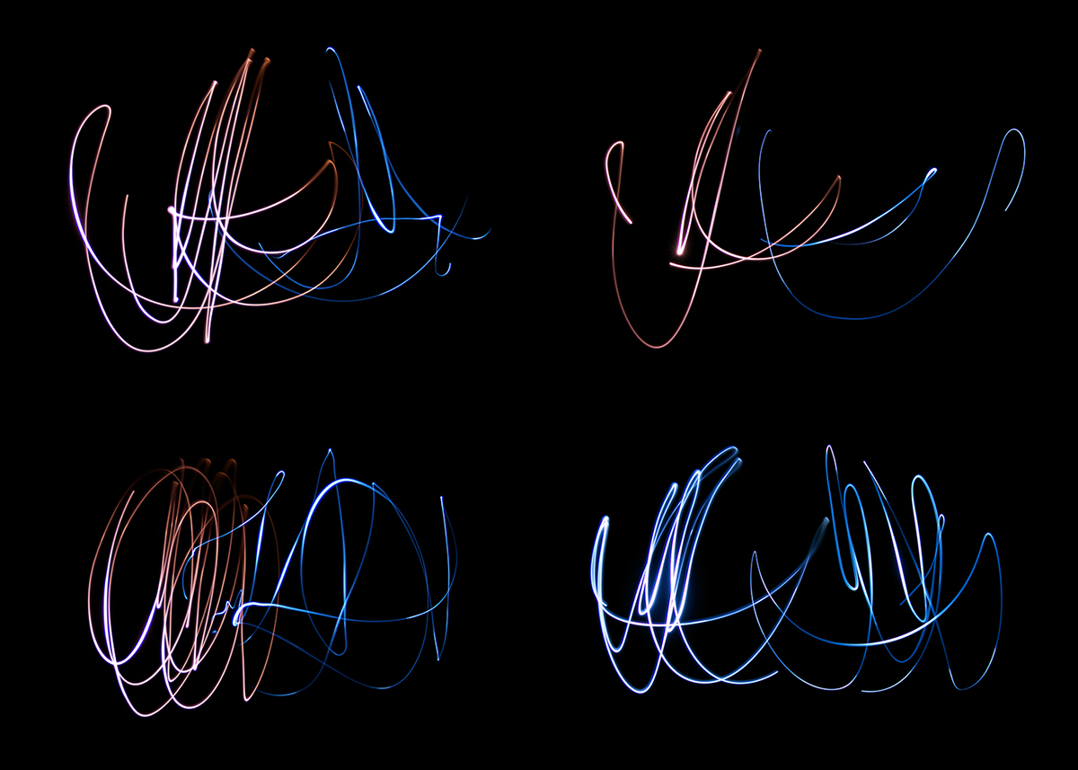
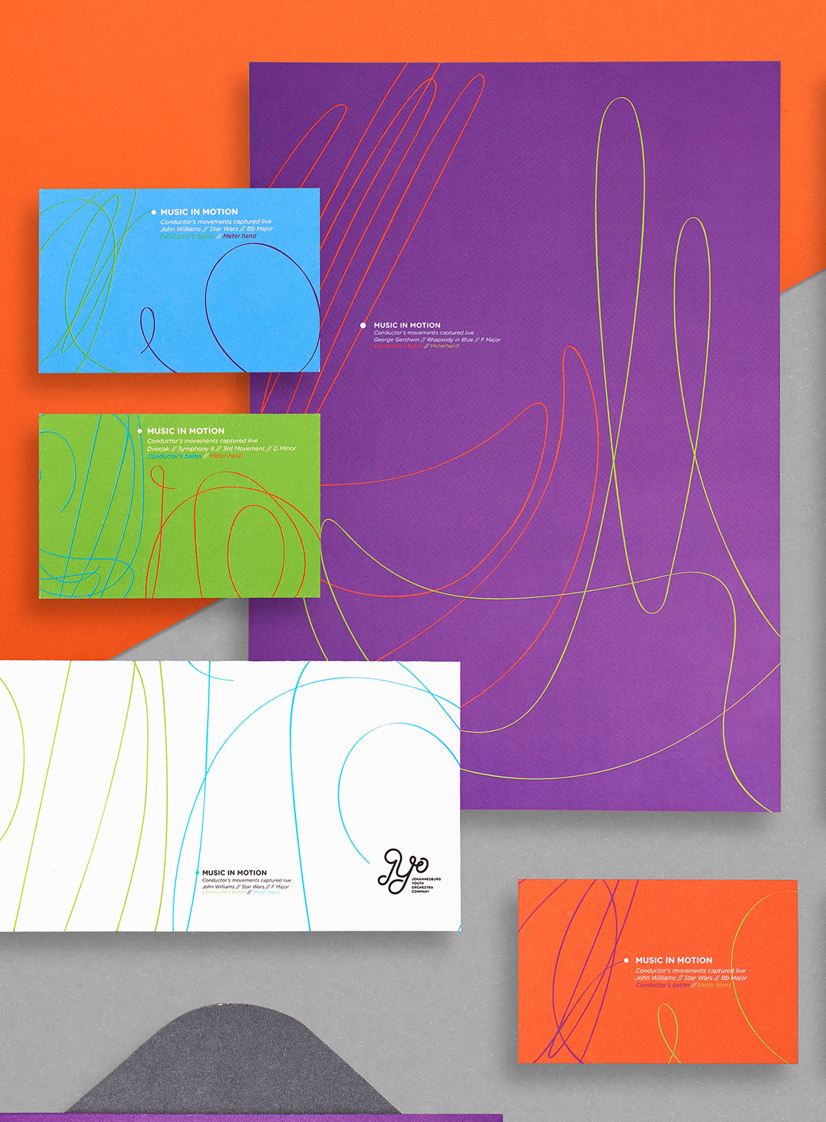
The conductor was turned into the designer and the paintbrush was given to the person who brought the music together. Tiny LED lights were attached to the conductor’s baton and timing hand, and then he had to do what he does best in a blacked-out room. From there, the light trails he created were captured with a camera set to long exposure. The fine lines and organic movement of the music created an endless pallet from which shapes and lines were pulled to build the logo and visual identity from scratch, from the darkness.
The Result
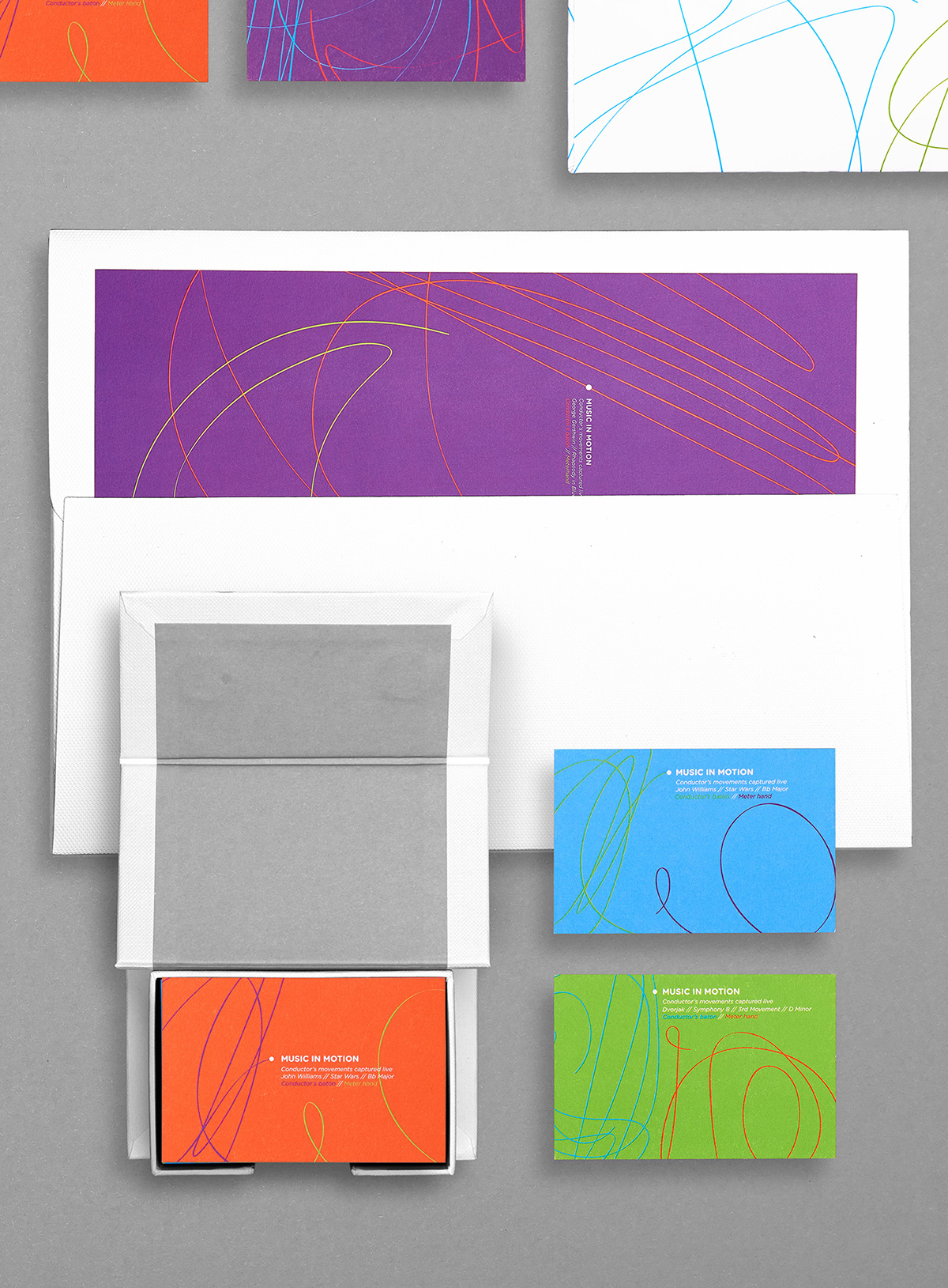
Refining the recorded strokes, a new logo and visual identity were forged for the orchestra. These strokes were contextualised with information that landed the idea and, with different songs for different elements, the rebrand was entrenched across stationery, communication and even the orchestra’s new building.
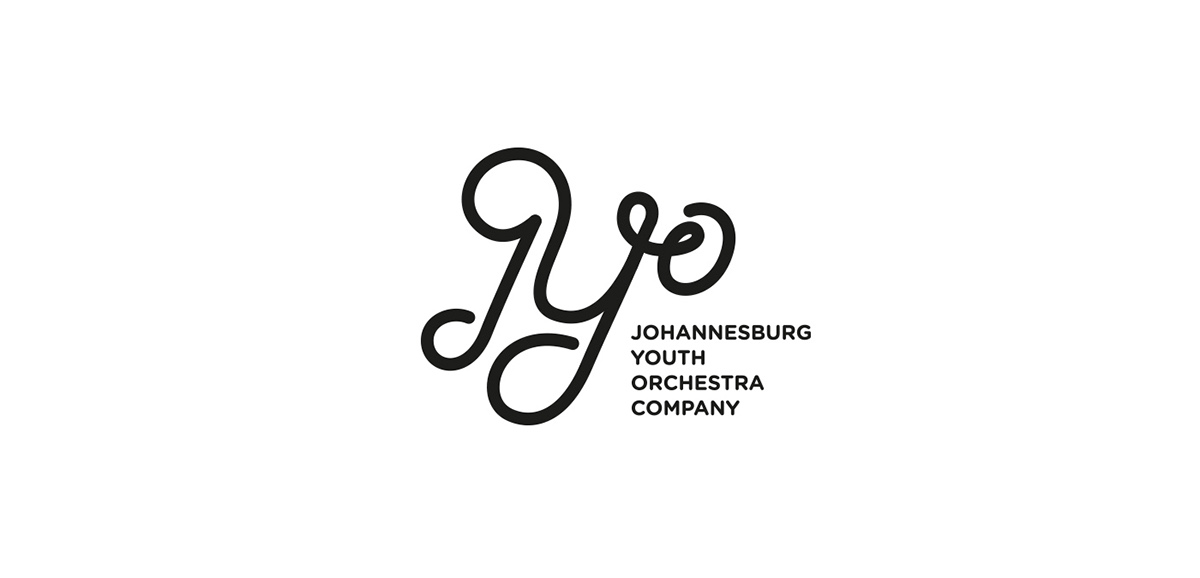
Logo
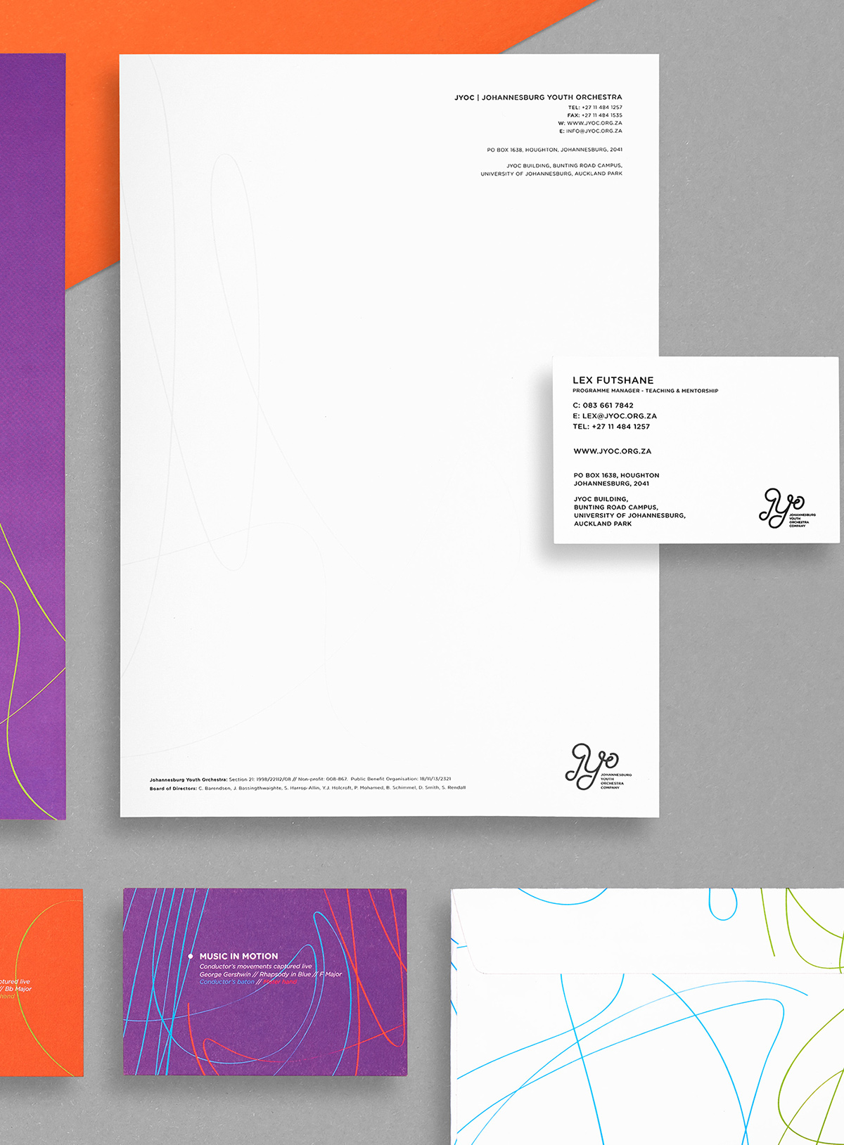
The logo was created inline with the concept, by capturing the conductors movements this helped us create a simple, custom logotype with a similar flow and movement.
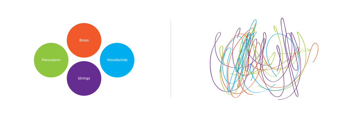
Colour |
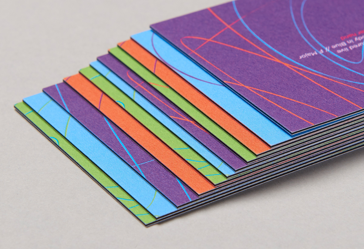
The rebrand included four colours that were selected to represent the four sections to the orchestra which include brass, woodwinds, percussion and strings. The four colours helped to further represent the members of the orchestra in each section making them feel part of the big picture when everything comes together.
The rebrand included four colours that were selected to represent the four sections to the orchestra which include brass, woodwinds, percussion and strings. The four colours helped to further represent the members of the orchestra in each section making them feel part of the big picture when everything comes together.
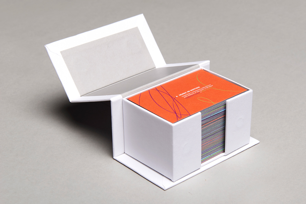
Stationery | The stationery was all printed on mohawk superfine papers giving us a top quality finish, thanks to moo.com
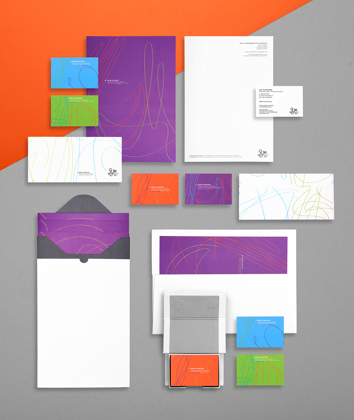
Stationery Detail

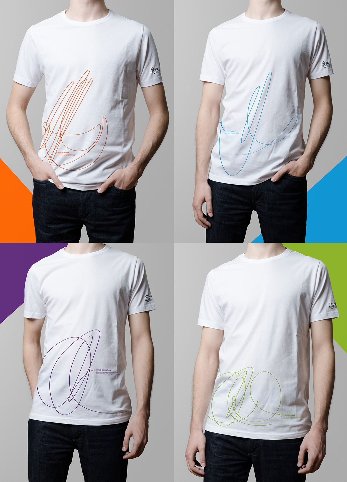
Tshirts | Each section of the orchestra (brass, woodwinds, percussion & strings) is assigned a colour and design.
New Building


Project Details:
Agency: Promise Group
ECD: Marc Watson
Art Direction: Andrew Footit & Nic Kostouros
Copywrighter: Daniel Druion
Designer: Andrew Footit
Thank You

