


Challenge:
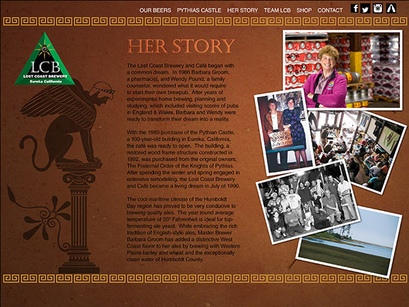
Lost Coast Brewery has been established since 1990 in Eureka California. They have had the same branding for twenty five years. They are very popular within their local community. They also have a very artistic look that draws a lot of people to collect their bottles and caps. There is a need to have a new look in order to appeal to the younger demographic while communicating they are a high quality craft beer.
Lost Coast Brewery has been established since 1990 in Eureka California. They have had the same branding for twenty five years. They are very popular within their local community. They also have a very artistic look that draws a lot of people to collect their bottles and caps. There is a need to have a new look in order to appeal to the younger demographic while communicating they are a high quality craft beer.
Solution:
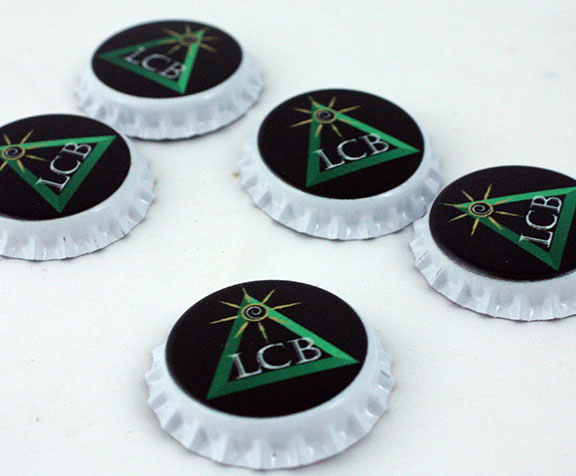
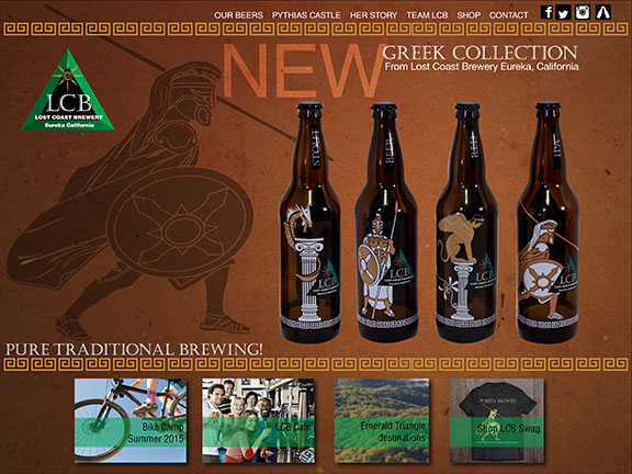
I recreated their logo to a more simplified look. The area they are in is known as the emerald triangle. I kept the green triangle and created an abreviated version of their name. This will help when they need to use their logo in reduced size. The theme I chose for this new series of ales is Greek. Their brewery house is called the castle of the brotherhood of the knights of pythias which is an organization inspired by the brotherhood of pythagoras from 600 B.C. This group of people were dedicated to pure living and pure thought, which goes well with the mission of the brewery to have pure brewing methods and ingredients. I used a dragon on the Stout bottle because Stouts were introduced by the Nords. I have a soldier at rest for the beer bottle because beer is known as an afterwork beverage. I have a sphinx for the red ale because it is a drink for the more experience beer drinker. And I have a charging soldier for the IPA because IPA is bitter. I also created a web design for the new look.
I recreated their logo to a more simplified look. The area they are in is known as the emerald triangle. I kept the green triangle and created an abreviated version of their name. This will help when they need to use their logo in reduced size. The theme I chose for this new series of ales is Greek. Their brewery house is called the castle of the brotherhood of the knights of pythias which is an organization inspired by the brotherhood of pythagoras from 600 B.C. This group of people were dedicated to pure living and pure thought, which goes well with the mission of the brewery to have pure brewing methods and ingredients. I used a dragon on the Stout bottle because Stouts were introduced by the Nords. I have a soldier at rest for the beer bottle because beer is known as an afterwork beverage. I have a sphinx for the red ale because it is a drink for the more experience beer drinker. And I have a charging soldier for the IPA because IPA is bitter. I also created a web design for the new look.


