

Client: Aalst Chocolate
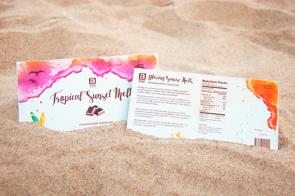
Targetted at busy and stressed Singaporeans in need of an escape or a holiday getaway, I designed the packaging for a set of three bar chocolates that are unlike the conventional chocolate you would find on a supermarket shelf.
Through the packaging, I wanted to depict how the chocolate can provide an escape for stressed individuals and give them a
refreshing energy boost. Hence, I chose to illustrate a beach landscape to express the idea of a getaway – a mini holiday through the delicious chocolate bar. The top half of each design is melting chocolate which I also made to look like the sea at the beach. The melting chocolate calls for the target audience to slow down, take a break and have a chocolate to boost their energy.
refreshing energy boost. Hence, I chose to illustrate a beach landscape to express the idea of a getaway – a mini holiday through the delicious chocolate bar. The top half of each design is melting chocolate which I also made to look like the sea at the beach. The melting chocolate calls for the target audience to slow down, take a break and have a chocolate to boost their energy.
However, the melting chocolate does not take on the look of typical dull brown chocolate. The vibrant colours make the chocolate appear more appetizing and the watercolour splashes give the designs a refreshing feeling. The vibrant colours chosen depict different moods – a blazing orange for the white chocolate to portray how the it will give an energy boost to keep one up and going for the day, a blue sea for the creamy milk chocolate that calms one down, and a pink and yellow sunset ocean for the dark chocolate as dark chocolate is eaten after dinner sometimes.
——


DIGITAL DESIGNS
——


——


