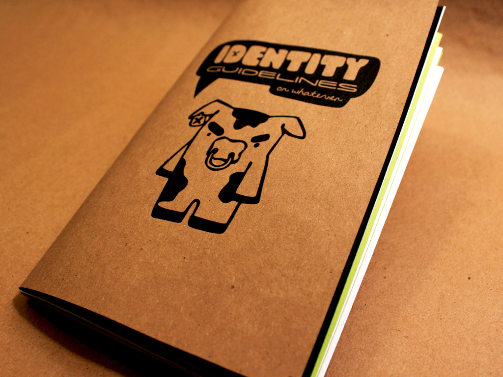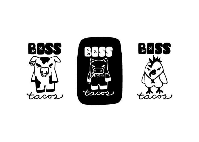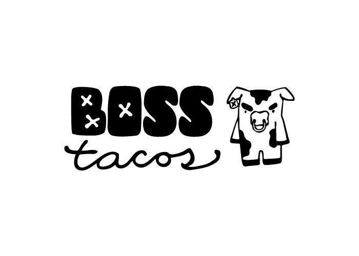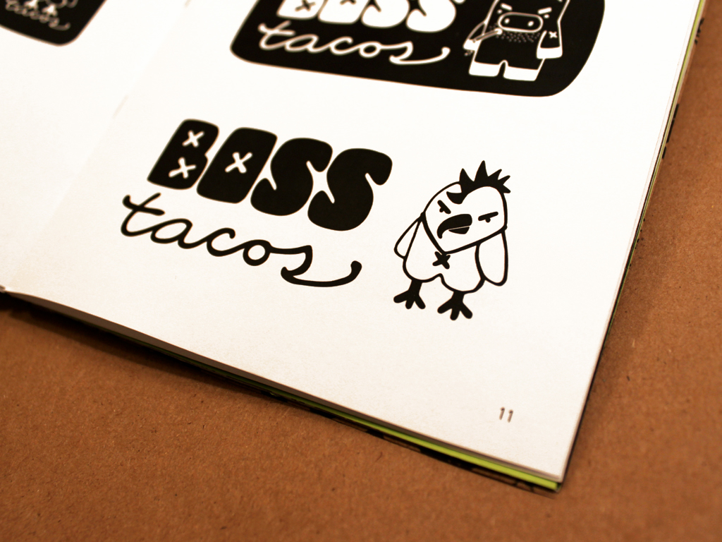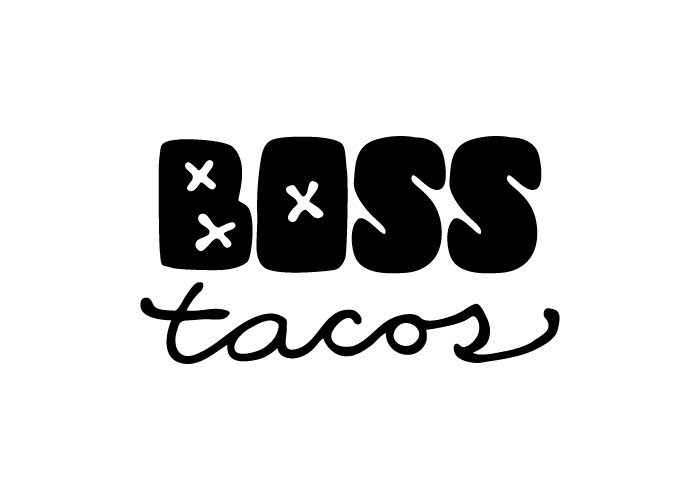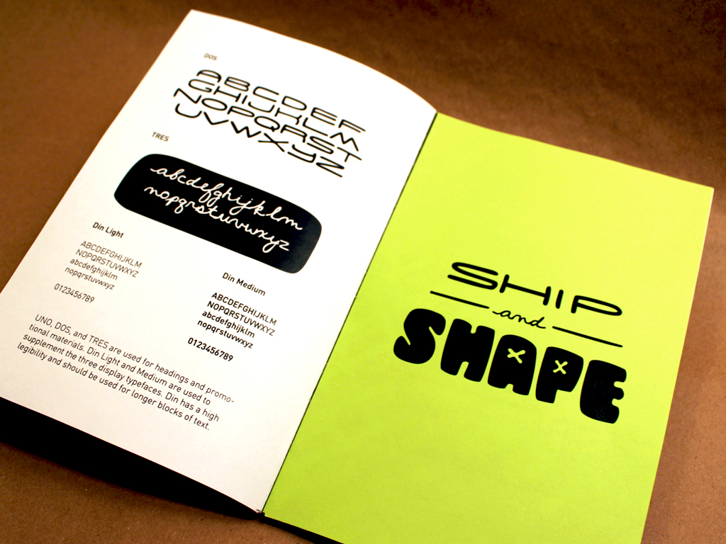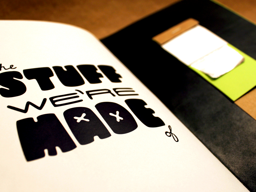
This graphic standards manual for Boss Tacos lays out everything needed for the fictional street taco stand. The identity includes custom typography, interchangable logo pieces, illustrated characters, as well as color and logo application guidelines.
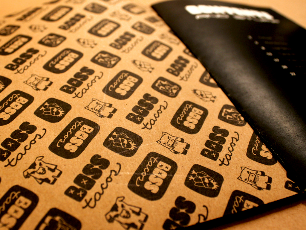
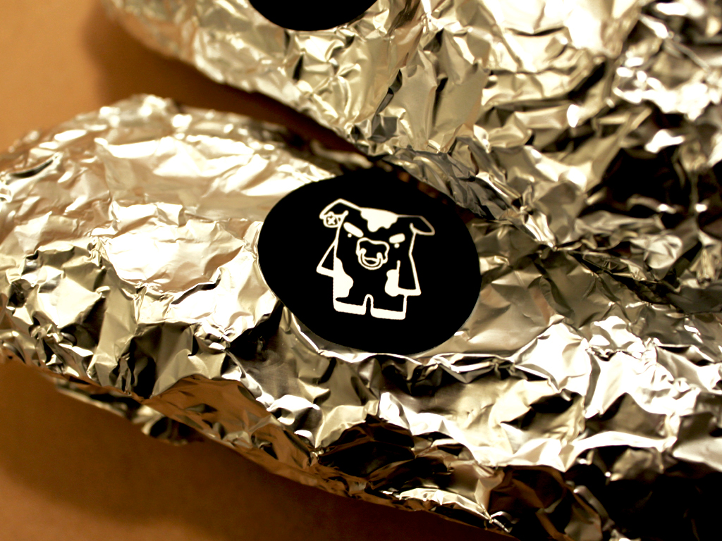
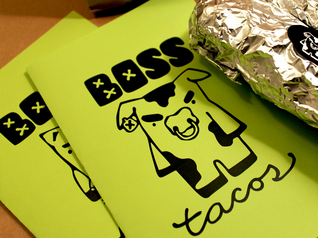
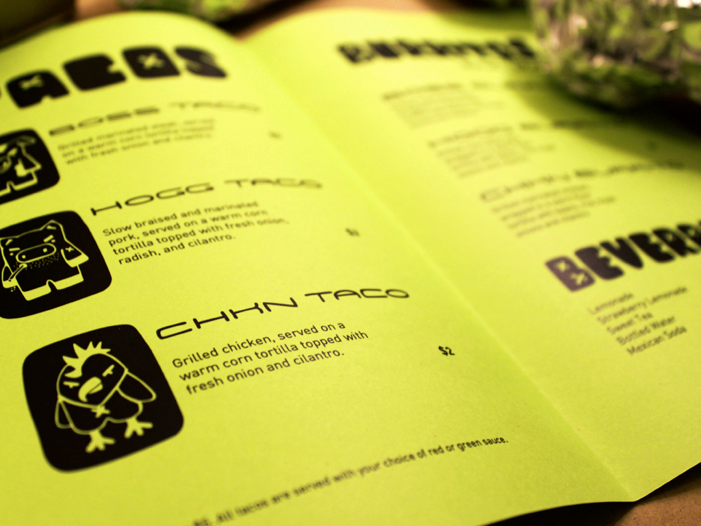
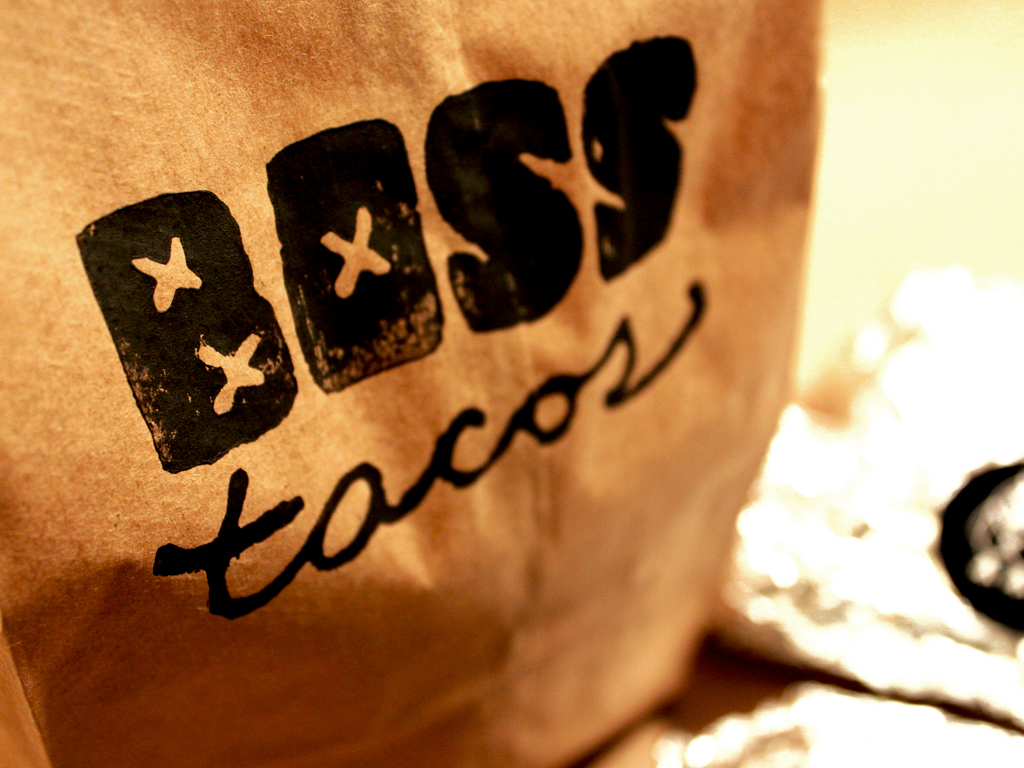
Promotional material was created to accompany the graphic standards manual. This includes a menu, a hand carved stamp used to stamp paper bags, and stickers for labelling tacos with meat choice.
Because taco stands don't generally have the funds to create a branding system, I made sure to keep cost in mind when looking for materials. Butcher paper, plain white copy paper, and inexpensive neon paper were used for the manual, and menus. The bags are hand-stamped with basic paint, and the stickers were printed on a home printer.
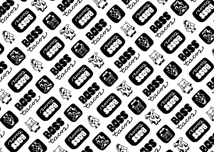
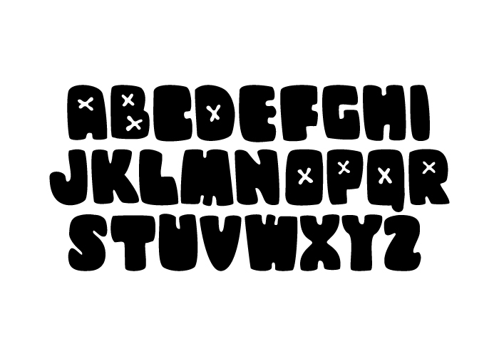
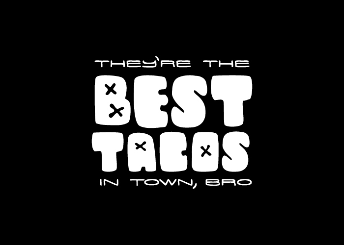
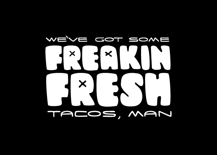
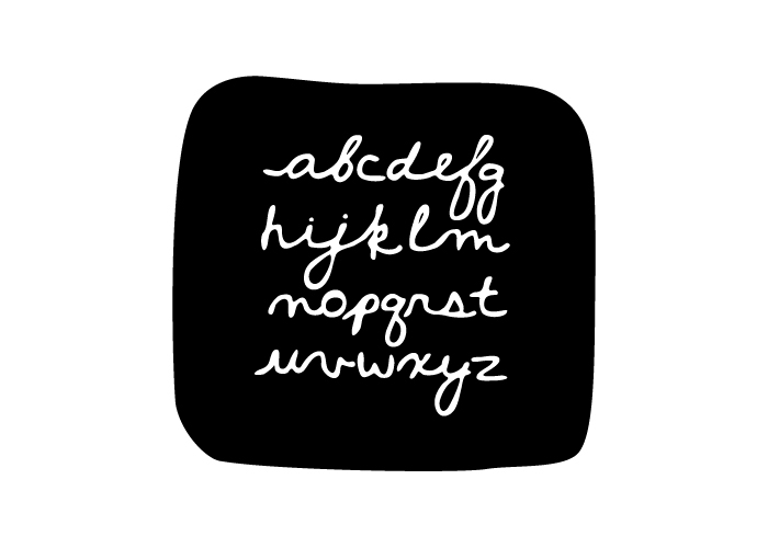
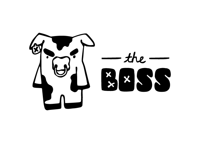
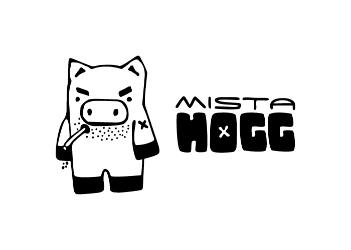
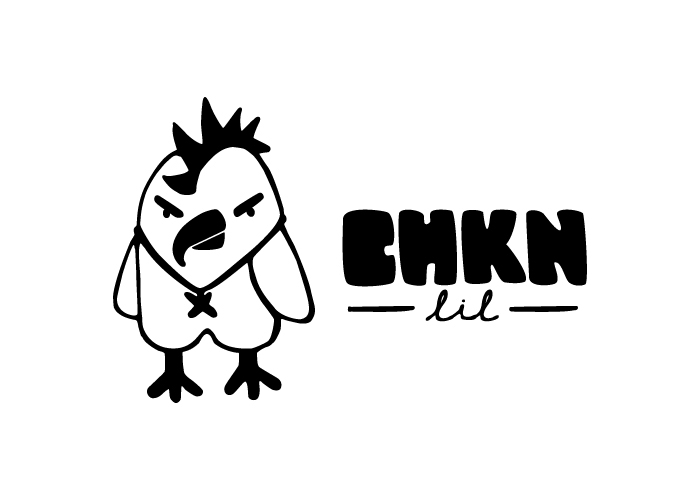
Boss Taco's aesthetic subtly references the street art that would surround any taco stand in a major city. With hand-done characters and typography influenced by urban style, the identity has a personal feel that matches the overall feeling of homemade tacos from a street-side taco stand. This brand has more character than the normal chain fast food place, with mascots who almost dare you to eat them.
Promotional material was created to accompany the graphic standards manual. This includes a menu, a hand carved stamp used to stamp paper bags, and stickers for labelling tacos with meat choice.
Because taco stands don't generally have the funds to create a branding system, I made sure to keep cost in mind when looking for materials. Butcher paper, plain white copy paper, and inexpensive neon paper were used for the manual, and menus. The bags are hand-stamped with basic paint, and the stickers were printed on a home printer.
Boss Taco's aesthetic subtly references the street art that would surround any taco stand in a major city. With hand-done characters and typography influenced by urban style, the identity has a personal feel that matches the overall feeling of homemade tacos from a street-side taco stand. This brand has more character than the normal chain fast food place, with mascots who almost dare you to eat them.