
Afroshok
I finally got to the end of the HTML5 layout for my web site. It is completely responsive.
I designed the "hamburger" menu icon to mimic the actual colours of the main navigation. The UX will be interesting ;-).
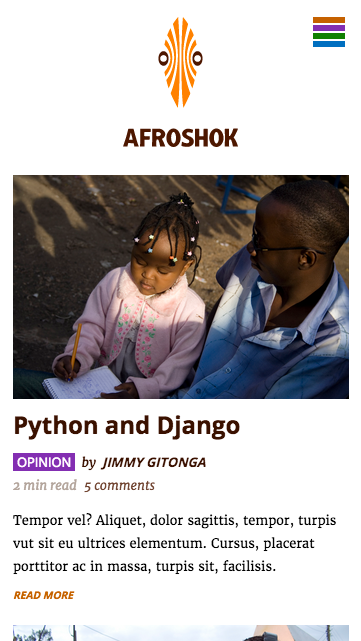
HOME
This is my home page displayed in a mobile-portrait view. It has very little going on visually so that the visitor can see what is happening quickly. This page will have a collection of the latest entries on the site.
It is specifically designed for places where bandwidth is a challenge.

ABOUT
This is the about page in the mobile-portrait view as well. Apart fo the home page, I wanted a look that is modern and yet has texture to make it "mine" design-wise. Some copy for the site is done like in this static page. I hope you like the art :-).

BLOG
This is the blog page. This is the mobile-landscape view.

CODE
The code page and it is in the tablet-portrait view. This page now shows the main navigation in full.
The is the home page again. This time in the tablet-landscape view.

DESIGN
As the device sizes progress, there are some sections of the site that are displayed and the page flow changed. This is the laptop (small-desktop) view.
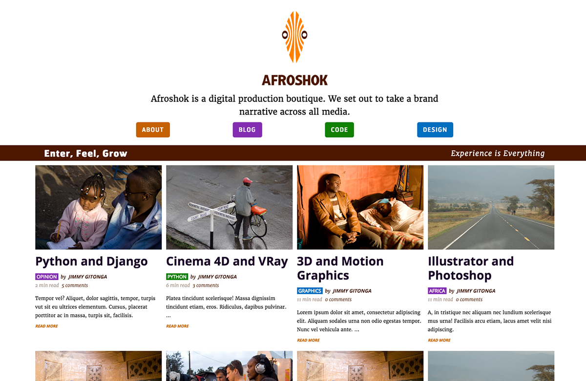
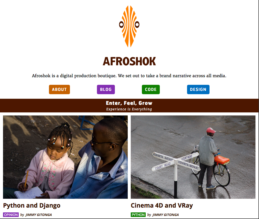
This is the home page showing the desktop (HD) view.

This is a code article page. I wanted to show what the floating navigation will look like once I am though with the UX for the site. While the page is a screen capture, the floating naviagation is artwork.
Front End Dev Pipeline
My pipe line is Adobe Illustrator for wireframes (when necessary) / mockups. Code development is in Sublime Text and CodeKit. CSS preprocessor - Stylus. Gulp for post processing. All icons in SVG and art in PNG. Images are in JPEG.
There is a lot more detail to this, but this should give a general overview of how I work.
All the images are mine. The some photos are of behind the scenes of "Killer Necklace", a movie by Judy Kibinge.


