

Restyling project for the logo of the city of Siena
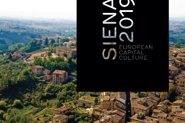
Poster rendering of the logo

Year: 2011/2012 | Place: SPD | Colours: Black/White
Tools: Adobe InDesign, Adobe Illustrator
Team: Emanuela Rizzo | Project partner
This has been one of the most important projects I've done during my Visual Design master in the Visual Identity course of the school "Scuola Politecnica di Design", in Milan.
Siena partecipated, along with other italian cities, in the competition to be chosen as a candidate for the selection of "European Culture Capital" for the 2019.
Siena partecipated, along with other italian cities, in the competition to be chosen as a candidate for the selection of "European Culture Capital" for the 2019.
The project was to redesign the logo of the city for this particular occasion.
I chose, together with my project partner Emanuela Rizzo, as a concept for the work, the word "hide".
I chose, together with my project partner Emanuela Rizzo, as a concept for the work, the word "hide".
Siena has so many "secrets" and unknown areas, and our research about the city led us to discover how these aspects were way more present in Siena compared to the other italian cities.
Because of this "feature", its inhabitants are kinda "jealous" of their city, almost reluctant to share the secrets, the customs and traditions of Siena (eg, the famous Palio) with foreigners.
But the moment Siena decided to candidate as a european cultural center, these secrets had to be unavoidably exposed, and the public had to be driven to "reveal" the city.
The actual logo concept is this one. In fact, the logo has two peculiarities:
• You can see what's behind the logo through the empty logotype, in order to push you "looking beyond" what you see.
• The top margin is sharply cut, and this is still the game: you begin to ask yourself questions, such as "Is there something missing?" or "Is there something else I don't see?".
These are the exact questions we wanted the audience ask about the city itself.
For as it was designed, the logo must be used only on the top margin, in order to fulfill his main concept.
Our goal was also to use the logo to cover some typical architectural squared elements of Siena, in order to make the audience "uncover" them (and the city) by physically removing the logo.
It's a simple logo, very versatile and, in our opinion, creates a large dynamism and openness, all aspects that Siena certainly needed.
Source: www.andreafornari.com


