2014
Typeface SF Uniform
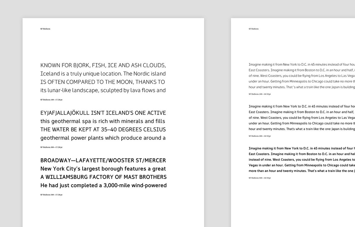
Sans Serif / 3 Weights / OTF Format
Designed by Alvin Kwan and Vince Lo
Designed by Alvin Kwan and Vince Lo
BACKGROUND
Around the time that we were working on the Commute App project, we felt it was a good opportunity to create a typeface that carried the same tone of voice we envisioned for the interface. We set out to develop the early version of SF Uniform and used the characters we needed for the app. It was only later that we came back to the project and decided to develop the rest of the glyphs for a standard set.
DESIGN
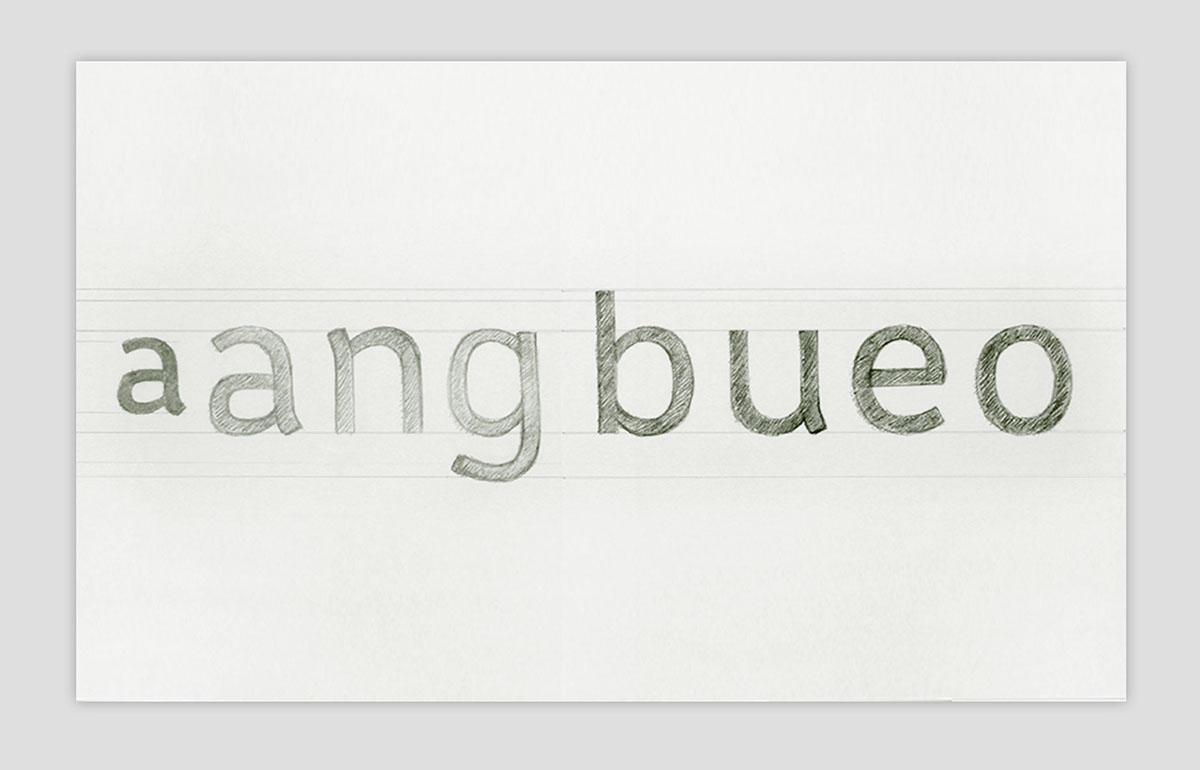
Our primary goal was to create a typeface with a taller enough x-height and large counters to achieve greater legibility. The slight nuances and details of the glyph ends, ascenders and descenders were also taken into account to help create differentiation between similar looking letters. As we dived into the development of the font, we worked on both the 300 and the 500 weight simultaneously. Shortly after the completion of the two weights, we added a light 100 weight to create more flexibility for use. Throughout the design process, our continual focus was on whether the typeface offered the right tone of voice—one that was not overtly cold nor too “friendly” that it lost its professional appeal. SF Uniform was our honest attempt at achieving this balance.