
JJ MAES
Branding
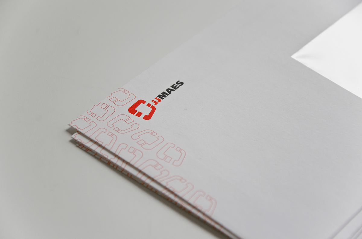
Branding
Client
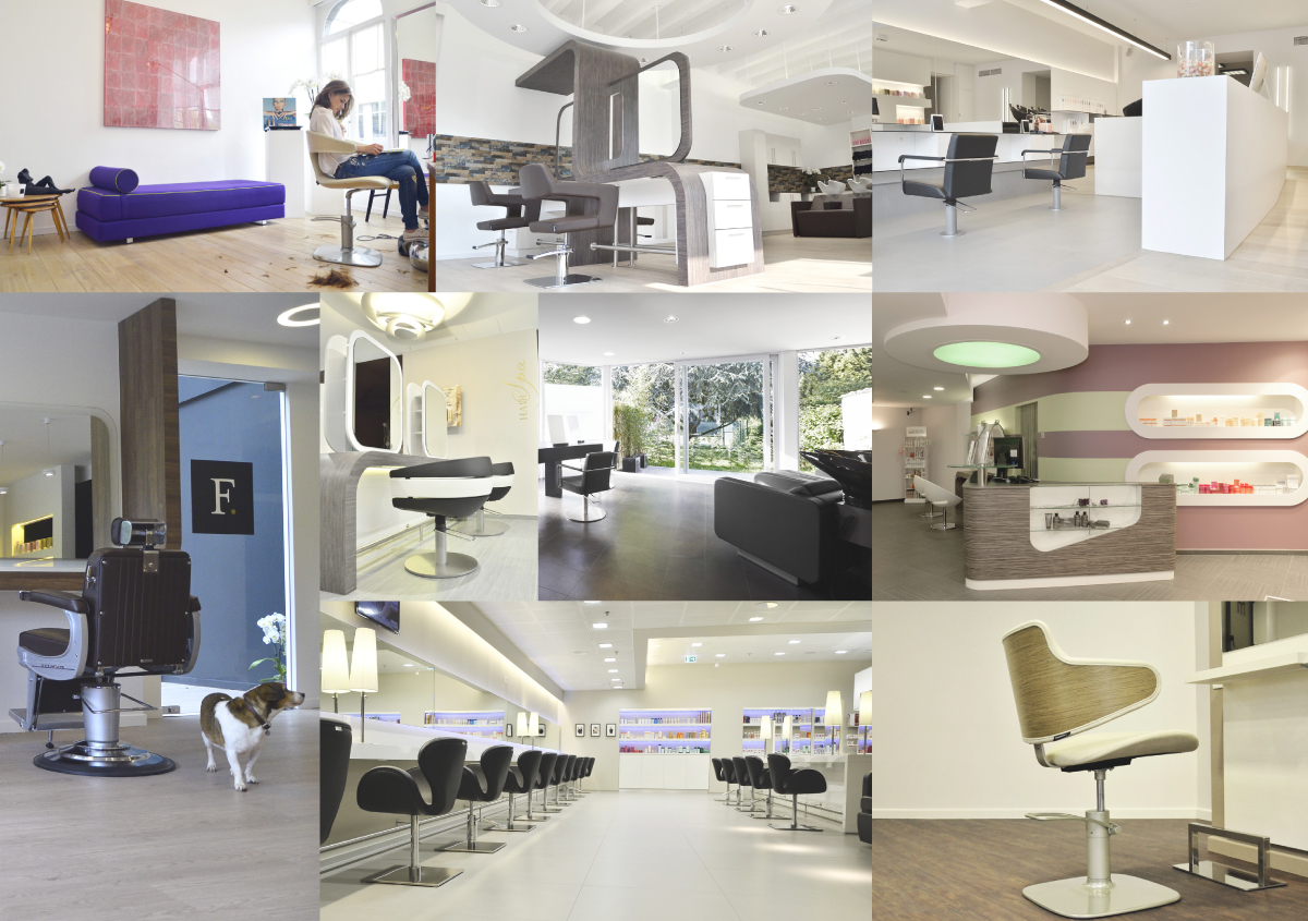
JJ Maes is a high end interior design and furniture retailer for hair salons. The company exists since 1954, and has a rich history of collaboration with iconic salons and barber shops in Belgium. The JJ Maes signature look embodies decades of experience in combination with cutting edge design and technology.
Project Goals
Simple and effective, photography based branding, that allows the possibility to update images over time. Utilitarian and minimal style as a good frame for JJ Maes architecture and furniture features.
Creative solution
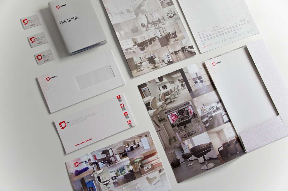
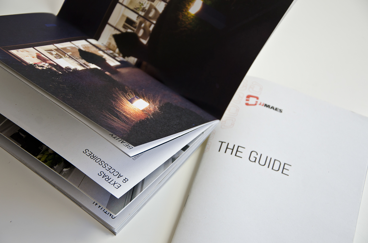
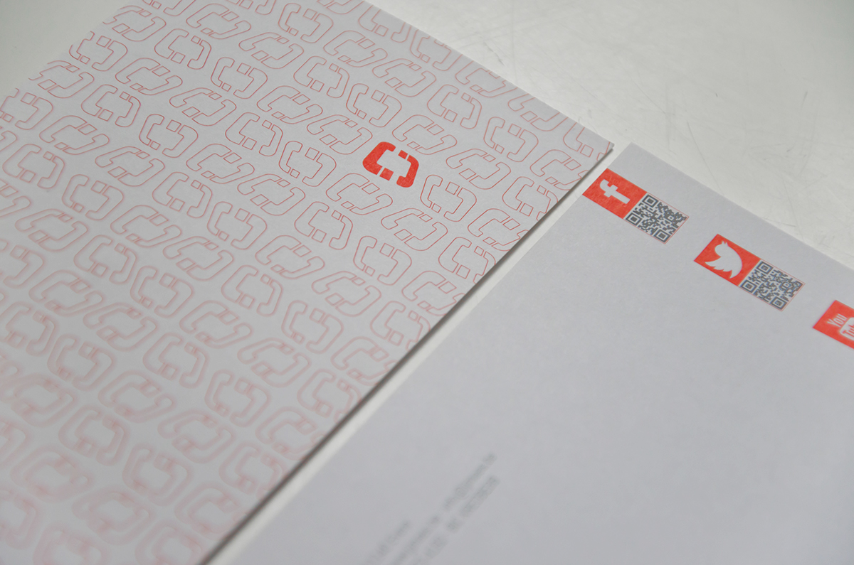
Bright red primary brand color, in combination with slightly desaturated photography gives an effective contrast while maintaing the integrity of the photographs. The use of natural quality materials, such as Lessebo Design paper and brushed metal, ties in with client's own use of material in handmade furniture. The logo update gives the illusion of space, bringing back the interior design factor.
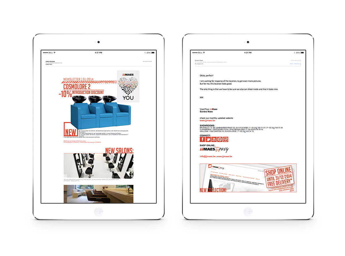
Website


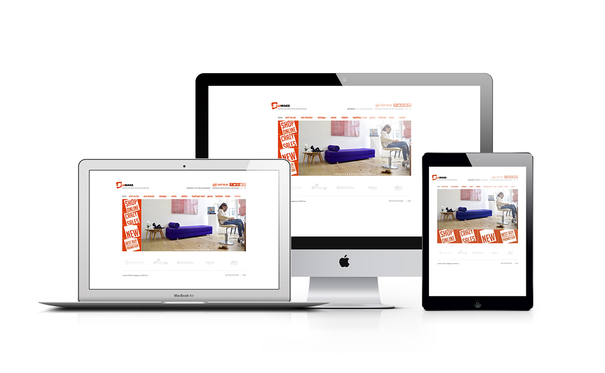
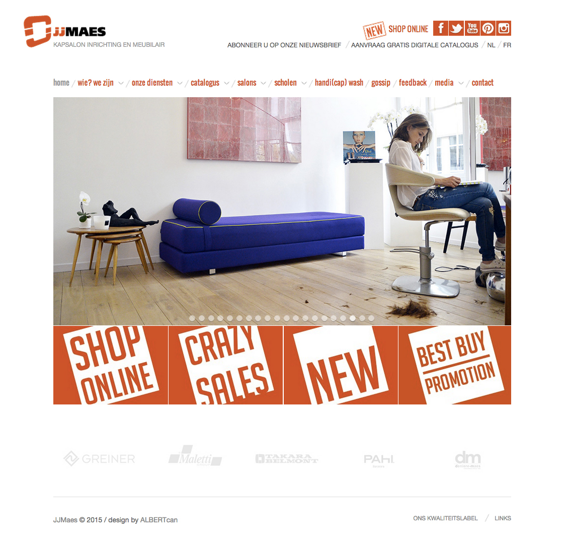

Art direction / design: Ana Van Aerden & Misa Petrovic for ALBERTcan
Photo: Ana Van Aerden & Luc Van Huffel for ALBERTcan
Photo: Ana Van Aerden & Luc Van Huffel for ALBERTcan


