
This "Bonfire" interactive prototype demonstrates how the fully developed web application will allow journalists to quickly identify, monitor and analyze Twitter communities and the conversations that drive them.
Bonfire
Northwestern University Knight Lab, 2014
Every day journalists must spot breaking news, quickly develop expertise on novel topics and identify the biggest issues driving conversations in the communities they serve. Bonfire takes the data Twitter makes available through its API and reorganizes it into an intutive web application for finding Twitter communities and monitoring the most important discussions and happenings within. The end result? An invaluable tool that allows journalists to accomplish all three tasks in short order.
The Features:
• Bonfire saves journalists time by automatically generating "Bonfires" - groups of interrelated Twitter accounts that make up communities.
• It allows journos to instantly find out what Twitter communities are talking about the most and identify their most important conversations.
• Reporters and social media engagement editors can stay tapped into multiple communities in just a few clicks.
• Improvement recommendations let users quickly refine Bonfires and ensure journalists won't miss a thing.
So that's Bonfire - but how did we get here? It all started with a simple question.

The Challenge
Twitter is a crazy place, but amidst the chaos news is always breaking and communities are constantly discussing the issues most important to them. These realties make Twitter an invaluable social network for journalists who want to understand their audience and provide up to the second coverage. Unfortunately Twitter's stream-centered design does journalists no favors - unless a journo is constantly monitoring their feed they're bound to miss something. To make matters worse the tools Twitter provides to cut-down on noise are rudimentary and extremely time-consuming.
With all this in mind the Knight Lab team set out to create a tool to harness Twitter's enormous potential to uncover news and key conversations. We had some idea what that might look like thanks to experience creating Twitter search tool twXplorer and a close relationship with the Nieman Lab, creators of Twitter curation bot Fuego. What we didn't know was where these tools still left journalists wanting - so we decided to find out.
With all this in mind the Knight Lab team set out to create a tool to harness Twitter's enormous potential to uncover news and key conversations. We had some idea what that might look like thanks to experience creating Twitter search tool twXplorer and a close relationship with the Nieman Lab, creators of Twitter curation bot Fuego. What we didn't know was where these tools still left journalists wanting - so we decided to find out.
Discovery
I employed qualitative and quantitative research techniques to better understand the needs, goals and challenges journalists face in modern newsrooms and the goals of the lab. Thanks to the nature of working in a research-focused lab, the process was rather exhaustive and allowed me to gain a deep understanding of the people we were hoping to serve. Some of the techniques I employed are are listed below, along with my key takeaways and the software I utilized in each step.
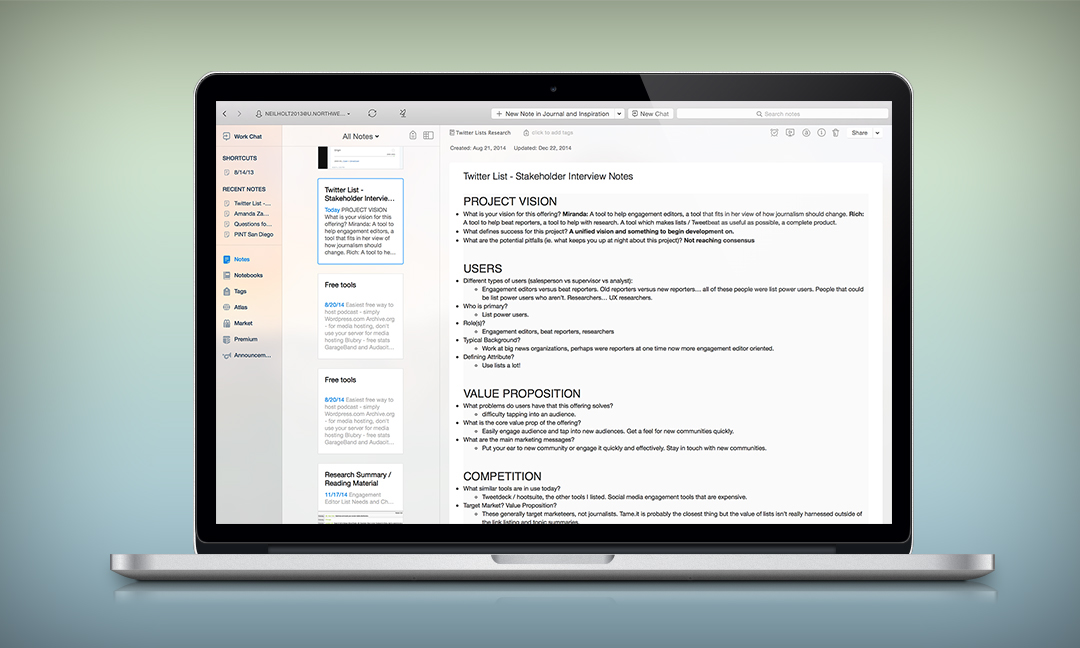
1. Stakeholder interviews
By consulting more senior members of the lab and making use of the interview template highlighted here I was able to construct an extensive knowledge base of the lab's past research into Twitter and get to know the lab's current offerings and ideas for the future. This knowledge helped me form a framework of product hypotheses to test and guide my research. It also helped to define my role in the project. The lab needed rational guidance and recommendations to ensure a successful future product, not just quick fixes on a current tool.
Key Takeaways:
• Hypotheses to guide future research - a variety of product ideas to test for efficacy.
• A focus on creating an effective product strategy as the primary project goal.
Software Used:
• Evernote
I use Evernote notebooks to easily organize the information I collect in research and share it with team members.
2. Usability Testing
I began my off-site research by looking at areas where the lab's prior Twitter-focused offering, twXplorer, left journalists cold. I arranged for usability tests at Northwestern's University J-School newsroom and the Tribune's RedEye newsroom. By asking journalists to perform certain tasks with the product I immediately identified trouble spots twXplorer's UI and a user tendency to jump into using the tool without taking the time to understand where it could be most useful in their process.

Key Takeaways:
• Journalists are under extremely high pressure to produce stories quickly.
• Tools must have very intuitive UIs and no learning curve if they're to appeal to journalists and make it into their finely-tuned workflows.
Software Used:
• Silverback (screen recording for usability tests)
• Google Hangout screen sharing for remote tests
3. Competitor Analysis
By looking at the strengths and weaknesses of competitors' offerings, I was able to identify areas where there was no need for the lab to tread. Heruistic evaluation of other Twitter tools quickly eliminated some hypotheses about where we could take our product due to superior competition, and resulted in a popular article.
Key Takeaways:
• Knowledge that marketing and alert needs were well served by other products.
• Graphical representation of Twitter data and meaningful analysis of Twitter groups were underserved markets.
• Best practices for UI design in this area.
Software Used:
• Excel (organization and analysis of competing products)
4. Expert Interviews
I spoke at length with journalists from top organizations including the Chicago Tribune, New York Times, Pro Publica, NPR, the Atlantic and more. These interviews were great for fueling ideation and getting a sense of the pain points in the workflows of a wide variety journalistic workflows.

Organizing and making sense of qualitative data collected in interviews with stakeholders and experts is made more manageable by involving the team early and often. After coding the research myself I invited lab staff to help me identify the most important key points and categories they saw, and give me their perspective on what they thought it might mean for where we should take the product.
Key Takeaways:
• The word "journalist" encompasses many different jobs with many different needs and levels of tech proficiency.
• Job roles generally fall into a three to five different categories.
Software Used:
• TapeACall for accurate recording of calls
5. On-site observation
Shadowing journalists at the Tribune allowed me to get a sense of the conversations driving decision making and the unspoken realities of journalistic workflows.
Key Takeaways:
• Journalists don't often have access to anyone with coding skills, especially for stories with quick turnarounds - so code libraries are insufficient solutions.
• Statistics must have proven significance to be meaningful enough to have news value, so without large sample sizes in final product Twitter statistics won't be very useful.
Strategy
While the discovery revealed plenty to me about the kind of product we should develop, the rest of the lab was still in the dark thanks to busy schedules of their own. Condensing the research into actionable documents was an important step in helping to define the research's key finding and communicate it to the lab as a whole. To aid in decision making I brought personas, journey maps and a research brief to the team.
1. Personas
I used personas to acquaint the team with the kinds of people I got to know in the course of my research. These broke down into 4 archetypes, each with some overlapping desires, goals and needs. As a team we quickly decided to eliminate fringe personas (bloggers and social media marketers) from our target audience. With this decision made I interviewed more reporters and social media engagement editors at top news organizations to finely tune and evolve the personas to the point where they were useful for decision making.
Key Takeaways:
• By bringing personas to the team early, many hours were saved getting too specific on certain kinds of people the lab was not interested in serving.
• A second round of more specific personas allowed for a finer understanding of the daily lives, skills and desires of the journalists the lab was interested in serving.

Rapid iteration on personas and in-depth journey mapping helped us zero in on the users we wanted to focus on.
2. Journey Maps
Once personas were thoroughly defined I was able to create journey maps to walk team members through the steps personas had to take to complete their goals. By marking the difficulty each persona had completing a given task common painpoints were revealed.
Key Takeaways:
• The "list" tools Twitter provides to journalists are very, very helpful for power users.
• The benefits of list creation, management and analysis are lost on the typical journalist due to the required time committment and ineffecient UX.
3. Research Brief
A research brief explained the current landscape of Twitter tools in plain english, and included quotes from journalists about their key needs, wants and pain points. Accompanying tables weighted persona interest in potential features and product categories based on A) common pain points and B) existing competitor options.
Decision from Stakeholders:
Thanks to the communicated research, stakeholders made the decision to focus on building a tool to help reporters, web producers, and engagment editors accomplish the following:
• Quickly become experts on trending topics
• Identify key members of communities
• Listen in on important Twitter conversations.
The tool would primarily be based around best practices for quickly generating groups of interrelated Twitter accounts demonstrated in Nieman Lab's Fuego, but would also allow for refinement of communities based on the unique interests of the user.

In the brief I utilized highlighted spreadsheets to indicate areas we might want to focus and areas we might want to avoid based on competitor offerings and persona needs.
More Research and Early Testing
With a decision from stakeholders I was now presented with a new problem - which features would best serve our personas in refining the automatically generated Twitter communities? To answer this question I quickly ran hypotheses by my prior contacts and drilled down into the specifics of what made for an interesting account, from a news perspective.
I came away with a variety of strong indicators including - frequency of interaction with accounts that are already counted in the community, frequency of discussion with members of a Twitter list, and common follows/followers.
One more problem: the lab developers weren't sure if it was possible to get this information with Twitter's API.
I passed this information along to a team of computer science students who were eager for a problem to chew on in a journalism innovation class. Over a few months they built a working prototype that revealed that from a Twitter list it was possible to extract information about people who commonly followed members of the list, commonly replied to tweets from list members, and commonly used terms tweeted by the list members.
Furthermore the accounts showing up in these findings were often interesting to our personas.
With the tech proven possible and the results proven useful, it was time to move on to the nuts and bolts of designing our new product, now named "Bonfire."
With the tech proven possible and the results proven useful, it was time to move on to the nuts and bolts of designing our new product, now named "Bonfire."
Funnelist uses a variety of metrics to suggest accounts to add or remove from a Twitter list.
Design and Prototyping
With a solid understanding of the market, our user's wants needs and goals, technical allowances and feature desirability it was time to move into the nuts and bolts of defining and building out product features.
In short, the most important product features were defined as such: 1) Allow users to automatically generate "universes" of Twitter accounts based on the input of 5-15 accounts they're already interested in 2) Provide recommendations users can use to to add and subtract accounts from these automatically generated universes, 3) Allow users to explore multiple universes with just a few clicks.
We settled on an "invite only" model for intital prototypes to ensure technical scalability and allow for rapid iteration on features thanks to real feedback from real users. My designs and prototypes therefore had two goals:
• Encourage sign-up by potential users
• Give developers and visual designers a structured understanding of what needs to be built.
To accomplish these goals I employed user flows, wireframes and lo-fi interactive prototypes.
1. Users flows
With a clear target audience (journalists familiar with Fuego and interested in creating their own versions) and a clear design challenge (encourage sign-up for trial), designing a landing page was fairly straightforward. I consulted best practices and ensured the design 1) provided instant engagement, 2) lowered friction to sign-up, 3) gave space for leveraging social influence and 4) provided increasing levels of description for the unconvinced. My userflows for the landing page were therefore based around providing multiple routes to sign-up and minimizing opportunities for users to become distracted and leave.
Designing the actual application was a bit more complicated. User flows were based around providing instant learning of the product through demonstration and exploration, and made to work best on the desktop computers where journalists do most of there work. Customizability was also allowed but was not a main feature - instead the most important links and conversations are highlighted up front.

I consider rough user flows a feature of my process - not a detriment. I find producing my first user flows with pen and paper allows me to be more empathetic to the user's needs and to think through everything more thoroughly. I use the UI notation outlined here.
2. Wireframes
Without need for complex visual design I chose to use the straightforward Balsamiq to construct wireframes. My wireframes employed a tabbed style interface to organize the various pieces of the application. This tabbed browsing was based on best practices I discovered during usability tests of the lab's twXplorer product way back in step 2 of this process. Positive actions are generally represented in green throughout the wireframes, and enough information was provided for the wireframes to also serve as a spec for developers.
Prior attention paid to thinking through the user flows made for quick and easy wireframing of the complete application, with only minimal changes needed after seeing the information in a visual format.
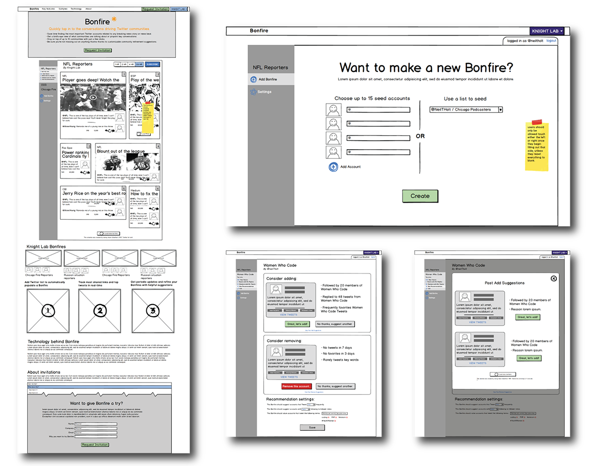
Balsamiq doesn't product the most attractive wireframes, but they're wonderful if you're looking for speed, effective communication and lots of user feedback.
3. Interactive Prototype
With my wireframes prepared I decided to move everything into InVision for preparation of an interactive prototype and presentation to stakeholders. In the past I had observed Google documents worked well for copy editing articles in the lab thanks to their system of commenting and issue resolving. InVision appealed to me as a prototyping system since it offered similar functionality and allowed for thorough presentation of the wireframes to stakeholders. Additionally, the web-based nature of the prototypes ensured stakeholders could examine the prototypes and closesly as they desired without the pressure of a fast-paced meeting.
The combination of Balsamiq and InVision was a huge success and agreed with the personalities in the lab, making for a painless design process. Using these tools I easily communicated my vision and quickly got input from stakeholders on small changes they'd like to see in functionality, resulting in three rounds of rapid iteration. You can view the most recent prototype here.
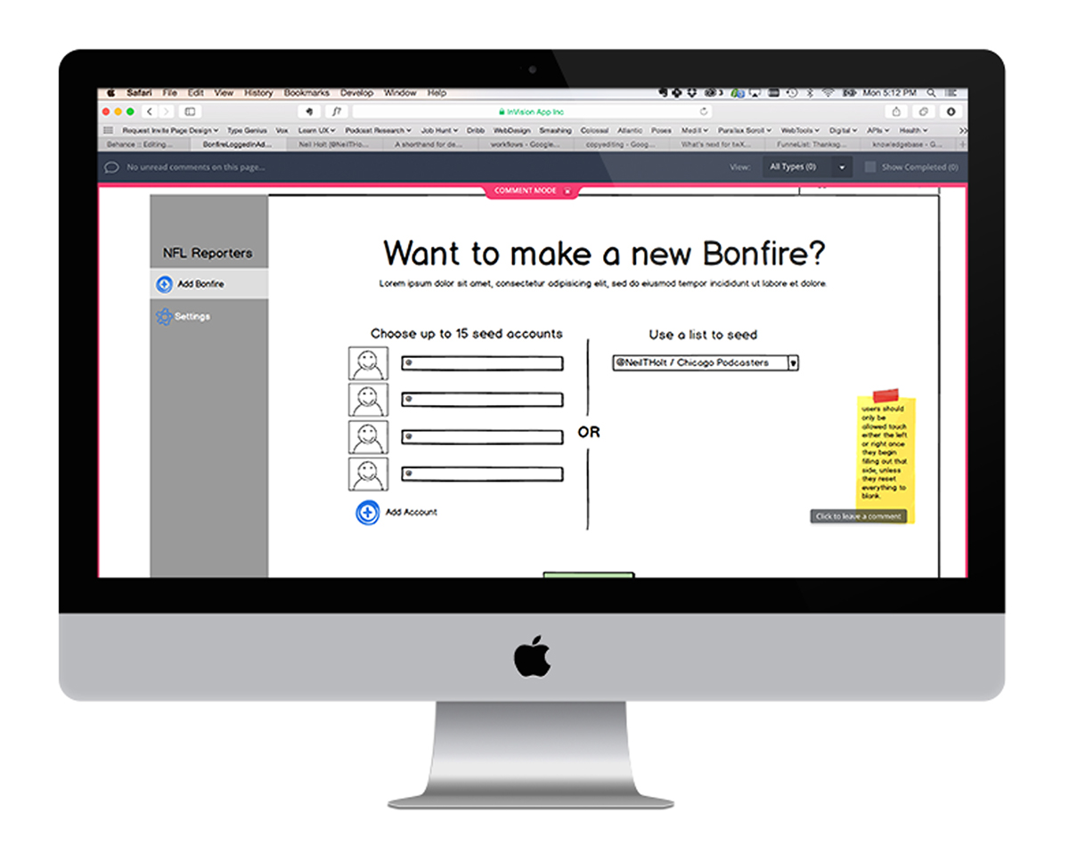
InVision prototypes make it easy for stakeholders and team members to explore prototypes, think through them and express concerns on their own time, allowing for much faster project advancment than less formal presentation techniques.
Success
After a few rounds of iteration on the wireframes and prototypes the team settled on feature specifications and a tabbed-interface design for the web app. The project is now in the hands of visual designers, front-end coders and back-end developers and will begin production when the lab has adequate resources available.

