
Helping Journalists Spot Trends
Neil Holt - April 2014
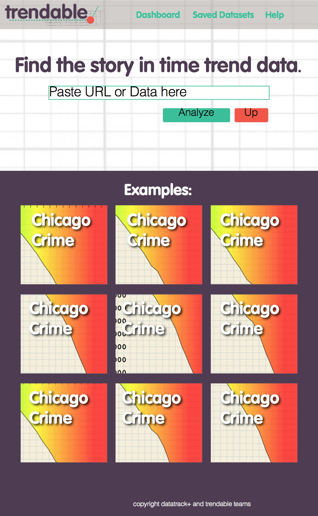
Trendable is a web app for journalists which allows users to knit together, import and analyze time series data. I designed and developed the front-end and interface of the tool over the course of 10 weeks. Time with backend developers was short as we only had a few hours together each week.
The focus was on creating a friendly and easy to understand data import experience. This tool is aimed at journalists who want to do quick data analysis who may not be very techinically savvy, everything about the design was decided with the following in mind:
• Journalists usually aren't tech savvy
• Data import is too time consuming for jounalists
• Journalists usually use desktop computers at work

The Challenge - No Time
Journalists trying to work with time series data often encounter a problem: the data is split into different files. In this example, Indiana has released pregnancy data from 2010 and 2011. Normally a journalist would have to open Excel or a similar tool and copy and paste the files together. This sounds easy, but with missing rows and columns, mislabelings, reordered columns and many more issues it can be a very time consuming process.
Therefore, after weighing our options for the quarter (Should we do more in-depth analysis? Should we allow users to embed results?) we chose to focus on this problem with the initial build of our tool. The data import screen is designed to call attention to the tool the journalist will be using to knit together their data. Here the journalist can choose from a few simple options, press submit, and be on their way to quickly analyzing their data - potentially saving hours of time. Instructions and "steps" (highlighted in purple) serve to guide the journalist through the process by giving them context and letting them know what to expect.

The Solution - Simple Choices
The dataset used in this example has a wealth of categories available to analyze. It's unlikely that a journalist will be interested in all of this information, so we allow the user to check or uncheck all. From there they can quickly select which categories they're interested in analyzing. We give users simple options like this throughout the process, being sure not to overwhelm them with too many choices at any given time and requring minimal thinking on their end.

The Result - Hours Saved
The data analyis screen (based largely on a past build of this app due to time constraints) highlights key trends, streaks and statistics in the data to help the journalist identify what the best stories hidden in the data might be. The journalist can also look at graphs and tables of the data they're most interested in. We chose not to spend much time on the analysis, instead working at the more difficult problem of how to allow journalists to stitch together datasets. Future versions could focus on more complex analysis, could allow for data export or could allow journalists to embed interesting graphs produced in the analysis in their stories.
Step 2. Visual Design
To ensure the UX would be as unintimidating as possible I did more thorough mock-ups in inDesign. Some of my first work was choosing friendly colors and fonts that wouldn't scare away tech-illiterate journos. The color pallette is friendly but uses noticable greens and reds that will later be used to easily navigate the data import process.

Step 3. User Flows
Once the rough design standards were settled on and the backend developers were gaining a grasp of how much they'd be able to code each week, we were able to begin to plan out user flows for the app. These gradually grew in detail as we began to get data into the system and identify errors we might encounter.

4. Bootstrap Wireframes
Over the last few weeks of the project I worked closely with the development team to rapidly prototype the app using Bootstrap and GitHub. First static HTML/CSS wireframes were meshed with the pre-existing backend code, then we used an agile process from week to week, setting goals for the week's work and quickly finding solutions to unforseen hiccups.

5. Rapid Paper Prototyping
When we encountered unforseen problems, for example the need to select the year of a dataset to be stitched together we usually mocked solutions on Paper to think about how they'd work before getting into the more time consuming process of coding them.

Sucess for Stakeholders
Trendable was chosen by the Knight Lab faculty as one of the most successful projects of the quarter, and demoed for Knight Lab funders as an example of the how software development and design practices can be beneficial for journalists.


