
NEW CONCEPT - SHOWCASING STUDENT WORK AND TEACHING STUDENTS TO THINK ABOUT STORIES IN NEW WAYS
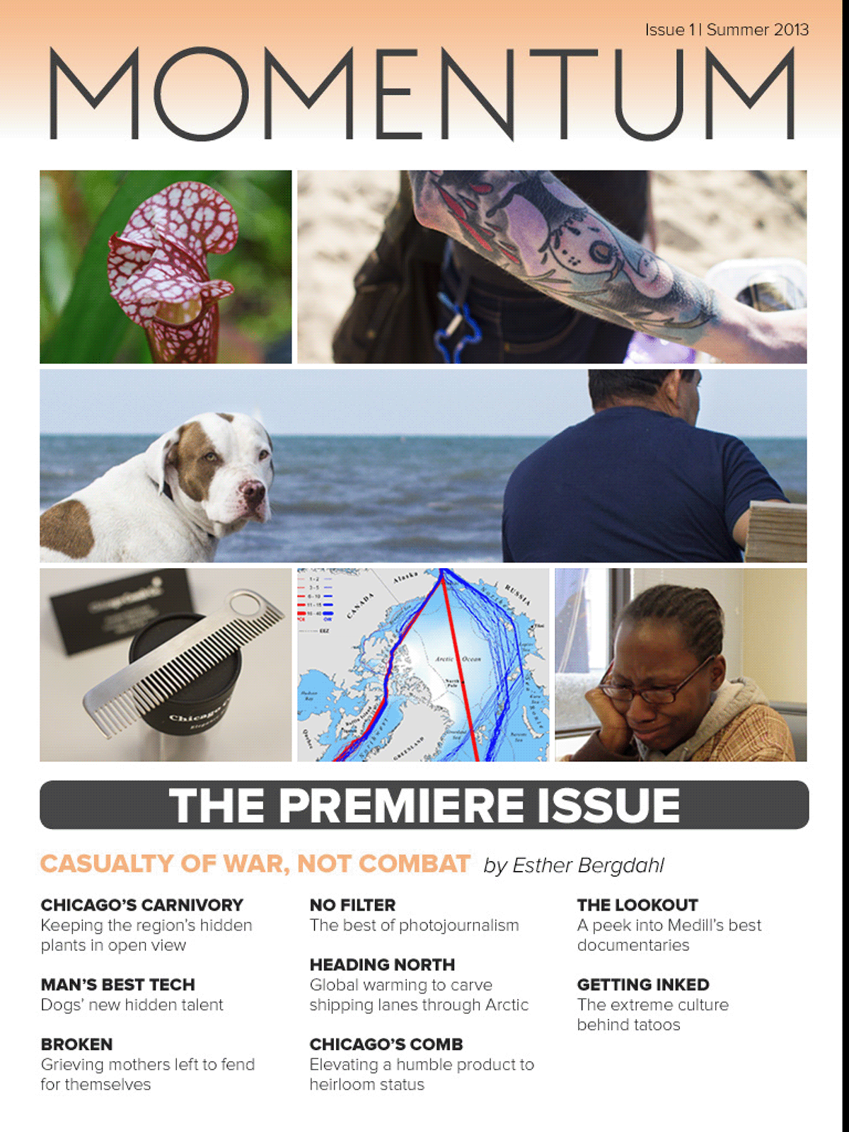
Medill Momentum is a proof of concept for an interactive iPad Magazine to highlight Northwestern's Medill School of Journalism students' best work. The magazine uses industry best practices and innovative storytelling techniques to move past the limits of traditional page and paper news stories. The cover features autoplay video, clean coverlines, and the ability to jump to the issue's featured story. The magazine is aimed at prospective students and alumni and aims to demonstrate how Medill is on the leading-edge of interactive storytelling techniques. More than that, it is easily reproducible thanks to templates my team and I produced, so students can quickly get a grasp on how to tell interactive stories without worrying about code.
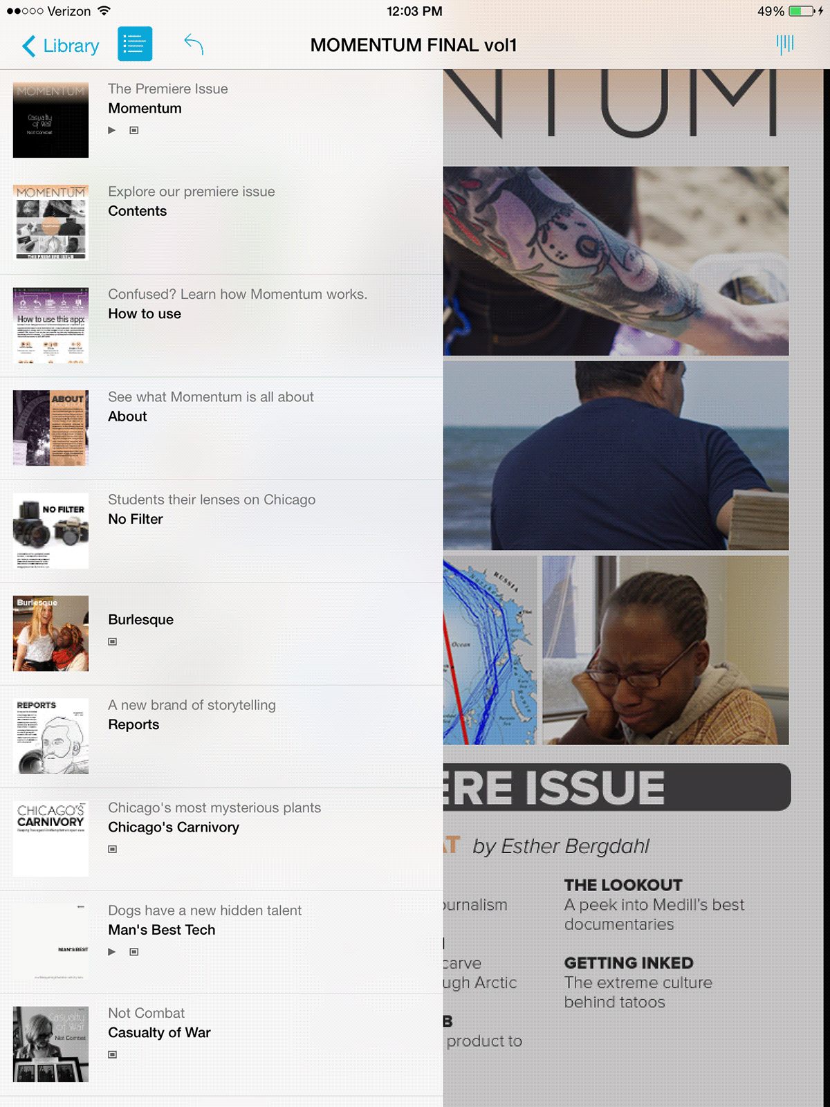
Our contents page allows users to jump to articles via a unique, interactive visual interface. JQuery is used to allow reader to interact with tiles to get a brief synopsis of a given story and a closer look at students' best photography and graphics. However, the images can easily be replaced without any knowledge of code, so new students can reproduce the magazine with the same format.
FINDING AND ORGANIZING THE CONTENT
We created three sections for Momementum - "The Lookout" our documentary trailers section, and "No Filter" our photojournalism section are highlighted on the contents page. The stories from "Medill Reports" are highlighted on the contents page instead of the section name, since they're the most important things we want users to access. We considered other means of organizations but decided this was the best means of separating content to 1) emulate the traditional form of magazines (short fun section -> longer stories -> short closing word section) and 2) we did not have enough variability in the kinds of stories to create larger categories of separation (ex. politics, sports, etc.).
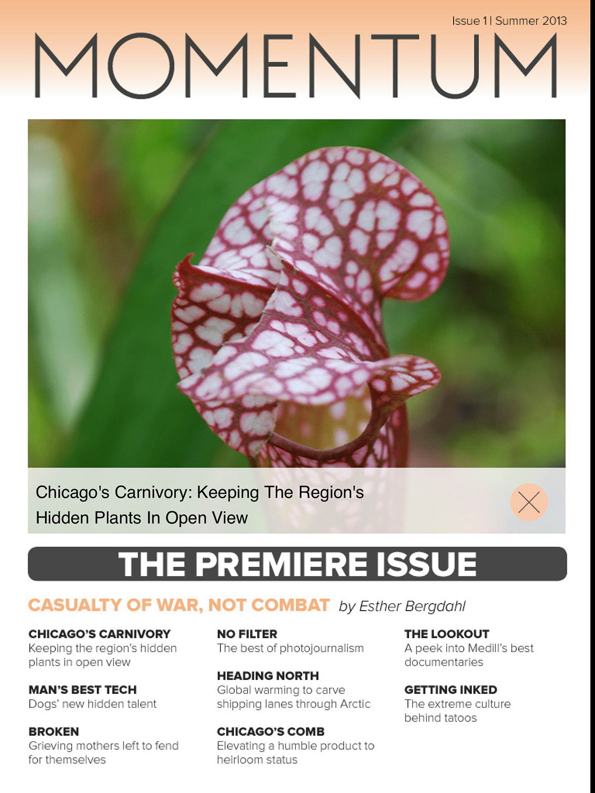
Here's a look at how the interface we created for the contents page works after touching a picture from the grid. Clicking again allows the user to jump to the story.

EXPLAINING THE INTERFACE FOR AN OLDER AUDIENCE
Since a large part of potential users could be alumni unfamiliar with iPad magazines, we decided to include a "how to use" page early in the magazine. I wanted to shy away from traditional magazine app explanations which use a photo of an iPad to explain how the app works. This solution uses a fake menu bar at the top to explain how the actual menu works when it's pulled down.
MORE OPTIONS FOR NAVIGATION
We made sure to make use of the additional options for navigation provided in Adobe's software. At any time the user can open this menu to get a quick overview of the magazine and jump to a given story that sounds interesting.
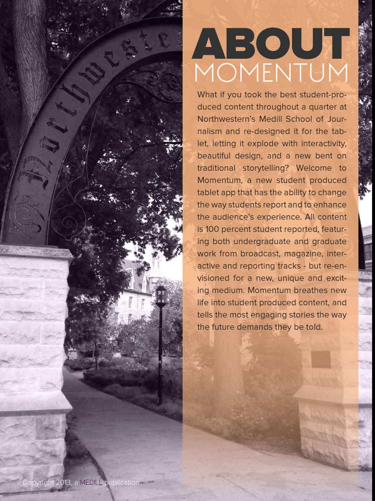
DESIGN STANDARDS FOR EASY REPRODUCIBILITY
Consistent design and branding are featured throughout the app. We used Northwestern's purple and it's complimentary orange to create a color scheme that felt fresh while still referencing the presitigous university where the magazine was created. These choices were also saved within templates to allow future students to easily recreate new issues of the magazine.
REWORKING OLD STORIES
To produce this magazine we reworked one-note, traditional text focused news stories such as this one. Medill runs a website, "Medill Reports" which publishes these daily. They don't receive much attention and there are few readers.
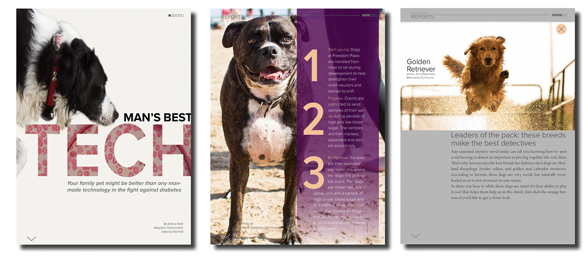
Using the iPad and interactive storytelling techniques, each page of this story becomes a fun, interactive digital experience.
NAVIGATING FROM WITHIN STORIES
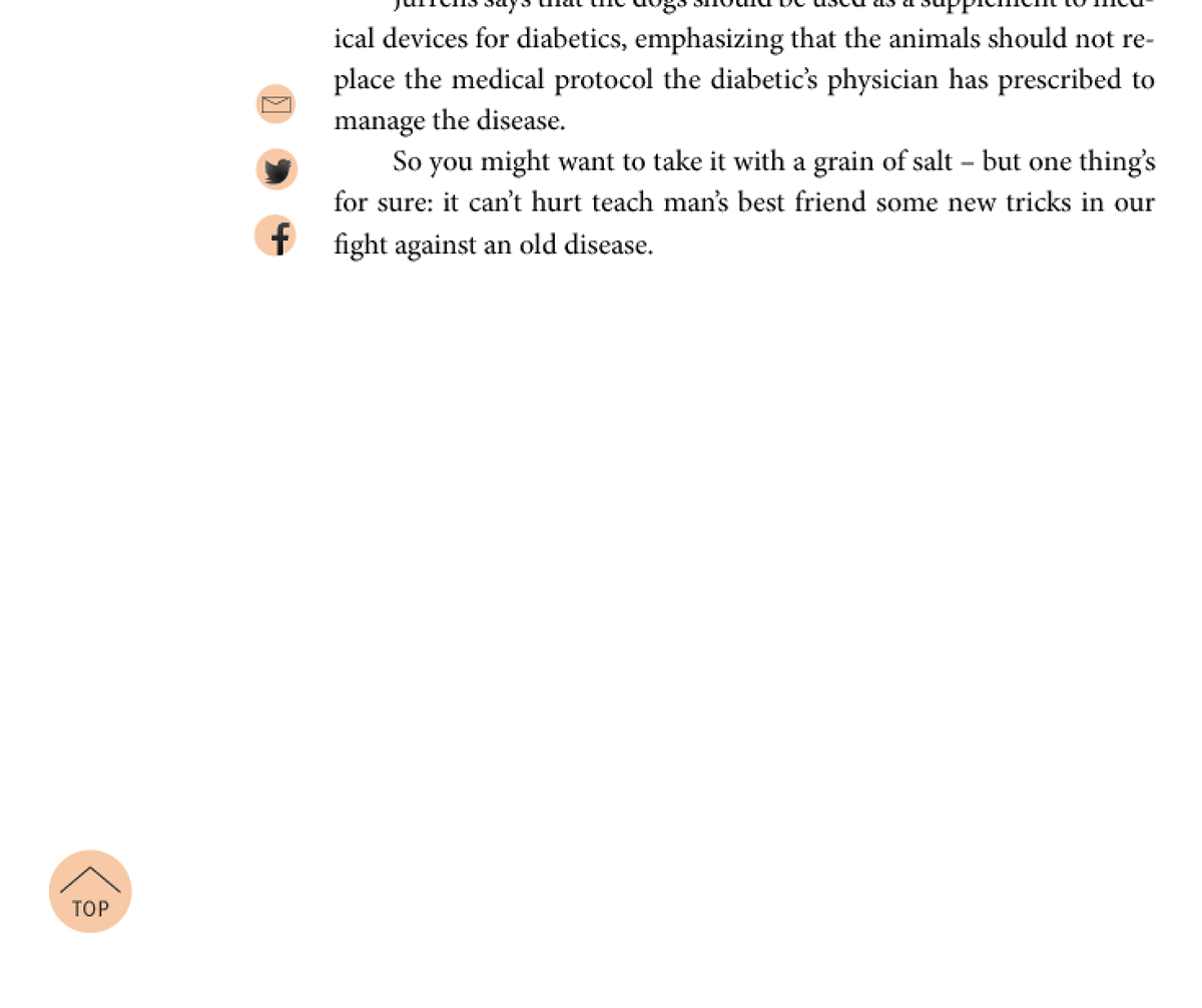
Once users reach the end of the story they're given the option to share the story or email the author, they're also able to jump back to the top of the story if they'd like another look. If they'd rather move on, the need simply swipe right. Swiping right at any time from within the app will move the user to the next story.
PROCESS AND RESULTS
Creating Momentum involved an indepth team process. We began by surveying the best interactive magazines available, such as Rolling Stone and National Geographic. Taking the lessons learned from them, we set standards for color, design, typography, grids and layout.
For individual pages we sketched -> wireframed -> and tested over the course of 4 weeks to make sure everything worked as planned and was up to visual standards.
The magazine proved a success and is still in use by Professor Susan Mango Curtis. In her class students now follow our magazine's template to learn about design, editing and new modes of storytelling.

