The beginnings of a brand
2005 was my fourth year doing graphics for Iceland airwaves, and the third year art directing the look of the festival.
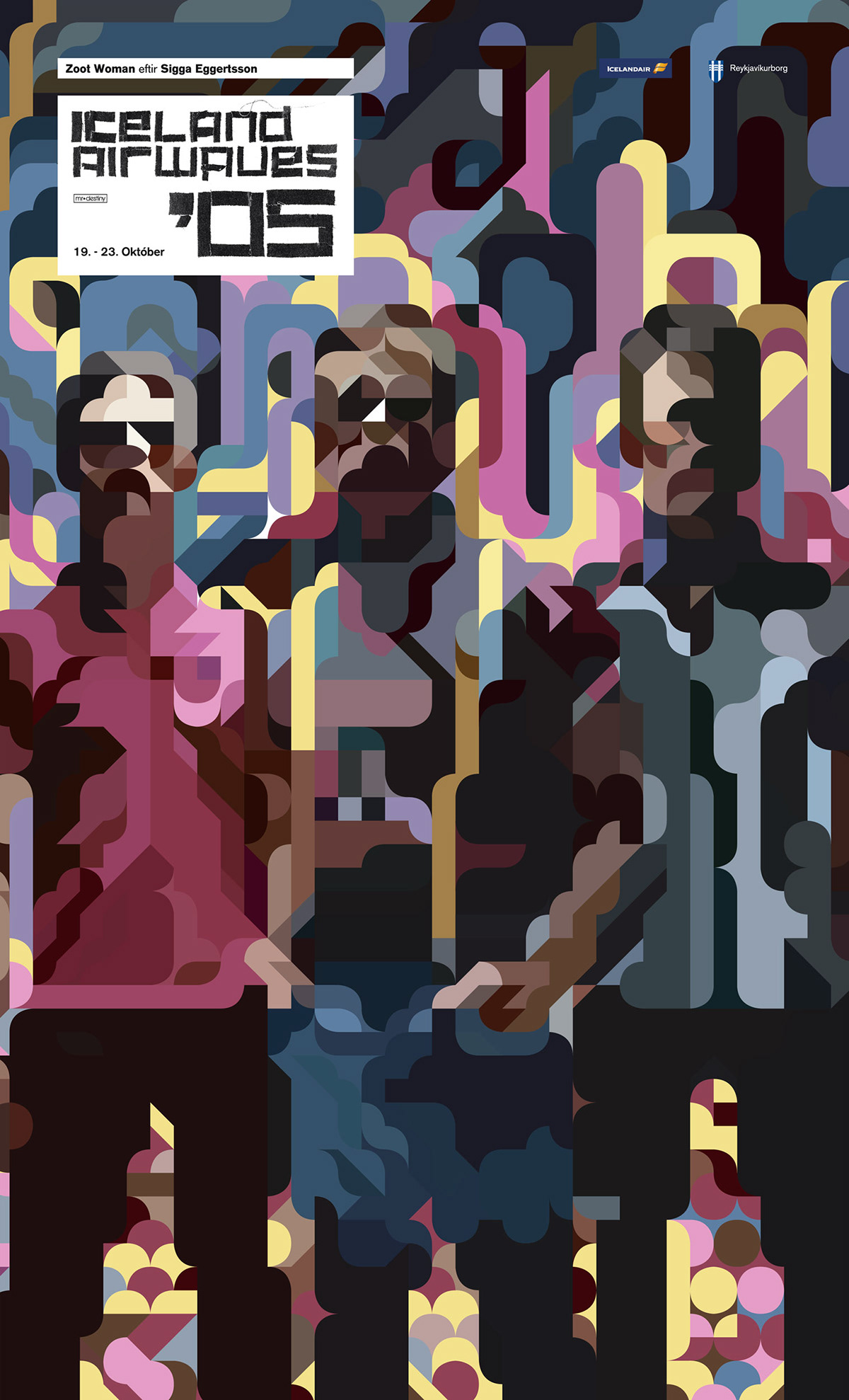
The first three years I experimented with visualising the ideal look of a cutting edge music festival, designing imagery to capture the spirit of it.
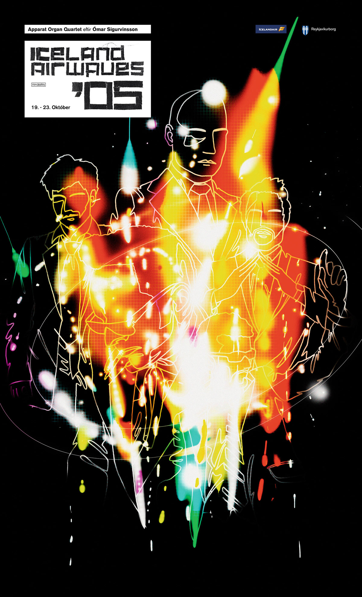
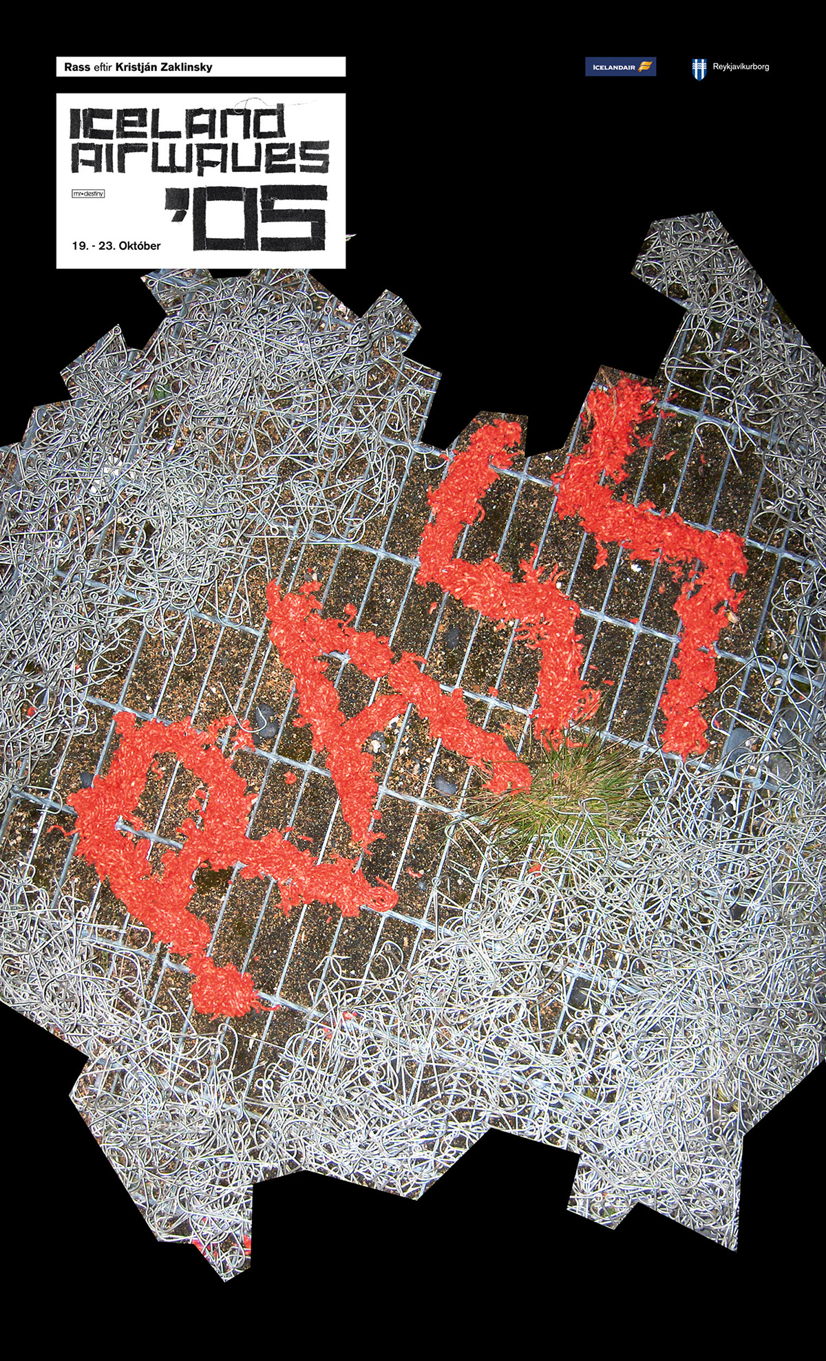
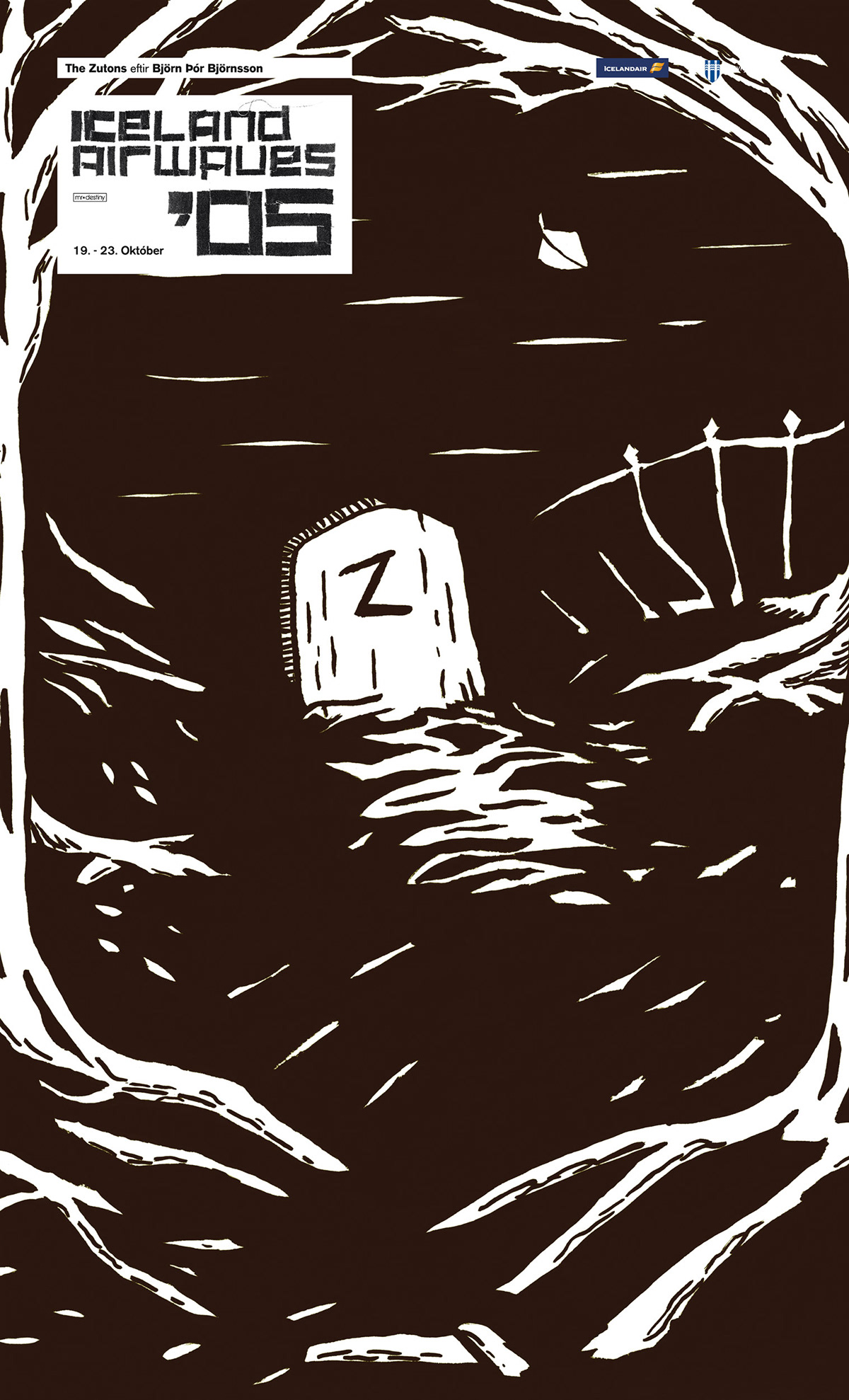
The fourth year I got the idea of turning the imagery into a festival of itself. Making the ads a platform for showcasing popular visual arts.
For the first run with this idea, I commisioned ten artists and illustrators to represent a band of their choosing from the festival lineup.
For the first run with this idea, I commisioned ten artists and illustrators to represent a band of their choosing from the festival lineup.
The participants included Siggi Eggertsson, Björn Þór Björnsson/Bobby Breiðholt, Berglind Jóna Hlynsdóttir, and Kristján Zaklinsky.
A new logo identity
This was the year that the current logo identity came to be, as well. The idea was to have it as simple as possible, made from square or pixel modules. By having a simple graphic frame, A stencil even, it could be redecorated simply, each year.
The first year's logo decoration was inspired by some things I'd heard Egill Tómasson, the co-ordinator of the festival say. In the ramshackle approach to such a large scale, low budget production, everything is held together with gaffer tape. I thought, well, the logo should be as well, then.