El proyecto tenía como objetivo diseñar la identidad gráfica y la etiqueta para un nuevo aceite de oliva ecológico virgen extra. En la búsqueda de nombre, se barajó adoptar el nombre de la necrópolis ibérica “El corral de Saus” (siglos V-III a. C.), descubierta en 1971 en los mismos terrenos en que se encuentra el olivar.
The purpose of the project was to design the graphic identity and label for a new organic extra virgin olive oil. In searching for a name the idea came up of adopting the name of the Iberia necropolis called “El Corral de Saus” (5th – 3rd century B.C.), discovered in 1971 in the same area as the olives grow.

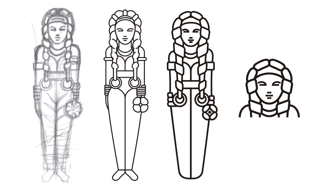
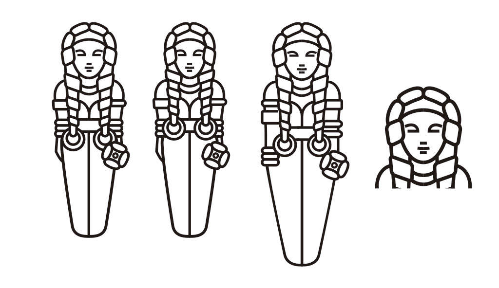
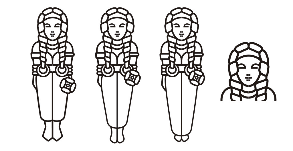
Una vez elegido “El corral de Saus” como nombre, la imagen gráfica estaba abocada a tomar algún elemento que hiciera referencia a esa necrópolis. Entre las piezas encontradas, quizá la más representativa era un conjunto de cuatro damitas que, formando un cuadrado reposaban tumbadas unidas por su brazo derecho. Nos propusimos trabajar sobre esta figura para convertirla en el motivo principal de la imagen. La idea era mantener el aspecto hierático y la desproporción de sus brazos y piernas con respecto a la cabeza para que conservara su estilo arcaico. Como contrapunto, utilizamos una gráfica limpia y contemporánea para conseguir una imagen tierna, joven y fresca.
Once “El Corral de Saus” was chosen as the name, the graphic image was bound to include some element that would make reference to the necropolis. Amongst the pieces discovered, perhaps the most characteristic was a group of four young ladies lying on their backs forming a square linked by their right arms. We resolved to work on this figure to turn it into the central motif of the design. The idea was to maintain the stylized appearance and the disproportion of the arms and legs with respect to the heads in order to retain the archaic feel.
As a counterpoint we used a clean and contemporary graphic to achieve a cute, young and fresh image.
As a counterpoint we used a clean and contemporary graphic to achieve a cute, young and fresh image.