Below are our results from need finding interviews.

Our analysis of the current interface flow has enabled us to clearly see what navigations and directories work and what needs to be redesigned and improved.

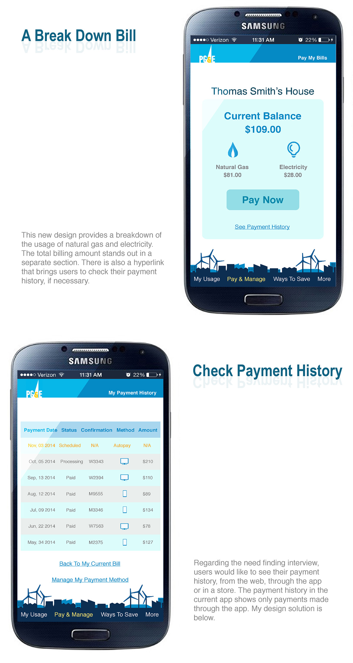
One thing we have learned is that it took a while to navigate to the pay bill page, which made most customers distafisfied. Also, there a several other issues, this is some miscategorization between the Bill, Payment History and Payment Method sections. We curently see a lot of potential ways to improve on the existing app design.
Apart from studying the current flow, we zoomed in to the details of the overall interface design, such as the color scheme. We found that a strong illustrative concept and better display widgets are needed, such as, texts, icons, and buttons.

After going through the fundamental process of finding user needs and studying the current interface and design, we have brainstormend for a better flow for the new PG&E Bill Pay mobile app for Android mobile users.

After studying the interface flow, we then studied the design of the current app. So you can see that our initial focus was on the needs of the users, while our secondary focus was on the visual design.

Next, quick wireframes were created to make interactive prototype.

In parallel with improving the user experience and interface designs, we have also thought about a new exciting look to the app. We connected user perception of PG&E's image with some illustrations of energy power.

And here it is! A new and exciting look for the PG&E Mobile Bill Pay app as energetic as the power PG&E provides.