


Project overview
남자가 피부를 가꾸는 것이 너무나 당연한 시대입니다. 다양한 남성 타겟의 스킨케어 및 코스메틱제품들이 나오고 있죠. 아이디얼포맨 또한 2017년 올리브영의 스킨케어 브랜드에서 독립한 남성 타겟 코스메틱 브랜드입니다. 런칭 때부터 제품을 사용하던 주 타겟층의 연령대가 높아짐에 따라 새롭게 변화가 필요힌 시점이었습니다. 키비쥬얼의 변화로 타겟의 연령대를 낮추고 브랜드의 가치를 더욱 잘 드러낼 수 있도록 디자인하였습니다.
Everyone understands that the era where men take care of their skin is now a natural occurrence. Various skincare and cosmetic products targeting men have emerged. Ideal For Men, too, is a men's skincare brand that became independent from Olive Young in 2017. As the age group of the primary target audience, who had been using the products since the launch, increased, it became necessary to make some changes. To lower the target age group and better showcase the brand's values, the key visual underwent a transformation in design.
Everyone understands that the era where men take care of their skin is now a natural occurrence. Various skincare and cosmetic products targeting men have emerged. Ideal For Men, too, is a men's skincare brand that became independent from Olive Young in 2017. As the age group of the primary target audience, who had been using the products since the launch, increased, it became necessary to make some changes. To lower the target age group and better showcase the brand's values, the key visual underwent a transformation in design.


Graphic Concept
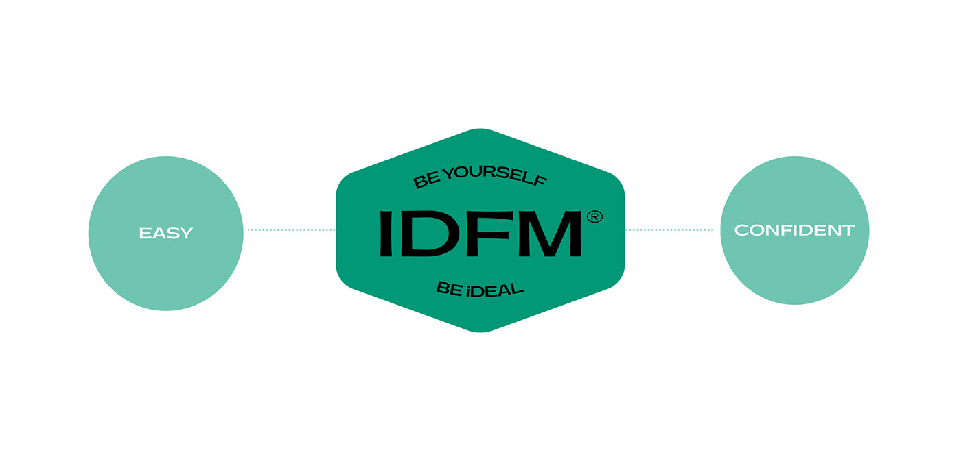
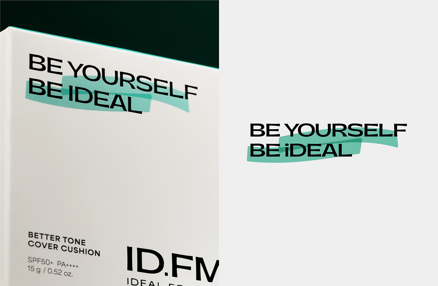
아이디얼포맨의 새로운 키비쥬얼은 핵심가치를 최대한 드러낼 수 있도록 하였습니다. 본인 스스로에 대한 확신과 명확한 가치관을 드러낼 수 있는 자신감있는 이상적인 남성의 무드를 보여주고자 하였고 이를 하이라이트로 표현하였습니다.
The new visual identity for Ideal For Men has been crafted to showcase its core values to the maximum extent. It aims to portray the confident and ideal man who exudes self-assurance and a clear set of values. This mood is highlighted to emphasize the brand's essence.
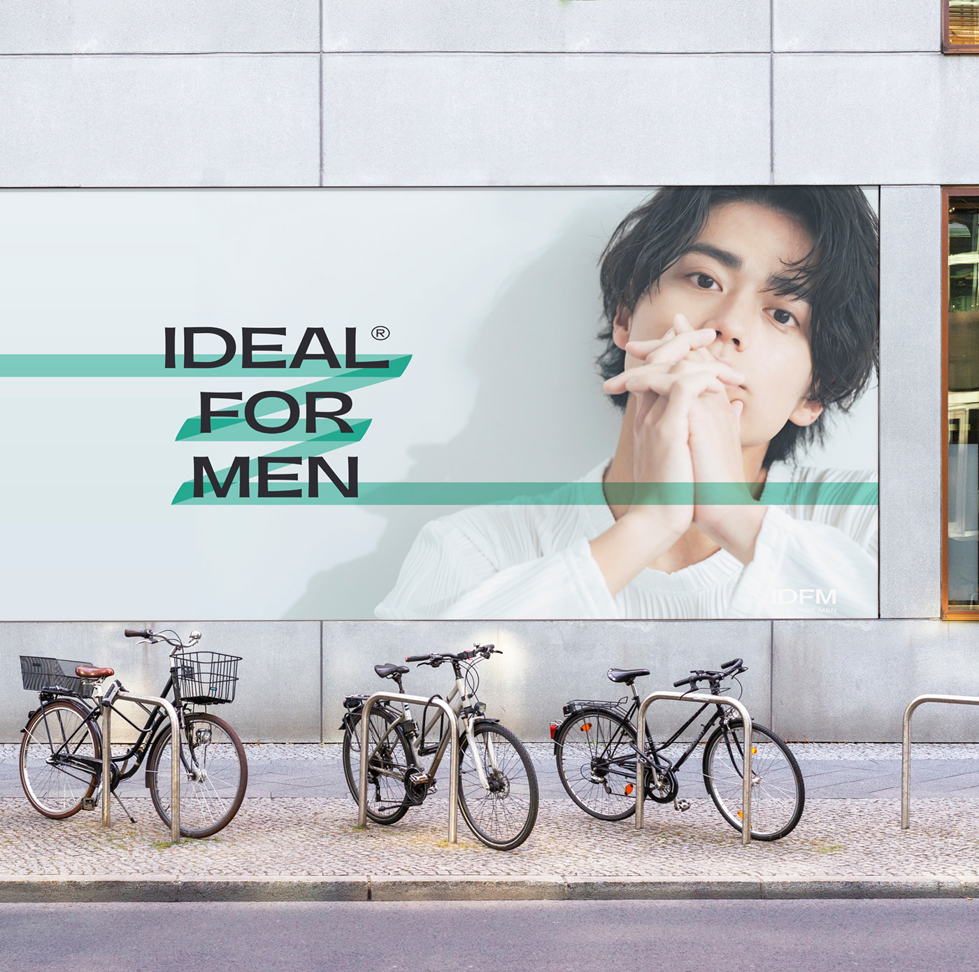
Logo Typeface
자신감있는 남성의 느낌을 자연스럽게 로고 서체에서도 느껴질 수 있도록 하였습니다. 여성스러운 뉘앙스를 표현할때 장평이 좁고 얇은 타이포를 사용하는것과 반대로 남성용 제품인 아이디얼 포맨의 서체로는 장평이 넓고 볼드하며 모서리가 강조된, 남성적인 뉘앙스가 느껴지는 서체를 선택했습니다.
We aimed to naturally convey the feeling of a confident man through the logo typeface. In contrast to using narrow and thin typography to express a feminine nuance, which is often employed when creating a feminine aesthetic, for Ideal For Men, a men's product, we chose a typeface with wide letter spacing, bold characteristics, and emphasized corners to evoke a more masculine nuance.


Graphic Asset
그래픽 에셋은 로고 타입의 형태를 계승한 볼드한 블랙 라인과 형광펜 라인의 형태를 활용하였습니다. 전체적으로 볼드하고 단단함이 느껴지는 밀도있는 형태로 제작하였습니다.
The graphic assets incorporate bold black lines that inherit the form of the logo type, along with the use of fluorescent highlighter lines. The overall design is crafted with a dense and bold structure, conveying a sense of solidity and strength.


IDEAL FOR MEN VISUAL IDENTITY 2023
Client : CJ Oliveyoung
Designer : Hyewon Kim
ohSeven Design
Executive director : Sukyoo Bae
Project Manager : Yunje Park
Designer : Song-yi Gu, Jinju Kim, Jahee Lee
Photography : Sungwoong Yoon
Photography : Sungwoong Yoon
클라이언트 : 올리브영
디자이너 : 김혜원
오세븐 디자인
총괄 디렉터 : 배수규
프로젝트매니저 : 박윤제
디자이너 : 구송이, 김진주, 이자희
사진 : 윤성웅
디자이너 : 구송이, 김진주, 이자희
사진 : 윤성웅


